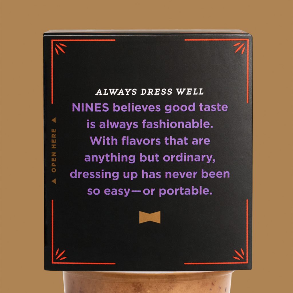
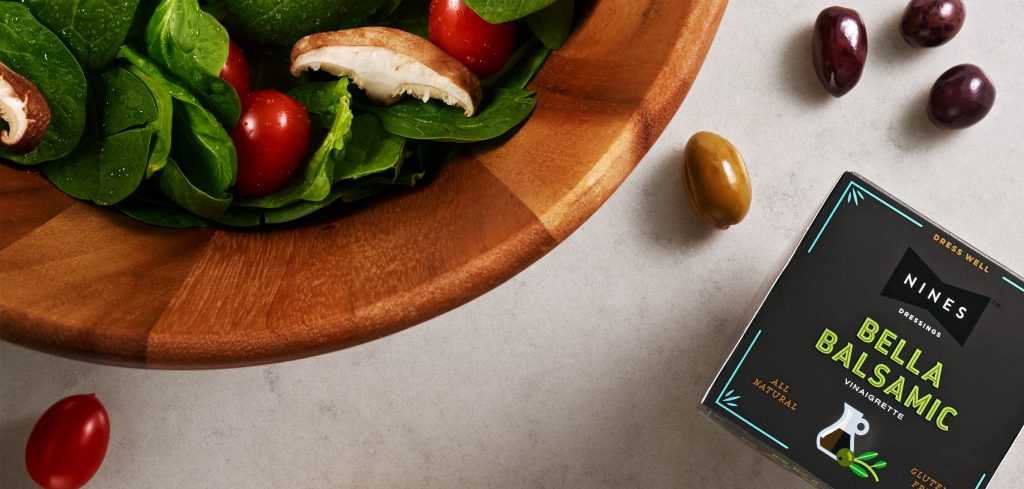
Black tie optional. Nines makes it easy to dress-well for any occasion.
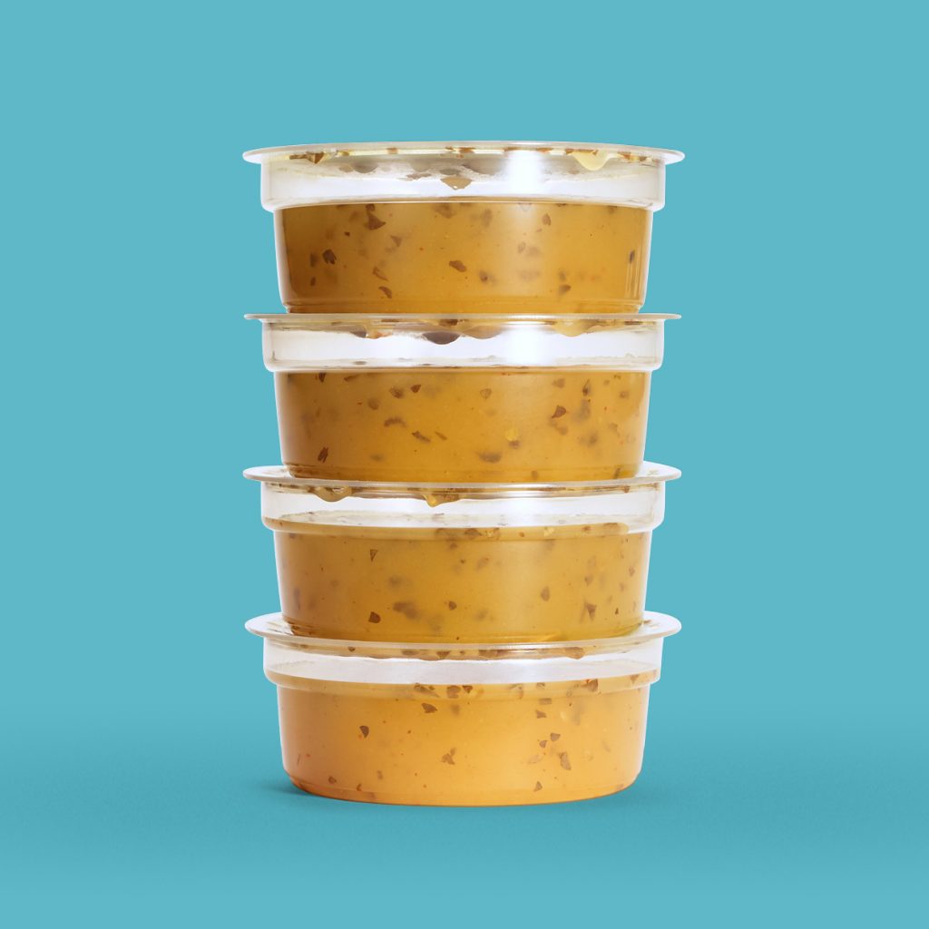
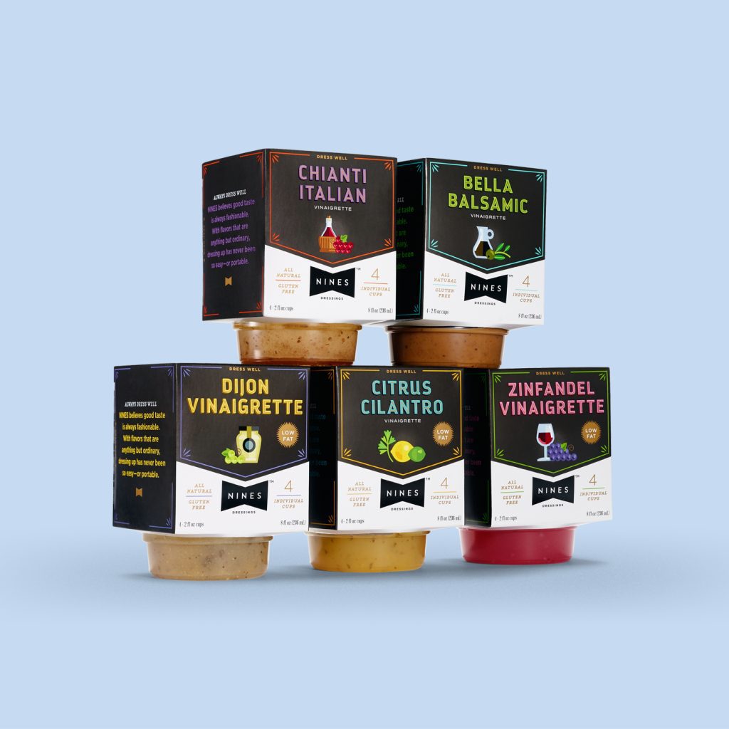
Nines is for busy people who want to dress their salads well. Offering on-trend flavors with all-natural ingredients, it hits all the right notes with grab-and-go convenience.
Photography: Bryan Borgal, John Hesselbarth, Jackie Young
Our client, a leading salad dressing wholesaler, acclaimed by restaurants for their range of great-tasting flavors, wanted to make the leap to retail. In order to earn space on grocer’s shelves, the new brand needed packaging that would make a statement. When our research pointed to the growing demand for portable, single-serve products, our strategy began to take shape.
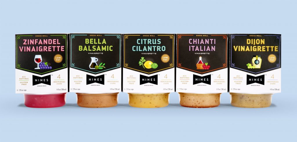
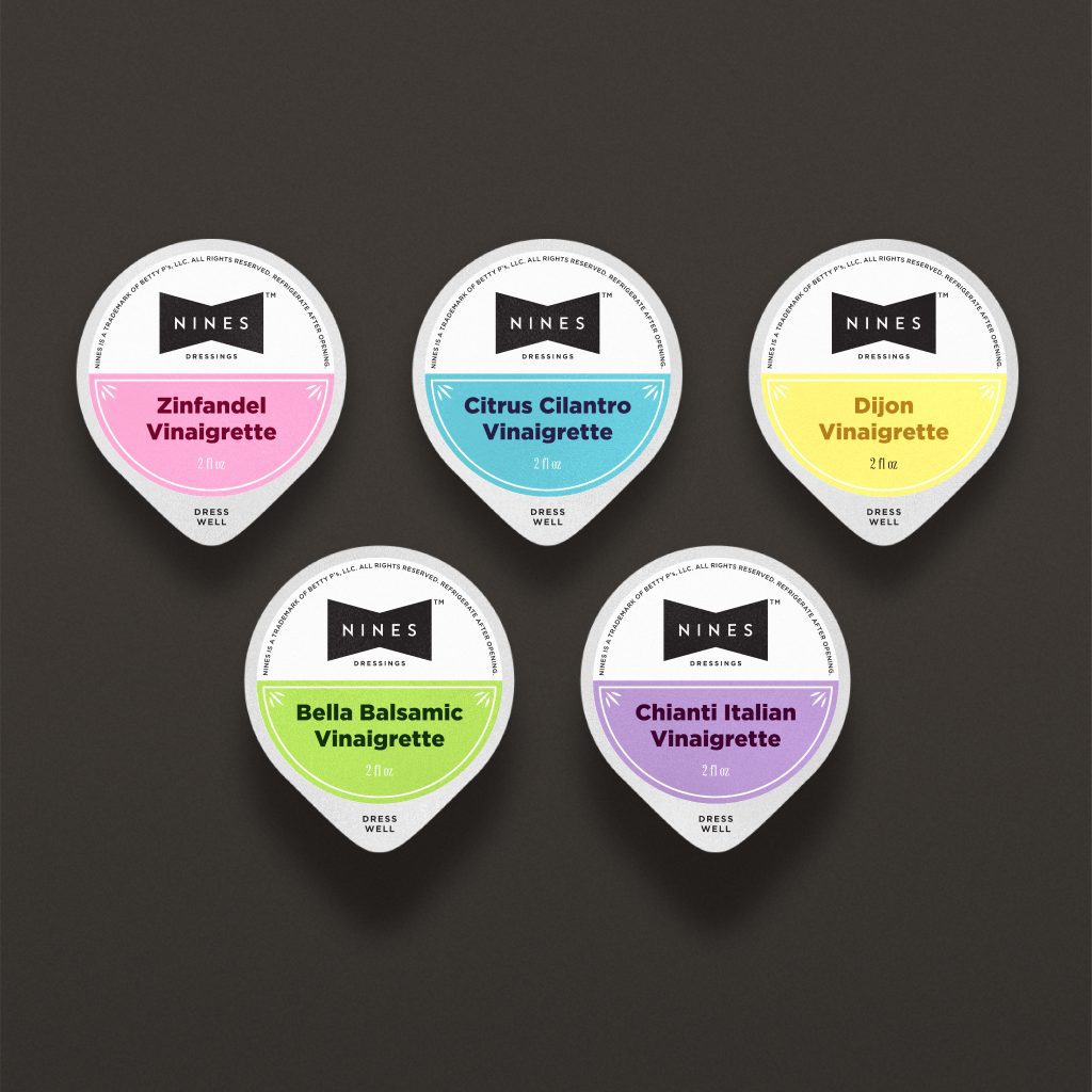
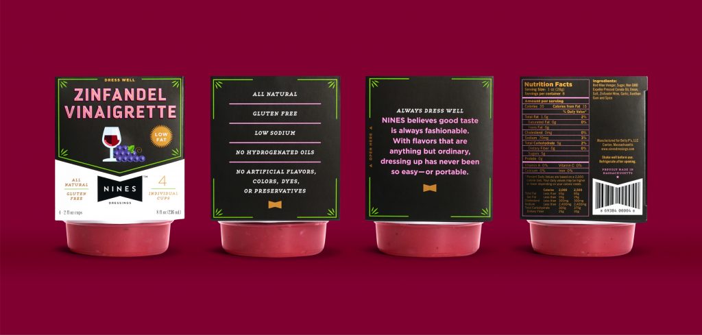
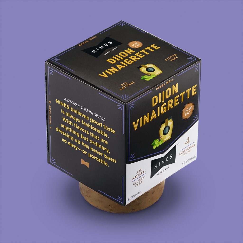
With smaller than average dimensions, the package speaks to the dressing’s high quality, on-trend flavor profiles and a shelf-stable recipe not readily found in other ‘to-go’ dressings.
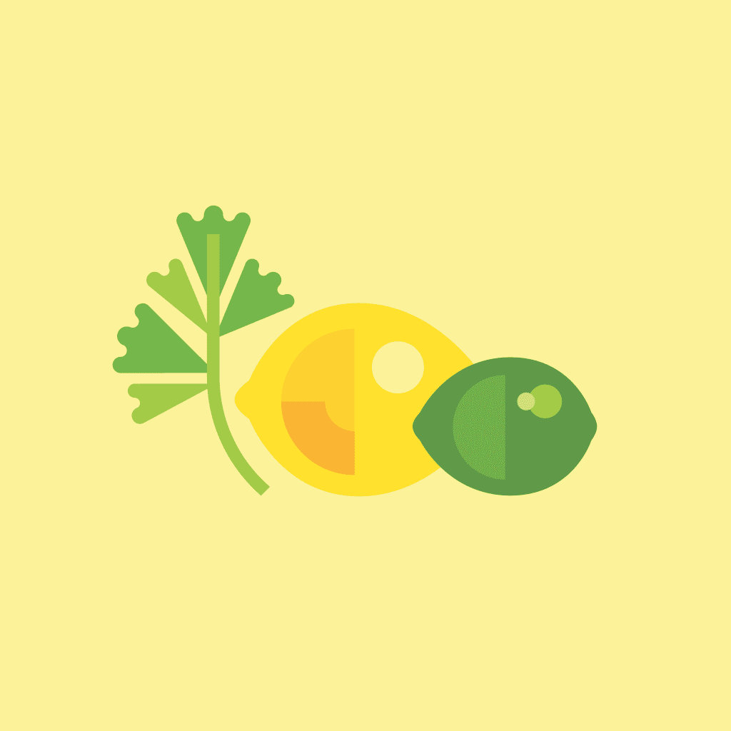
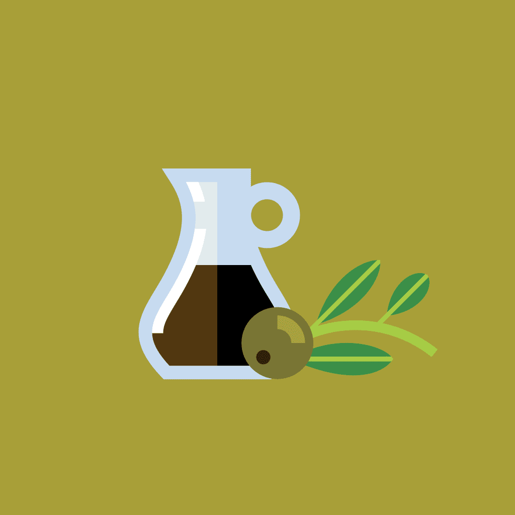
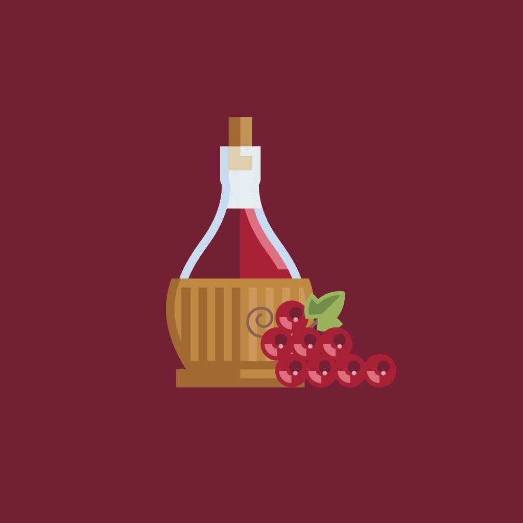
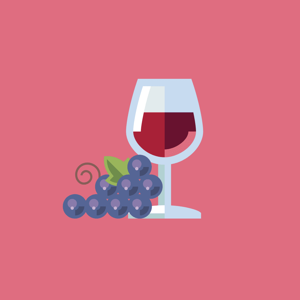
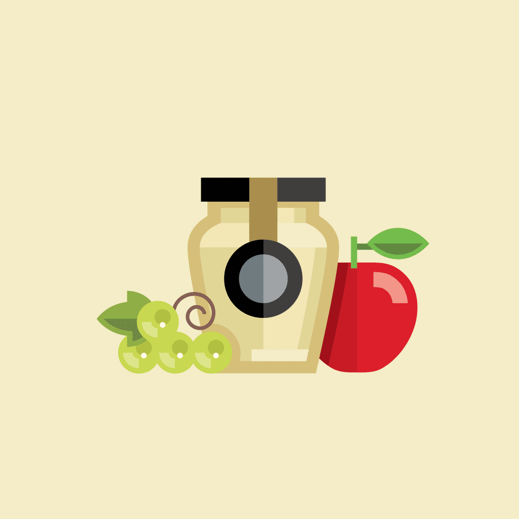
The black bowtie, a classic icon of sophistication, anchors the visual brand and offers context for the company’s name and their family of premium products. Simple, colorful illustrations differentiate the variety of flavors and depict the all-natural ingredients. Adding a touch of humor, the copy on and inside the package encourages consumers to “Always Dress Well”.
Within 6 months of the rebrand, Nines was picked up by a 500+ location, multinational grocery chain.
Nines was sold at 16 independent organic grocers within 6 months of launch.