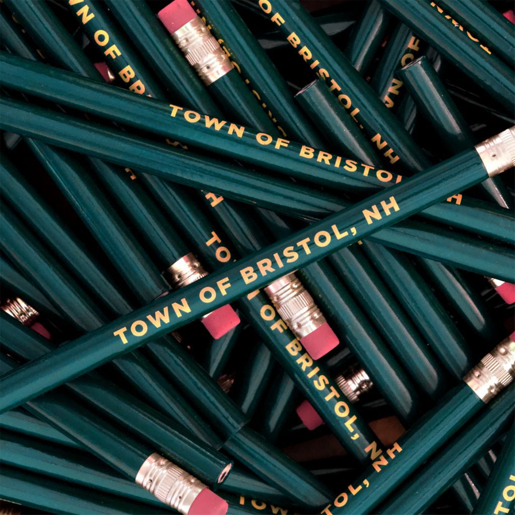
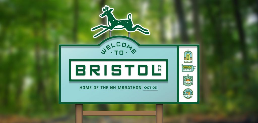
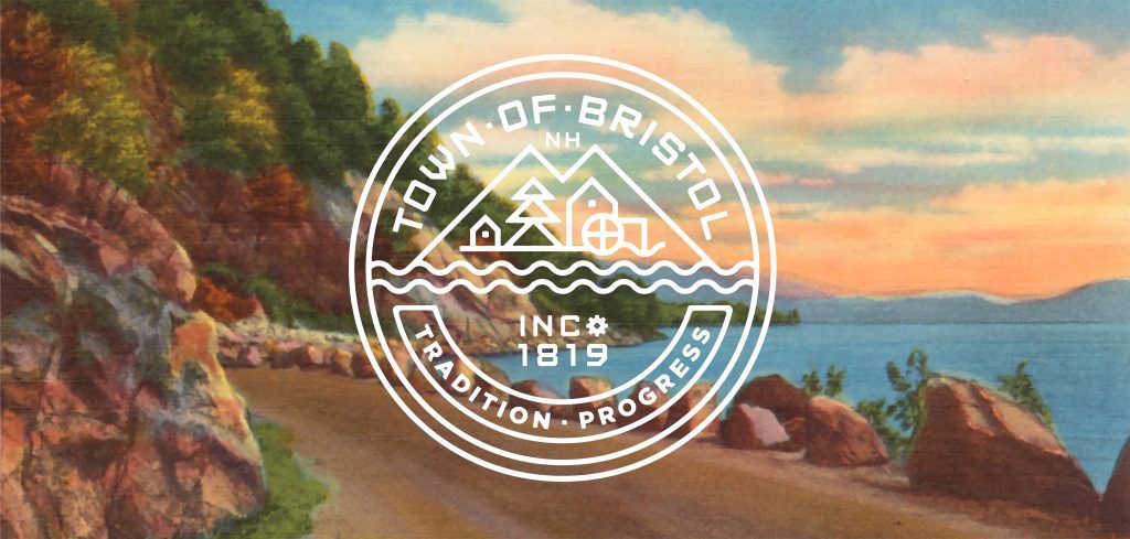
Bristol, NH. A post-industrial town flows into a new season of progress and play.
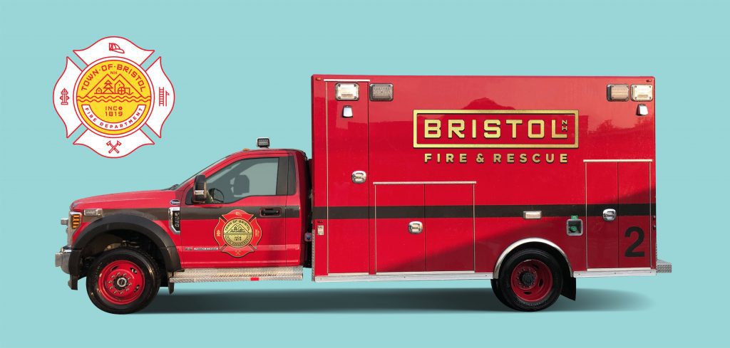
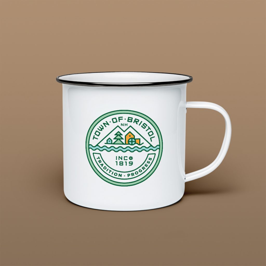
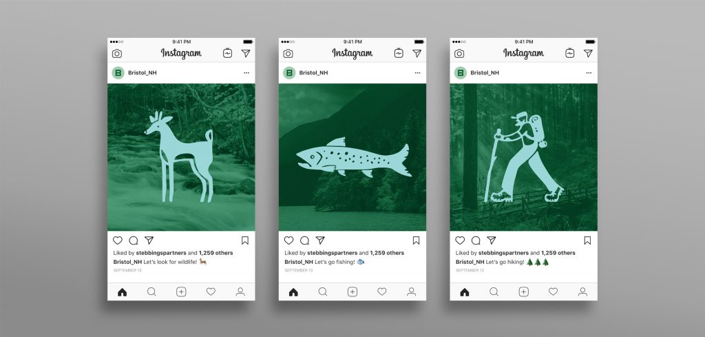
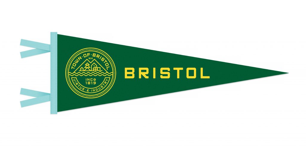
Scope Brand Identity, Brand Strategy, Custom Type, Illustration, Merch, Signage & Environmental Graphics, Web Site
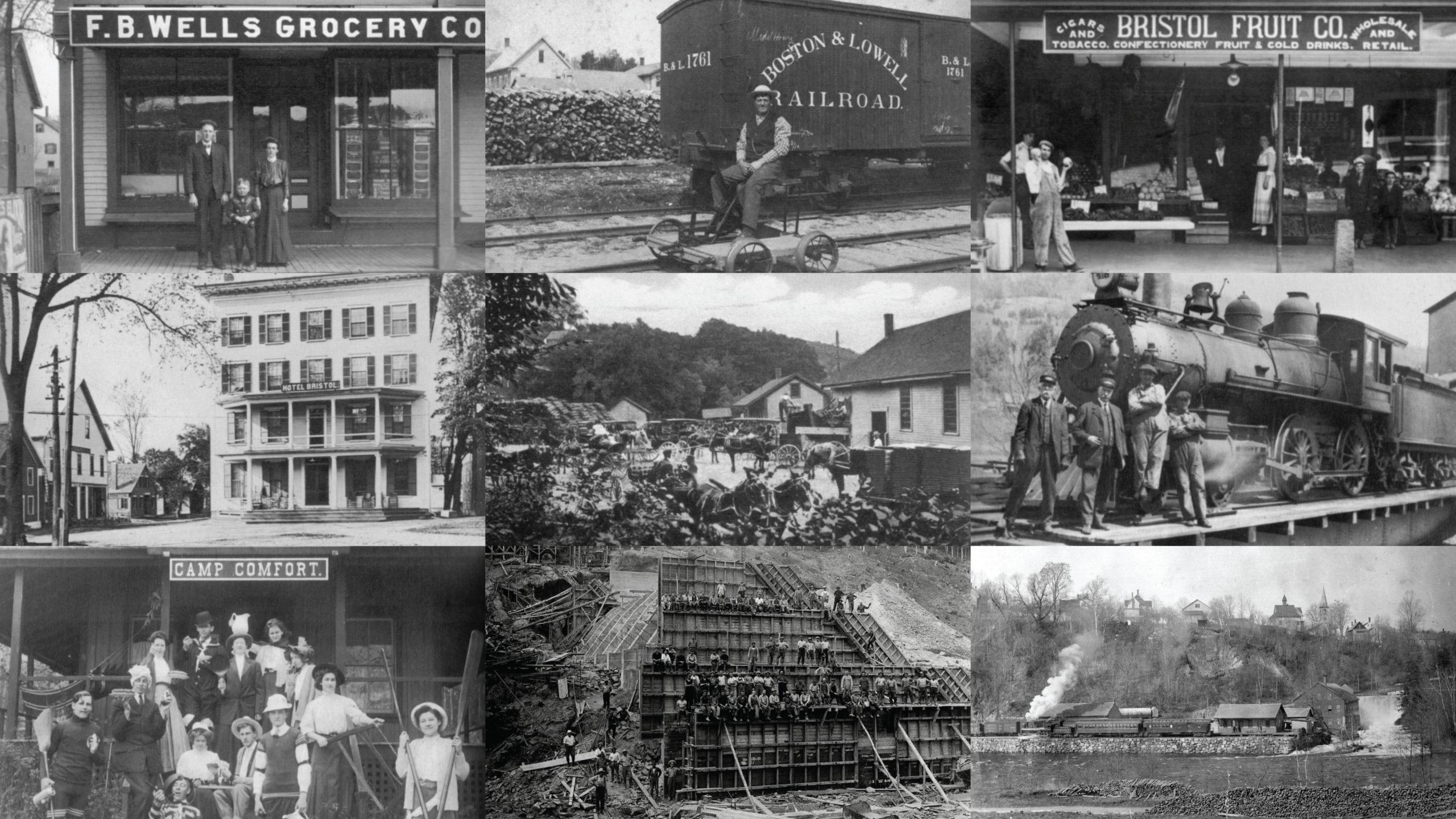
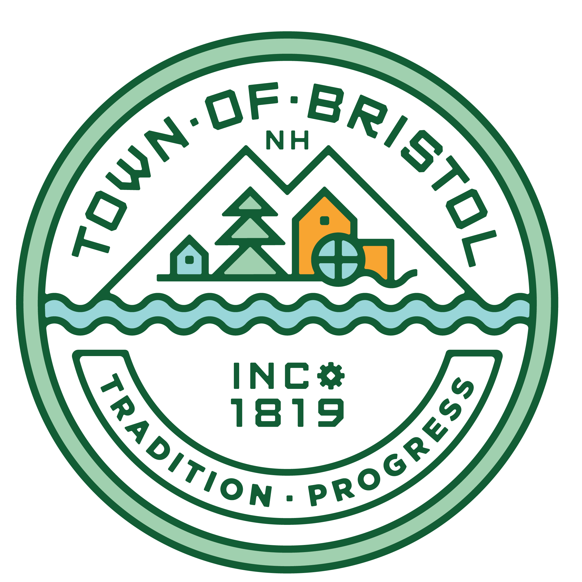
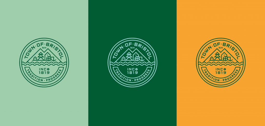
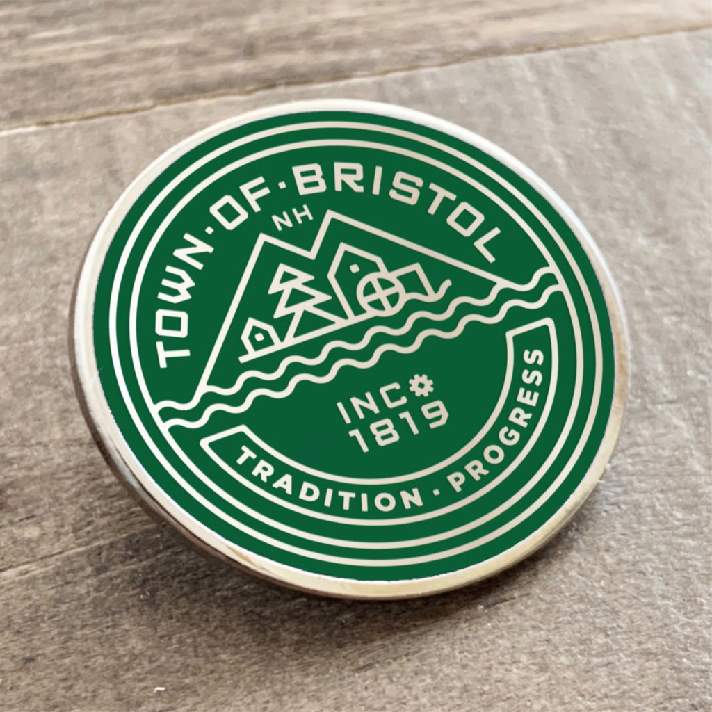
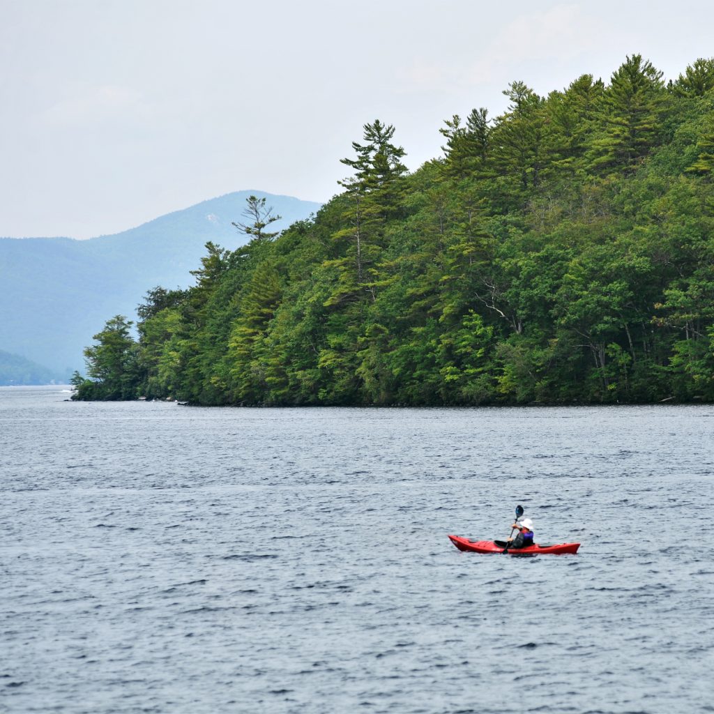
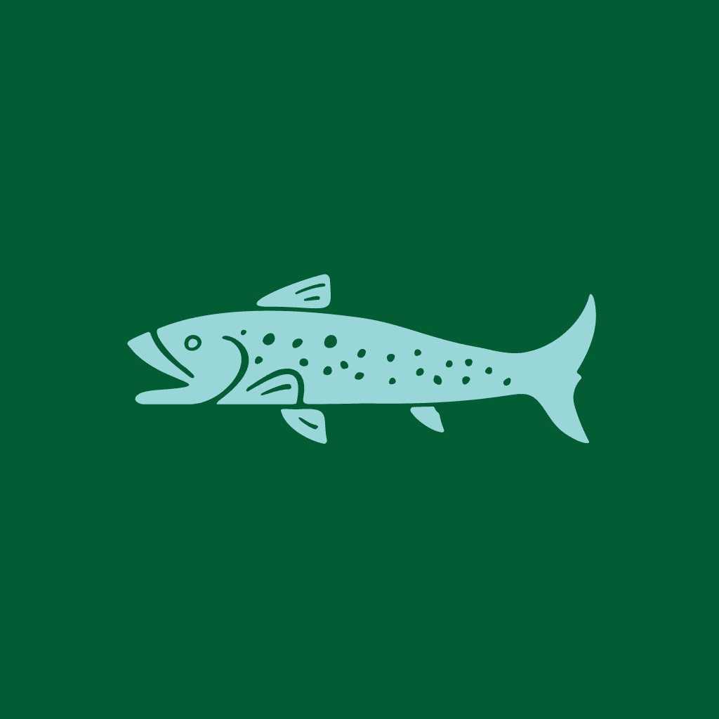
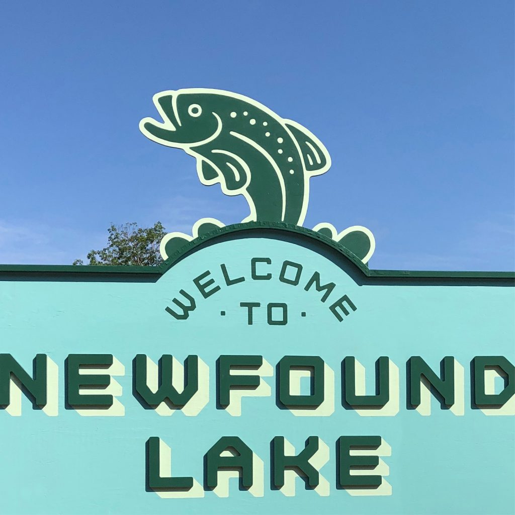
Bristol New Hampshire, incorporated 1819, is a small, rural town located at the southern end of Newfound Lake near the foot of the White Mountains. Situated at the merge of two rivers, Bristol’s abundant water-power led to significant growth as an industrial hub throughout the 1800’s. With the increased business traffic, Bristol became discovered by the outside world for it’s natural assets, drawing a stream of seasonal visitors looking for a prime vacation spot and seemingly endless opportunities for outdoor recreation.
Today, the water-powered productivity that built Bristol is in the past, leaving behind a vacation town with a seasonal flux that puts a strain on local business. With a current year-round population of approximately 3200—a number that about doubles in the warmer months—the town began to consider branding as a way to stabilize the local economy.
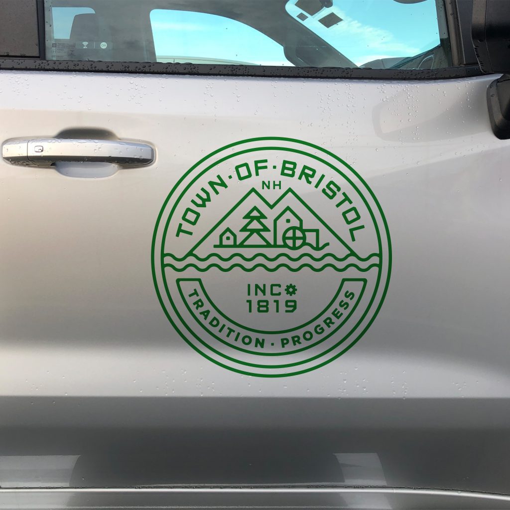
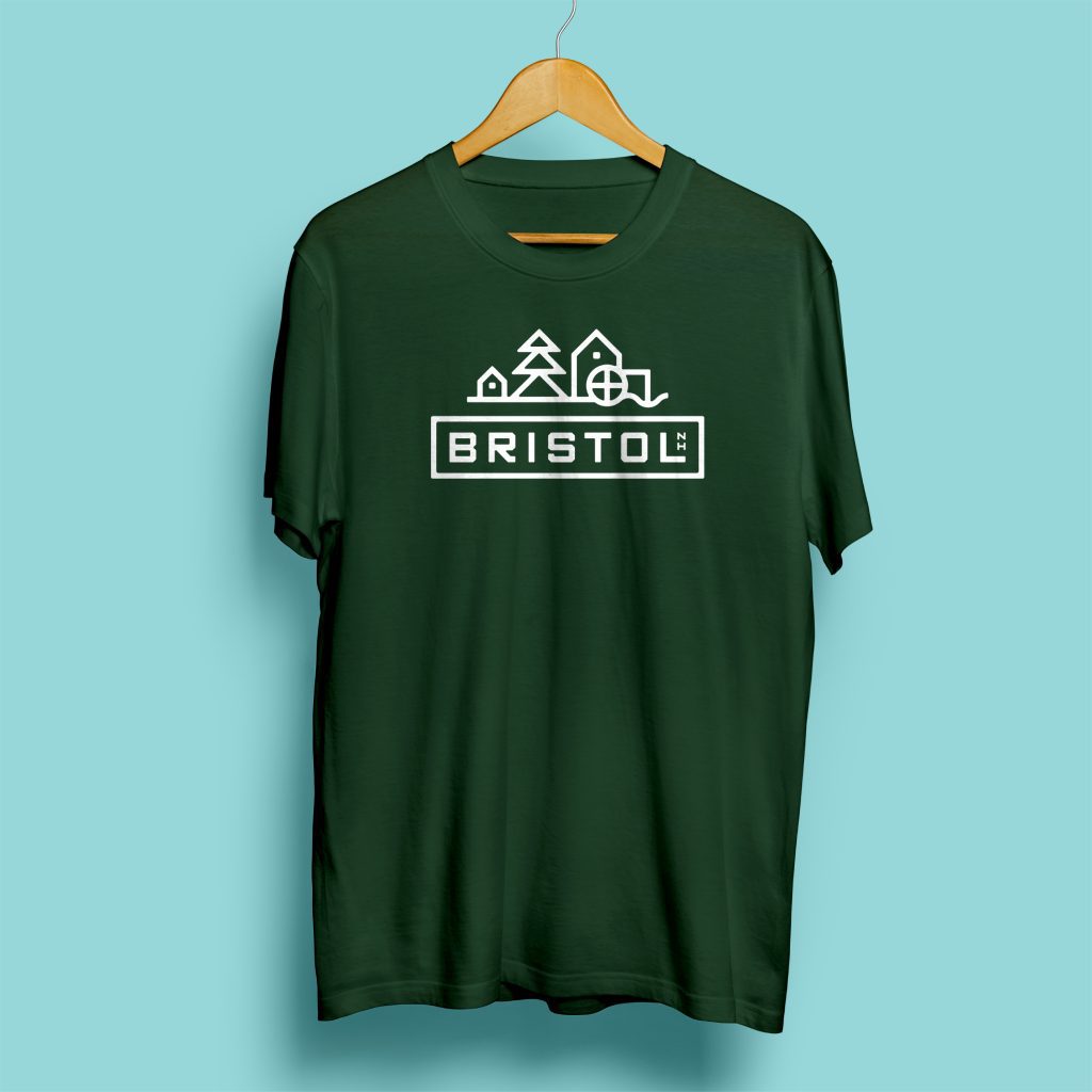
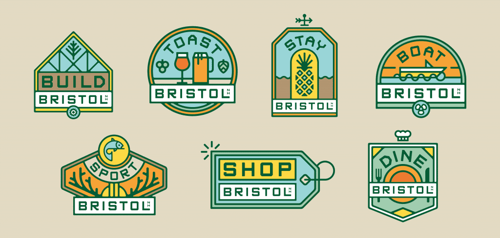
We were asked to join the effort in Bristol by developing a brand for the town that would signal optimism and opportunity. The designs needed to stand as a rallying point for the citizens of Bristol, their growing business community, and those who were yet to join them.
Through this effort, Bristol has rolled out the welcome mat for the hospitality industry, the tech industry and others. For startups or established businesses looking to make a move, Bristol offers affordable real estate, hearty infrastructure, and a hard-to-beat work-lifestyle.
Bristol NH was noted by President Biden as a small town that demonstrated exemplary strategic growth.
Numerous new businesses and private investors have come into Bristol in the months following the rebrand.
The Chum team went all in to understand Bristol’s rich history and form an inspiring vision for its future. Our town’s authentic personality came to life in their work and we’re gaining significant interest from outside Bristol as a result.
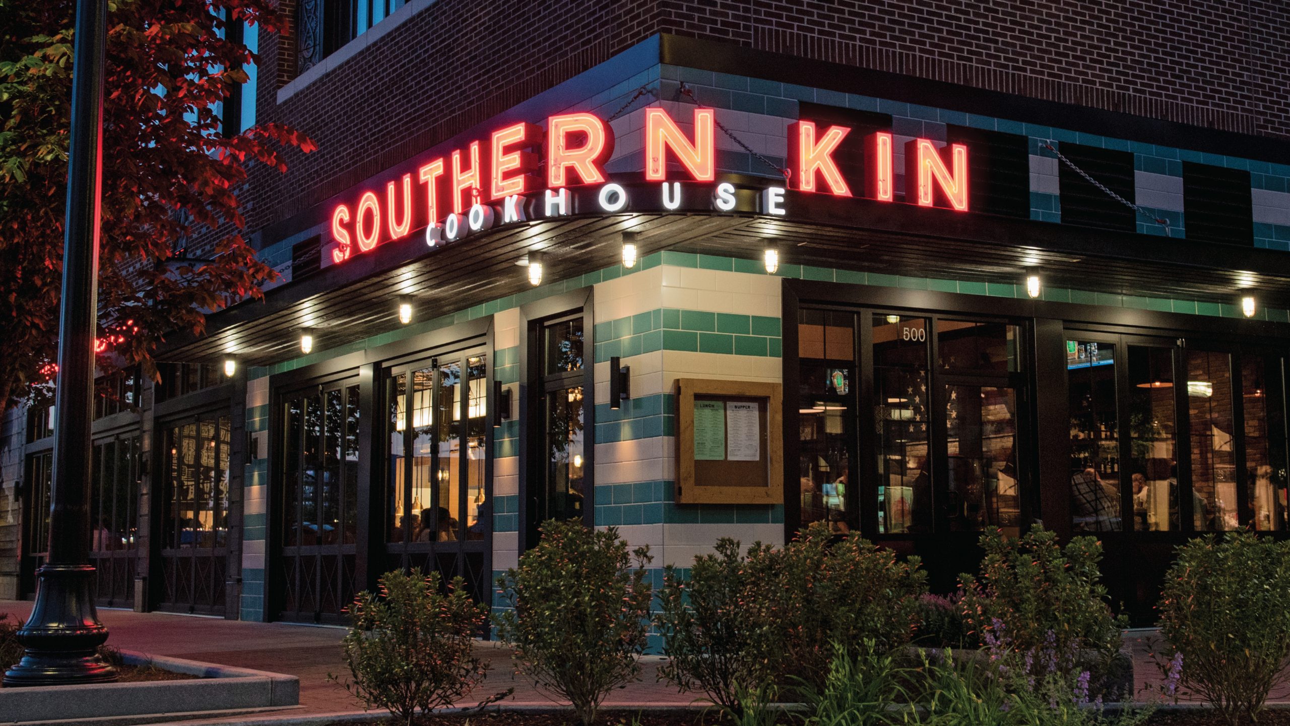
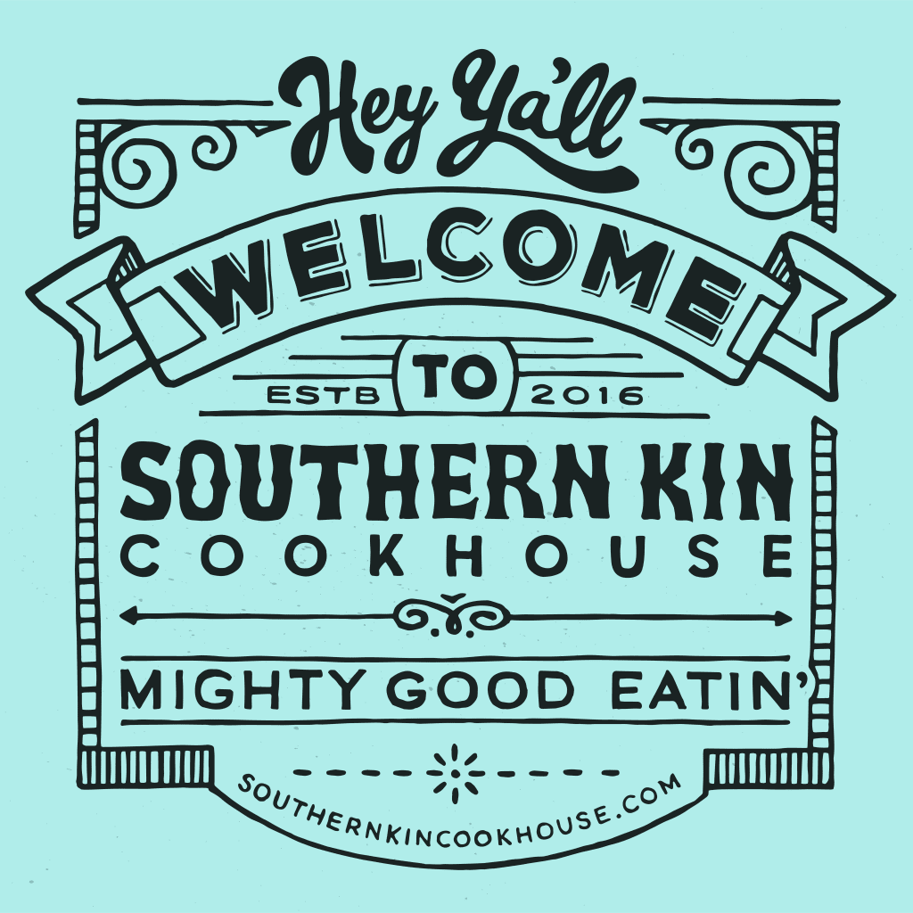
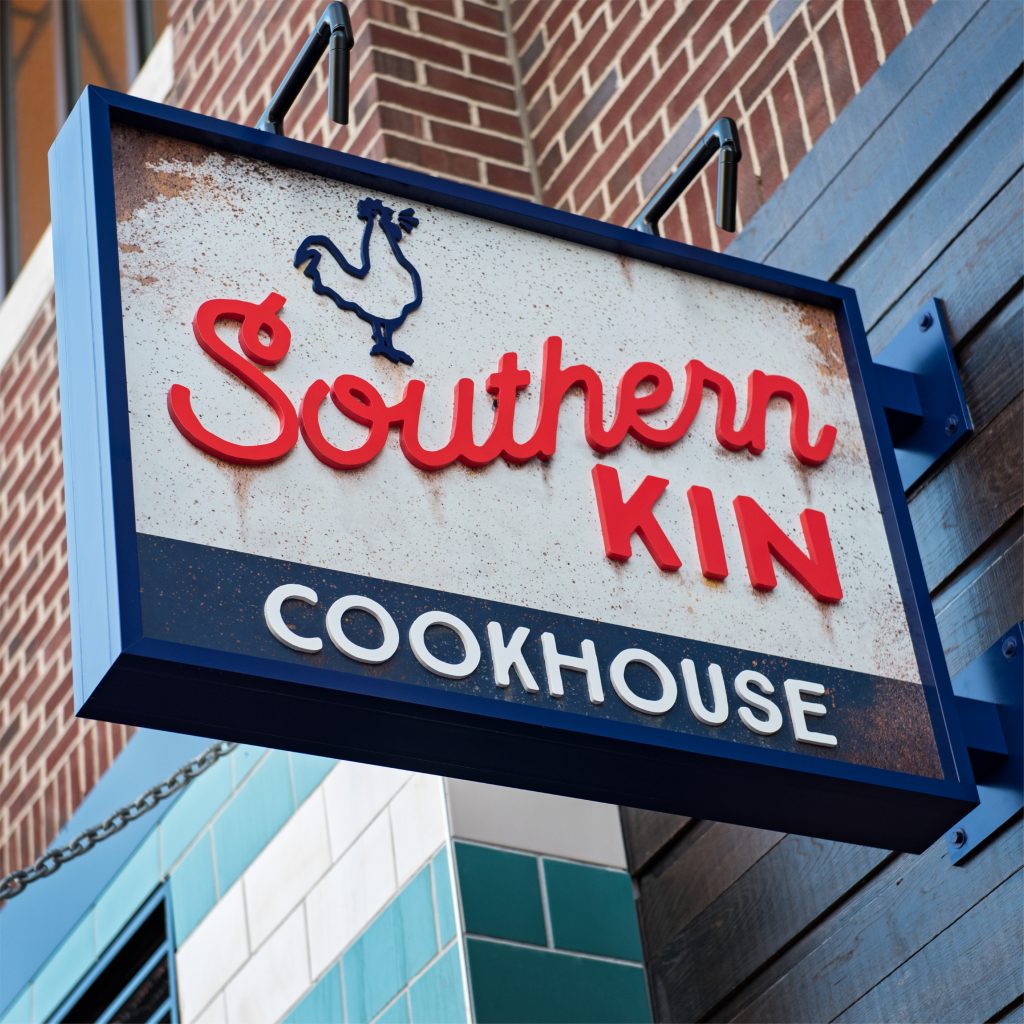
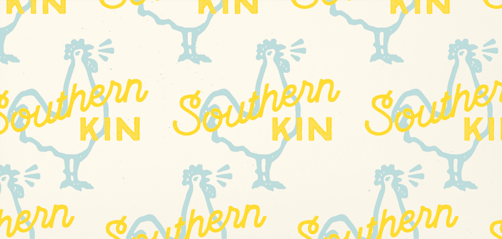
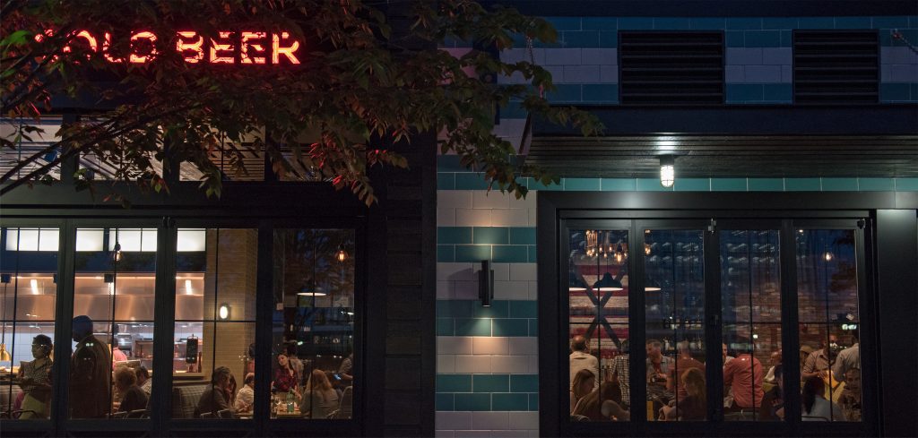
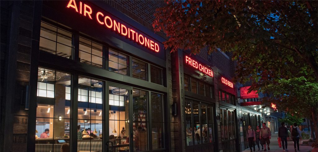
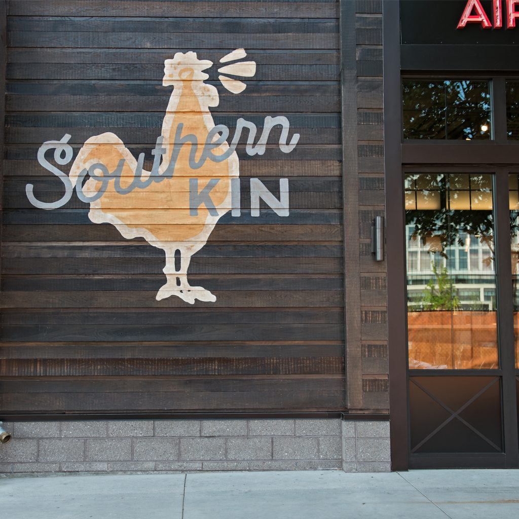
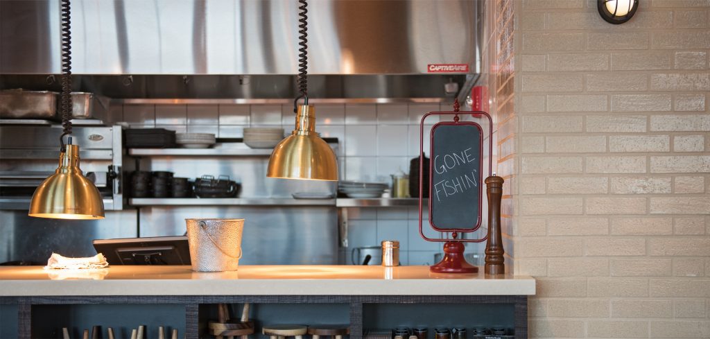
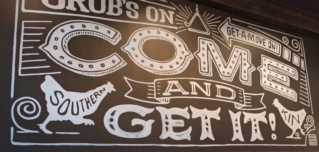
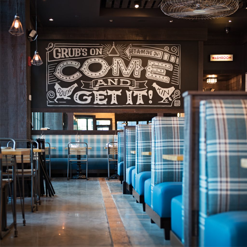
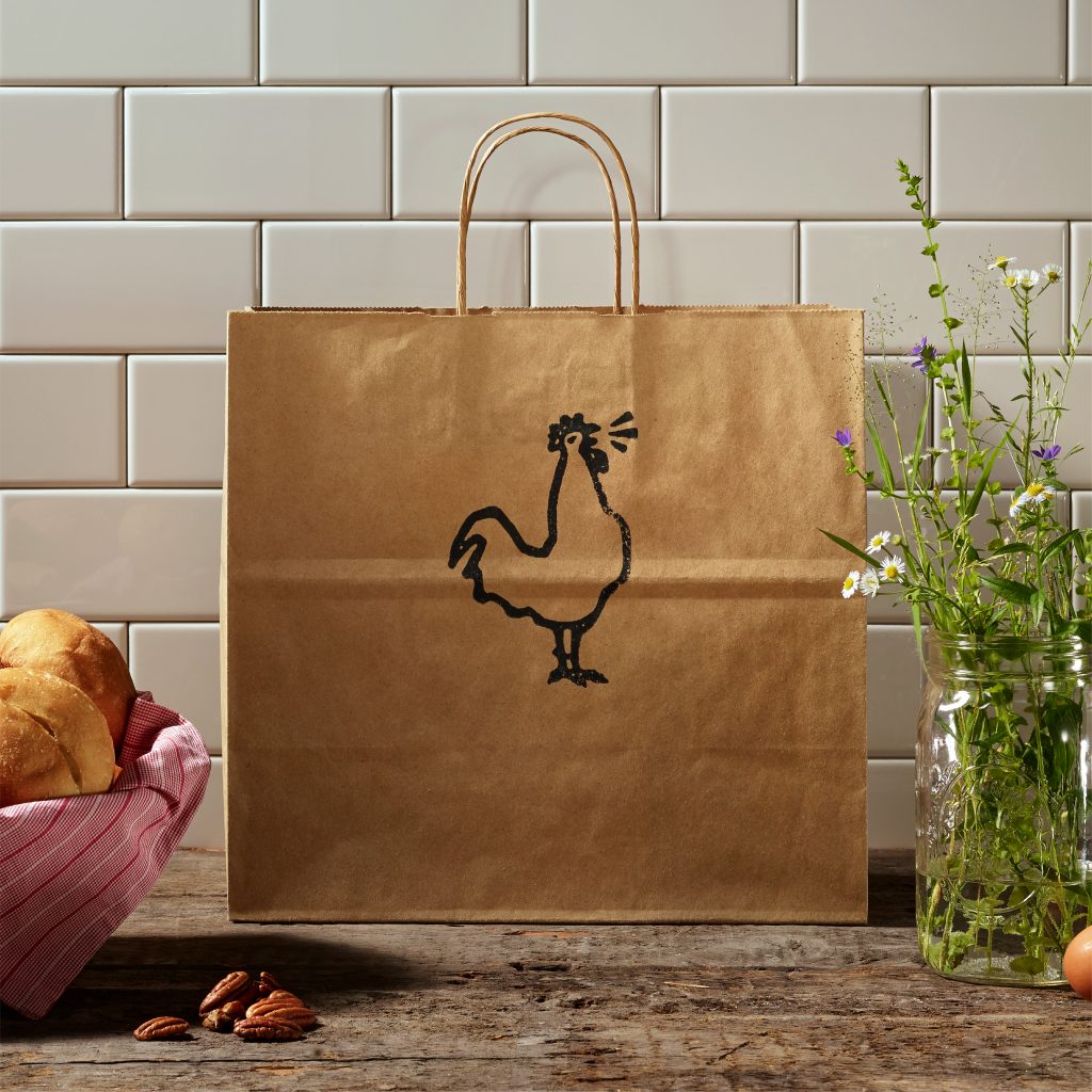
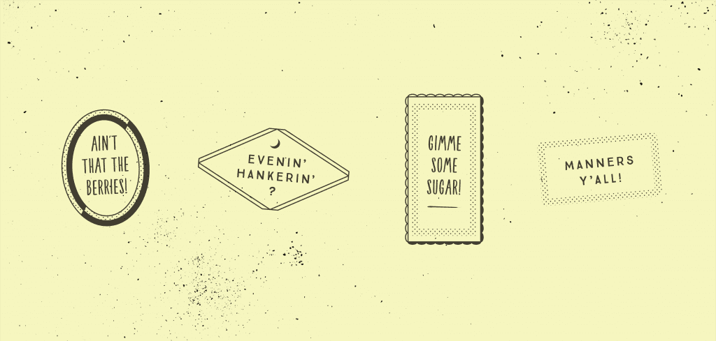
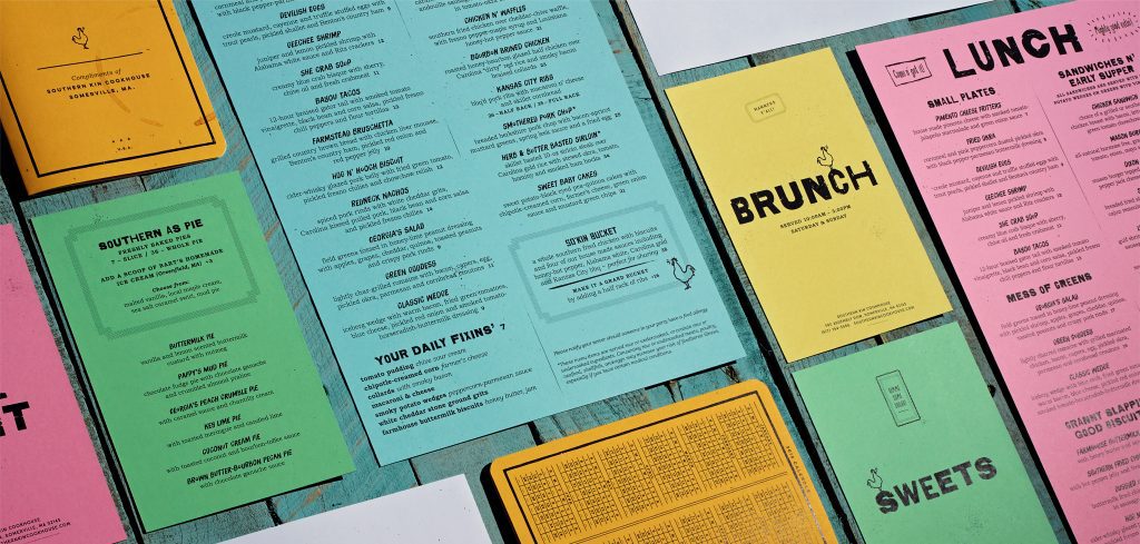
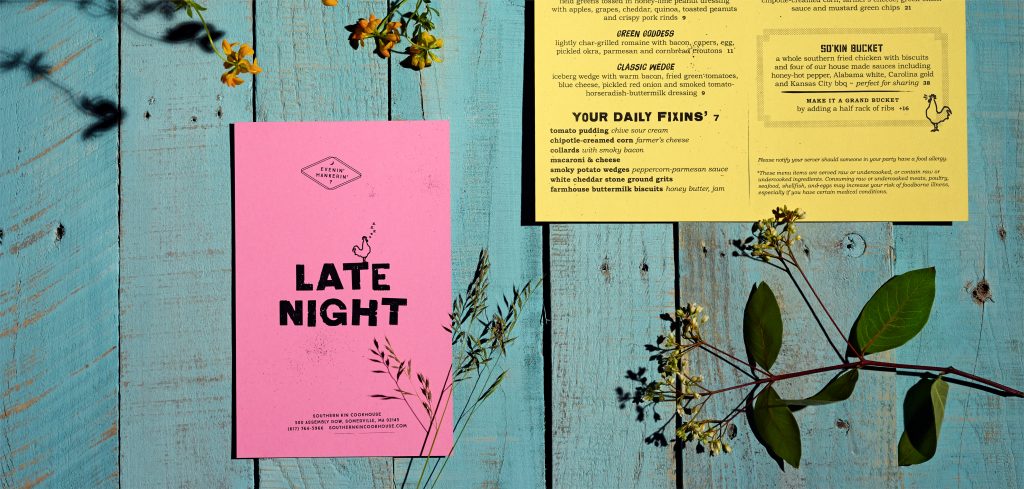
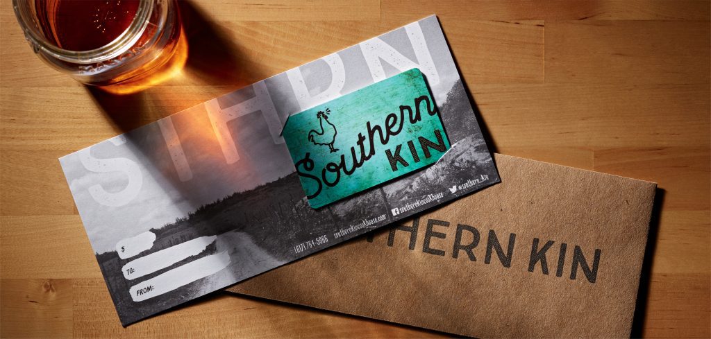
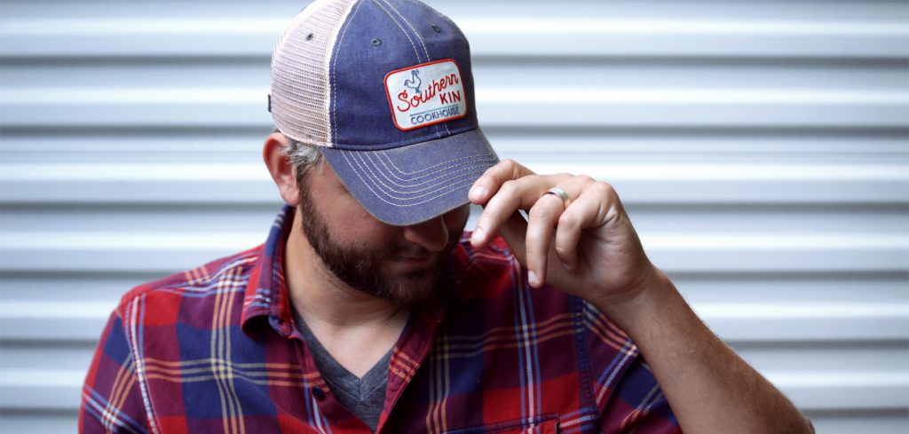
Welcome friends. Southern Kin Cookhouse makes southern charm feel at home in the north.
Scope Brand Identity, Brand Strategy, Collateral & Menus, Environmental Graphics, Illustration, Merch, Naming, Web Site
Awards Art of the Menu, Bento Design Awards, Brand New, Innovation Award
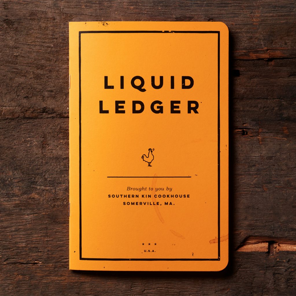
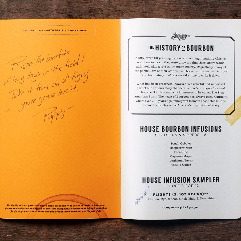
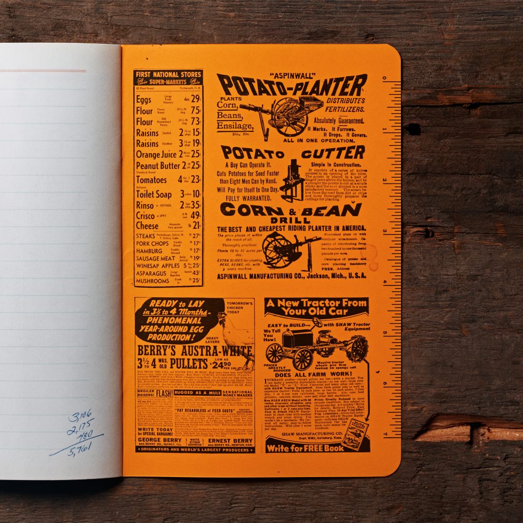
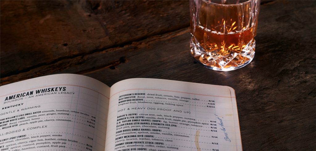
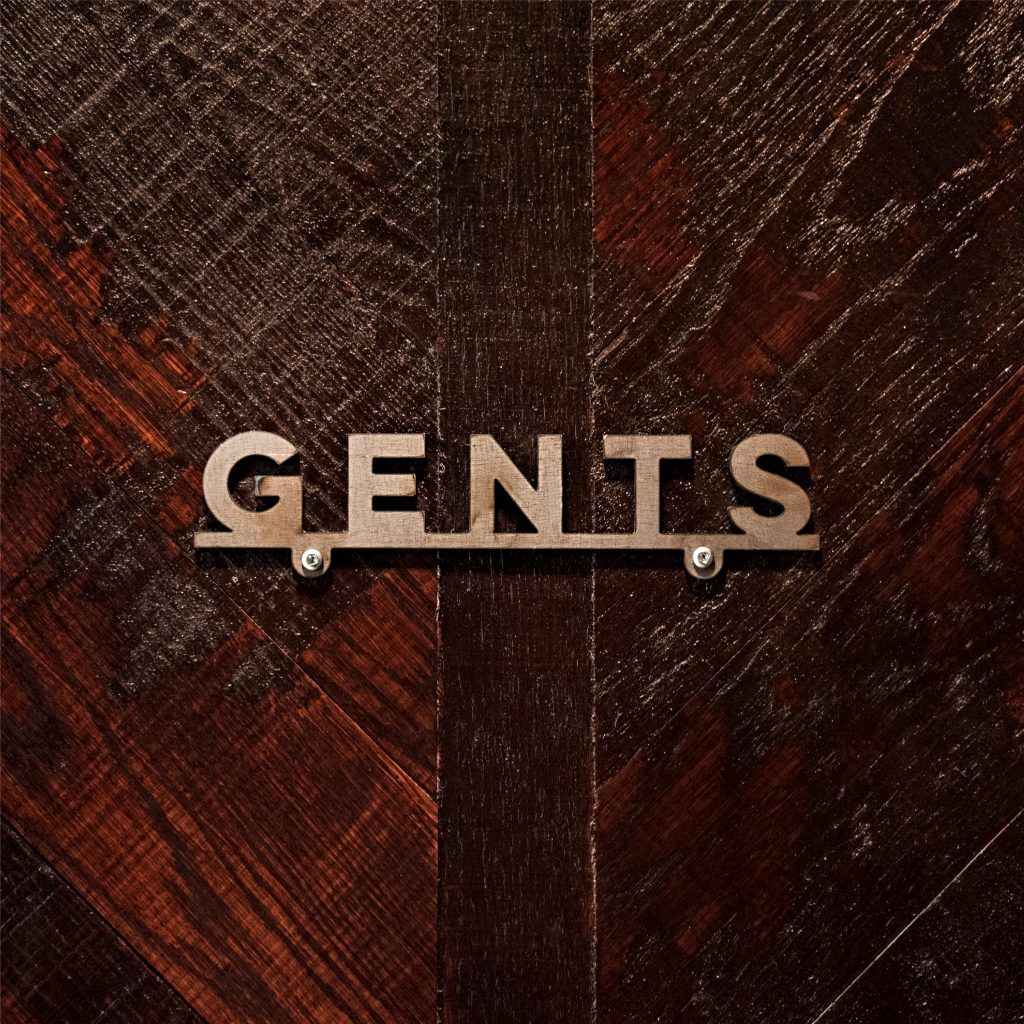
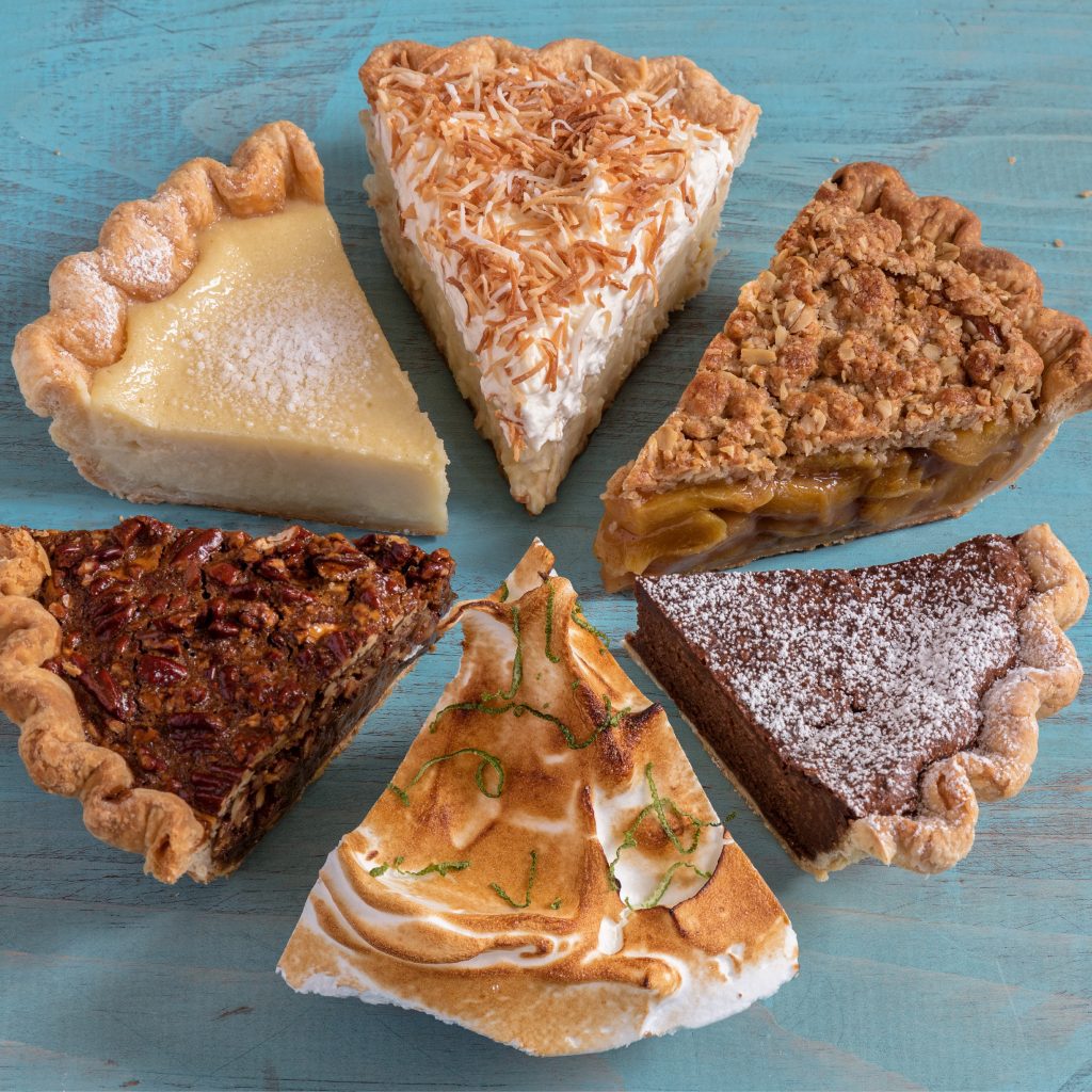
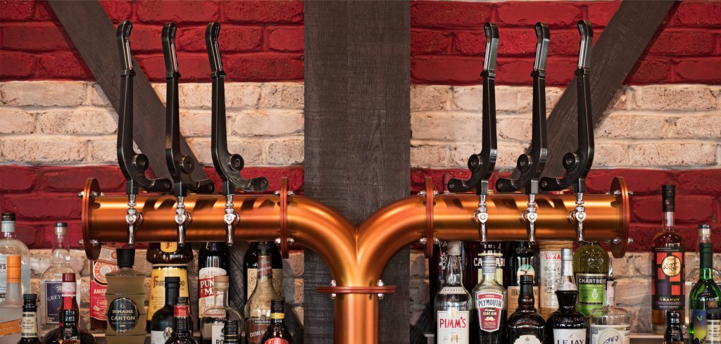
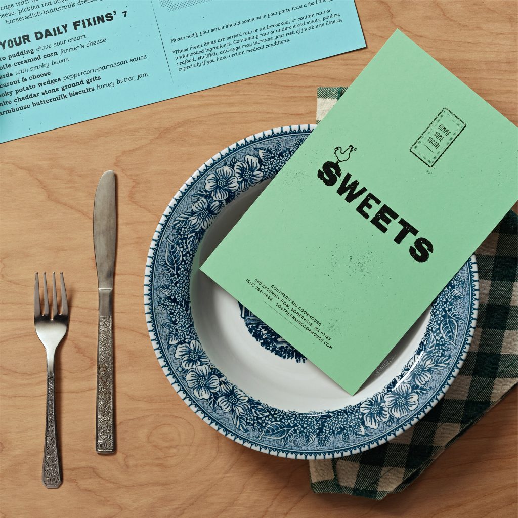
Southern Kin Cookhouse embraces the hardworking charm of life in the South. Warm, uncomplicated and comfortable, every detail, from murals to paper goods, draws it’s elegance from utility. It’s a place where guests can indulge in brunch, lunch, dinner, or even late-night pie. And where the award-winning “Liquid Ledger” compels guests to settle in and stay a while, showcasing a stand-out collection of bourbons and a well-curated list of southern cocktails.
Photography: Bryan Borgal, John Hesselbarth, Jackie Young
The overall experience combines “the warmth of Mamma’s Kitchen and the utility of Pop’s Barn”, in a roadside-style restaurant like the kind you‘d find on a road trip in the south. The Southern Kin Cookhouse story centers on lovingly-prepared, chef-interpreted comfort food served in the kind of place that brings folks together, where everyone is treated like family.
In the 1st year of operation, Southern Kin earned 3x the revenue per sq ft of neighboring restaurants.
Chum delivered a huge success for us—a concept that we’re now looking to grow.
Euz Azevedo, President, Boston Nightlife Ventures
Southern Kin earned 3 national awards for design excellence.
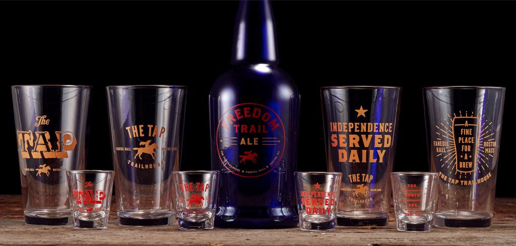
Blowing the dust off an old story to revolutionize a Boston watering hole.
Scope Brand Identity, Brand Strategy, Collateral & Menus, Copywriting, Illustration, Merch, Signage & Environmental Graphics, Web Site
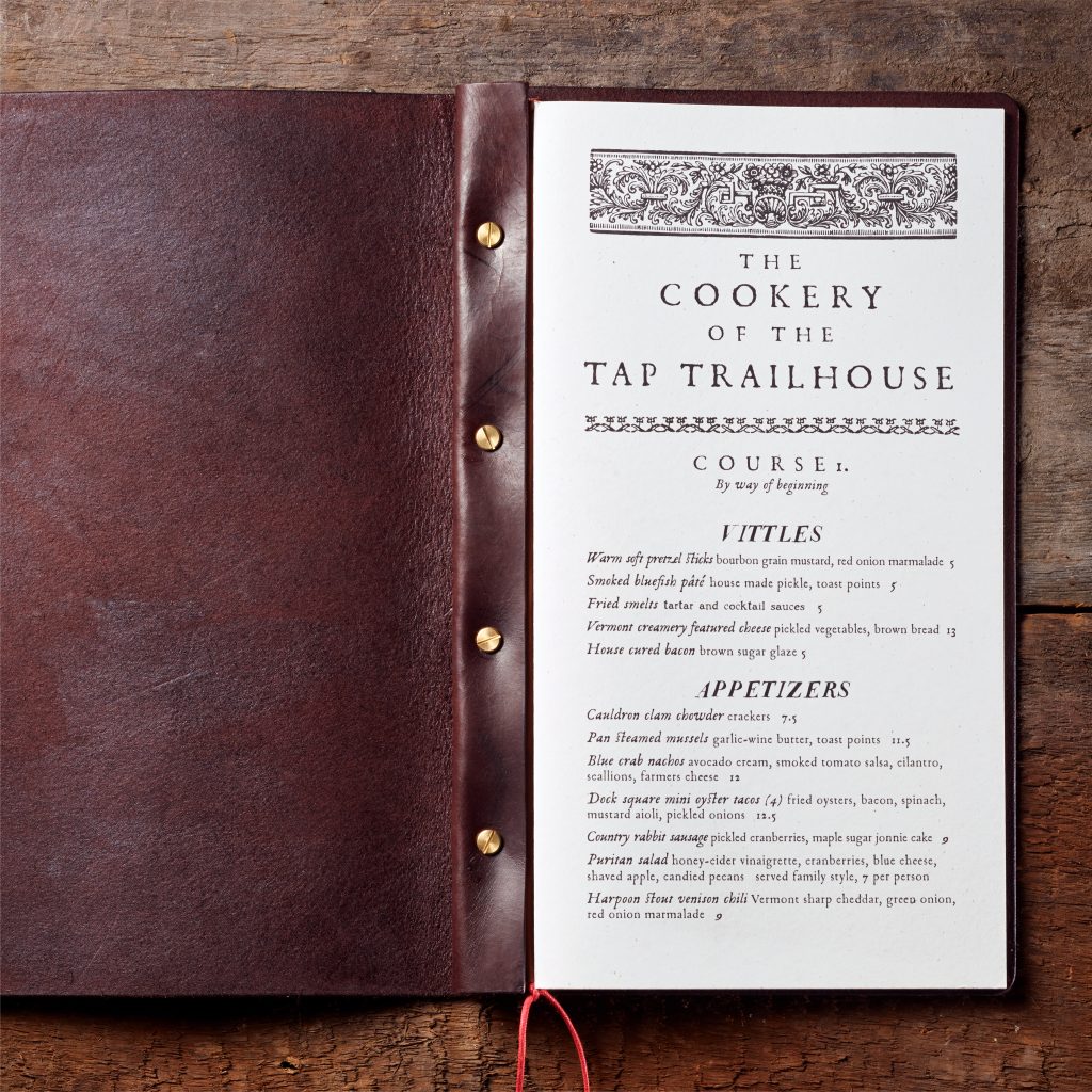
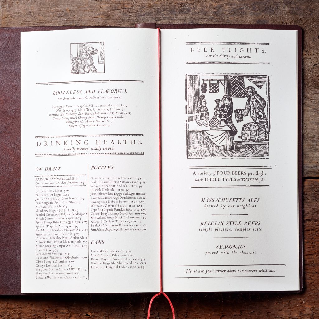
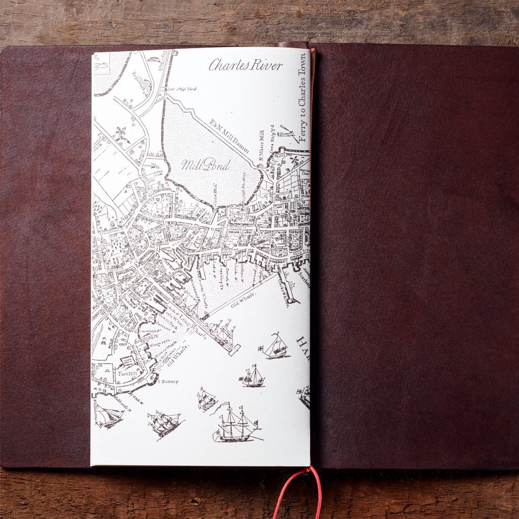
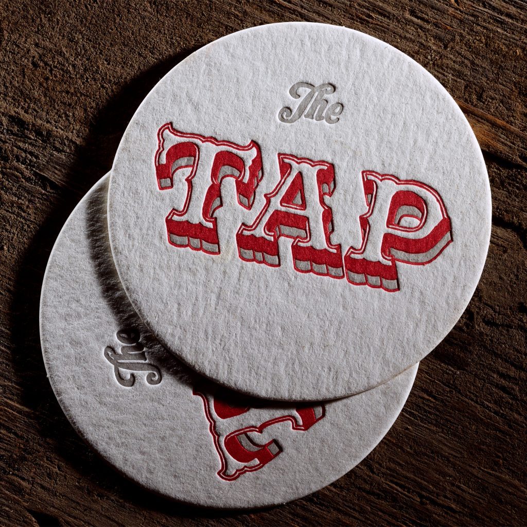
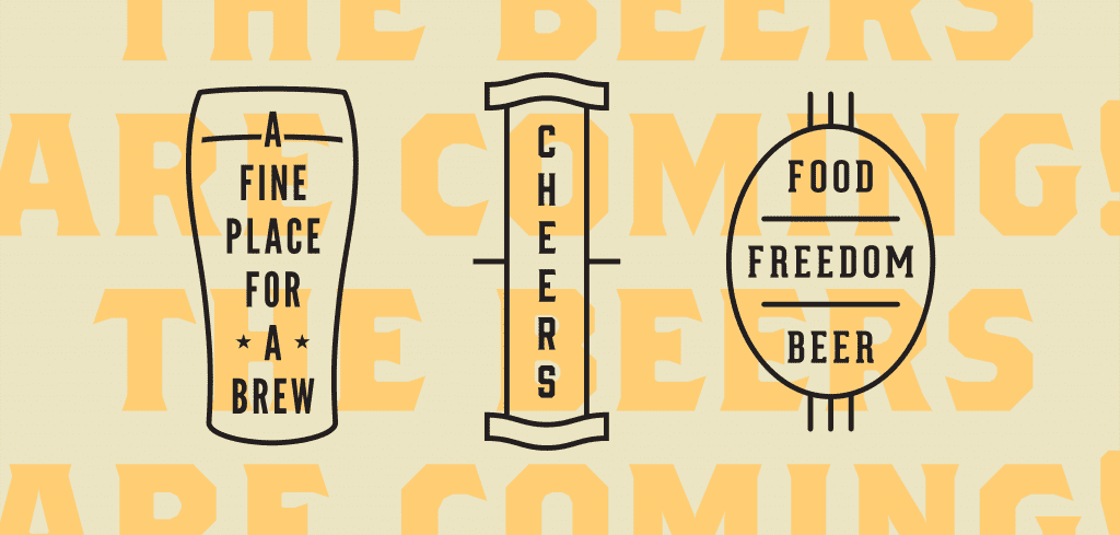
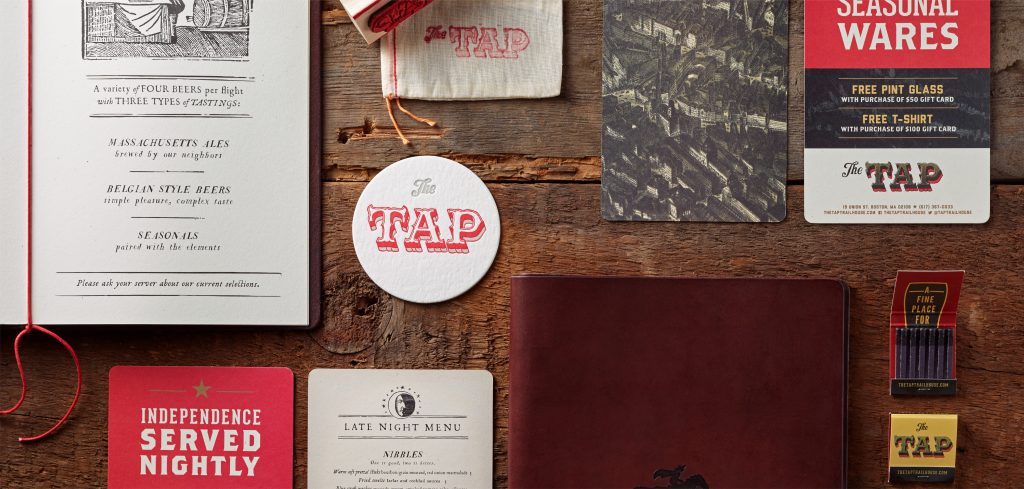
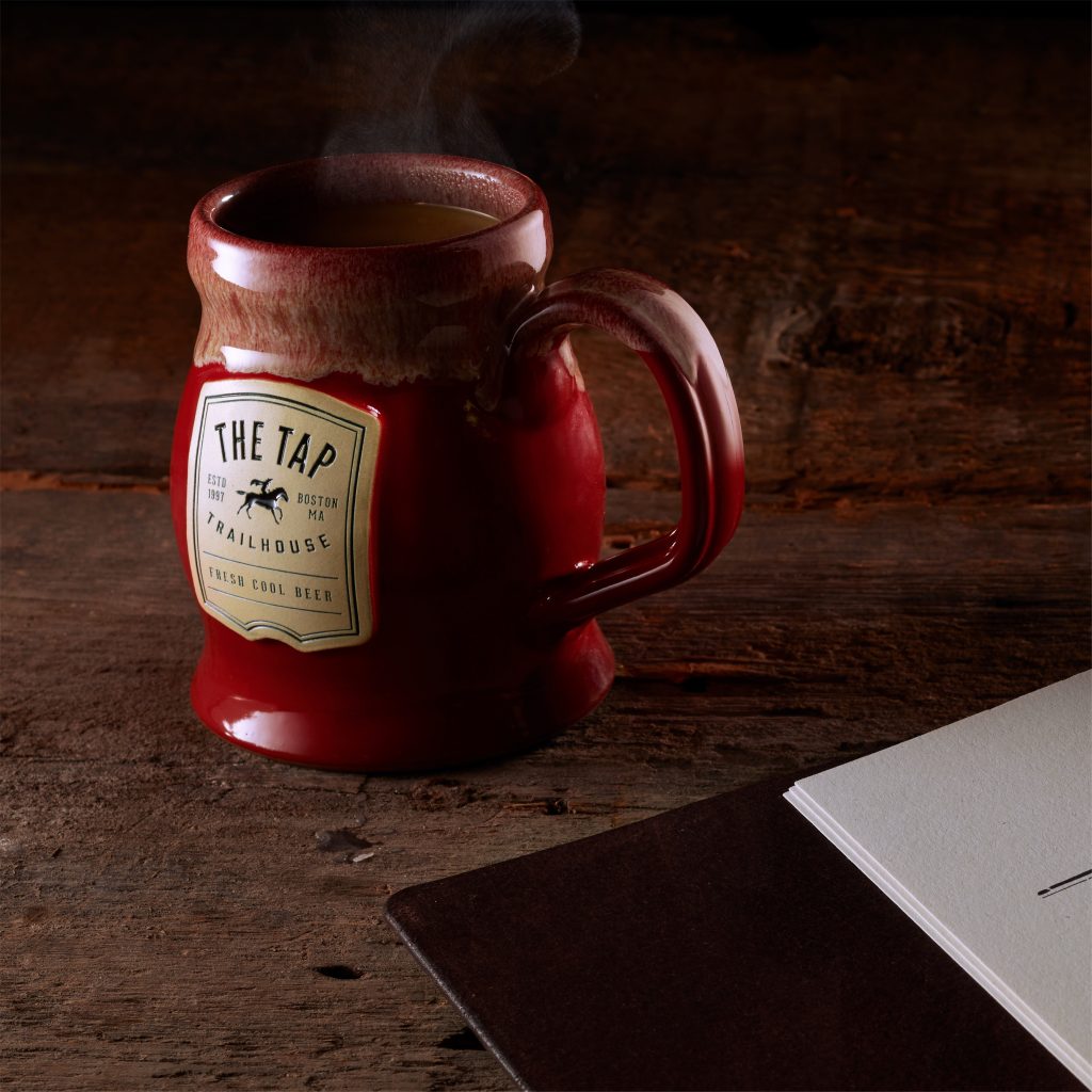
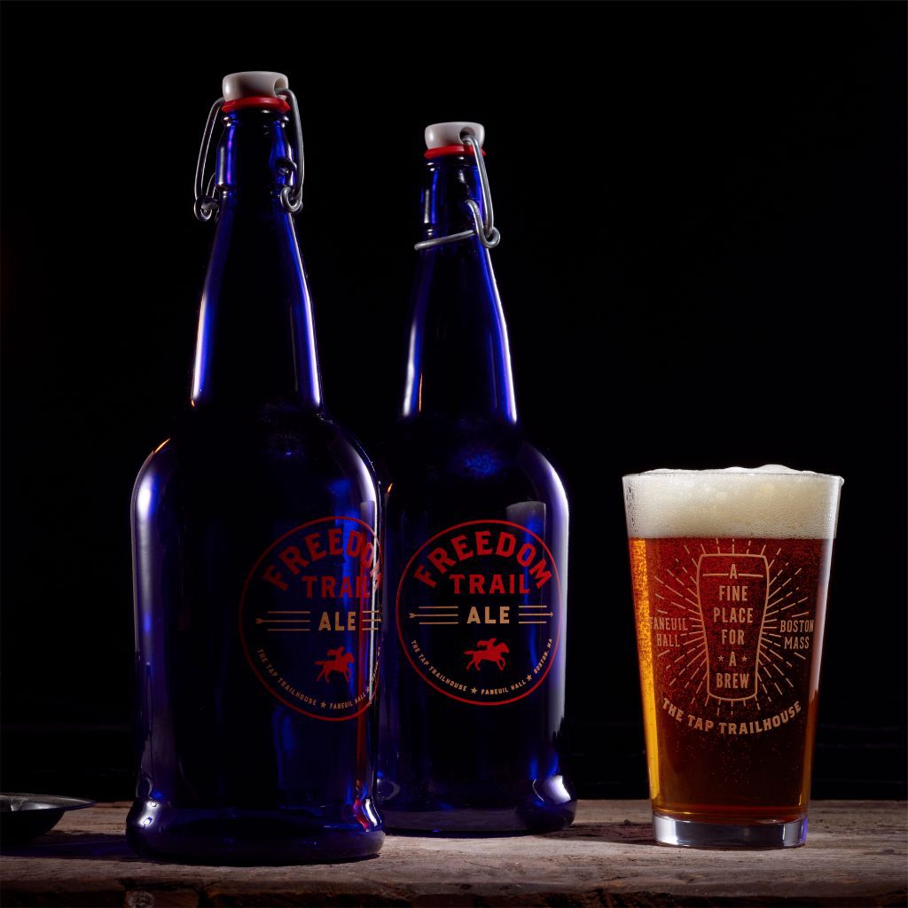
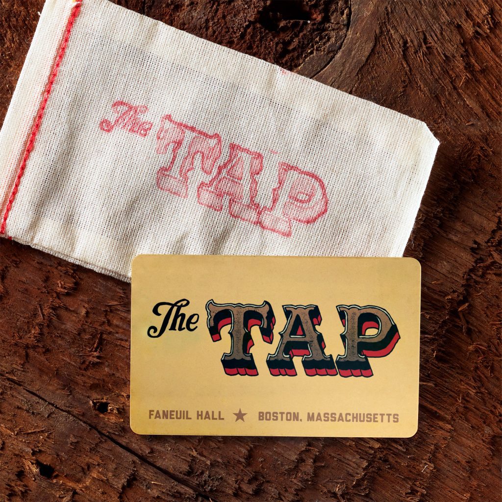
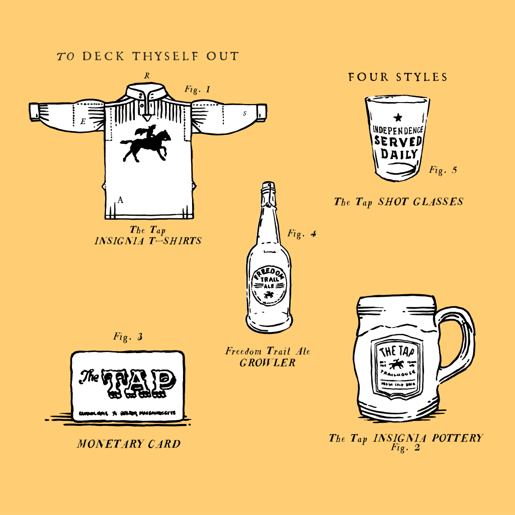
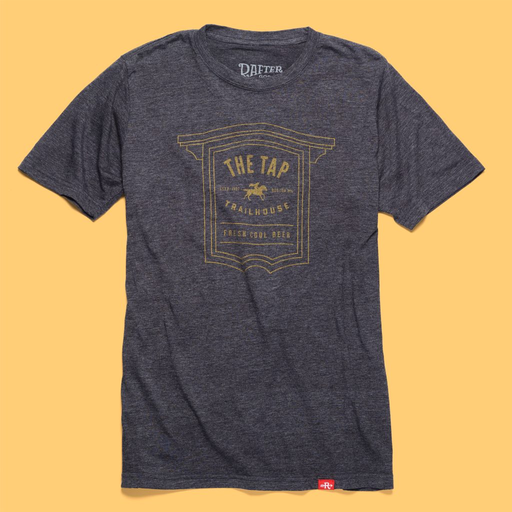
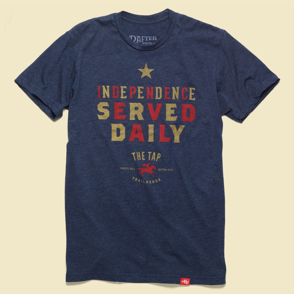
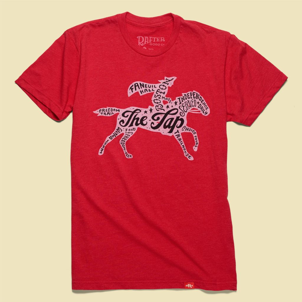
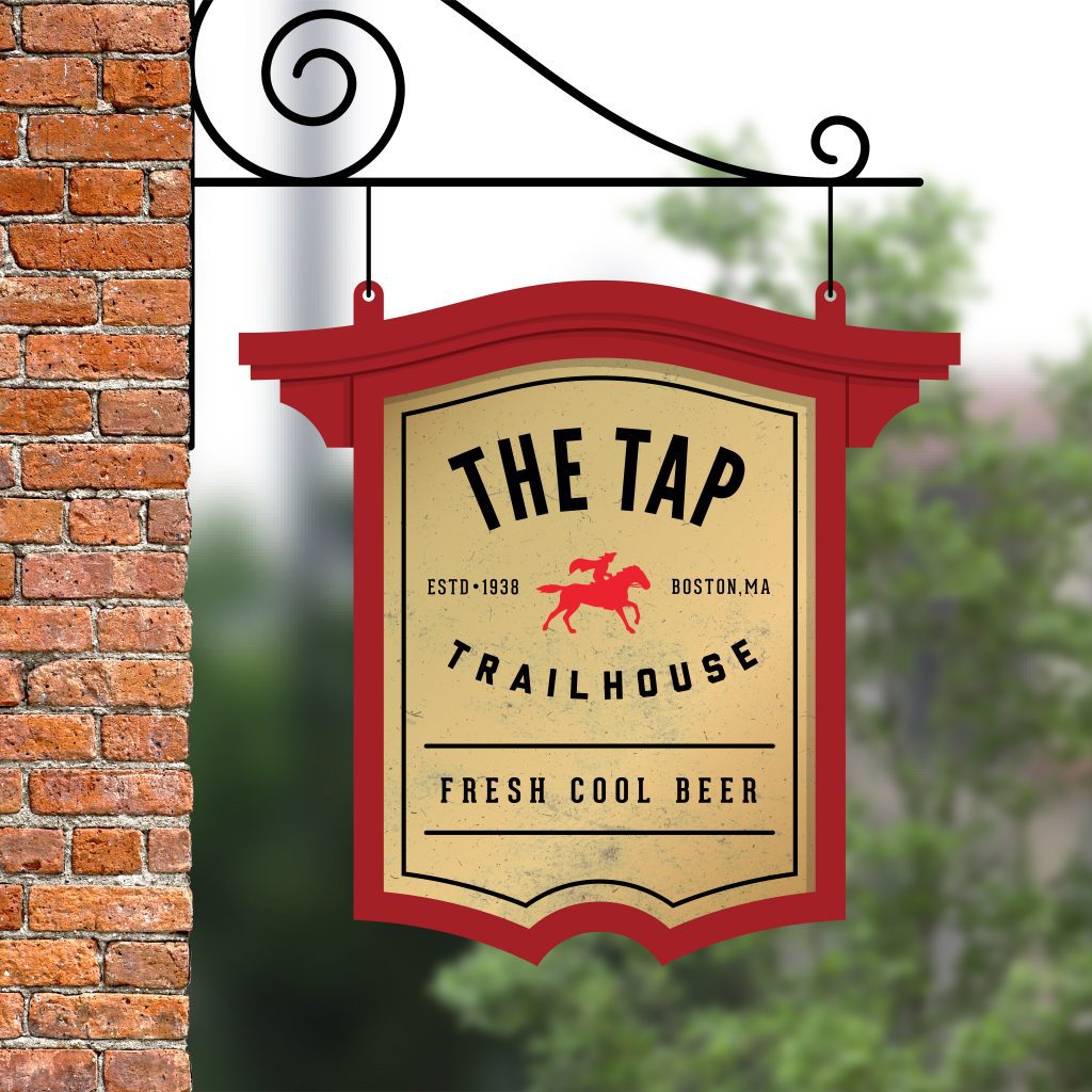
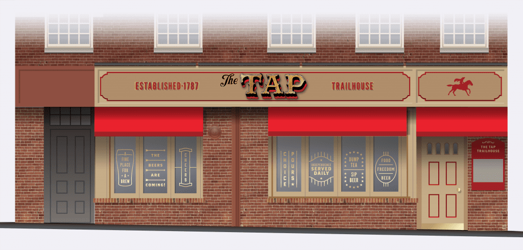
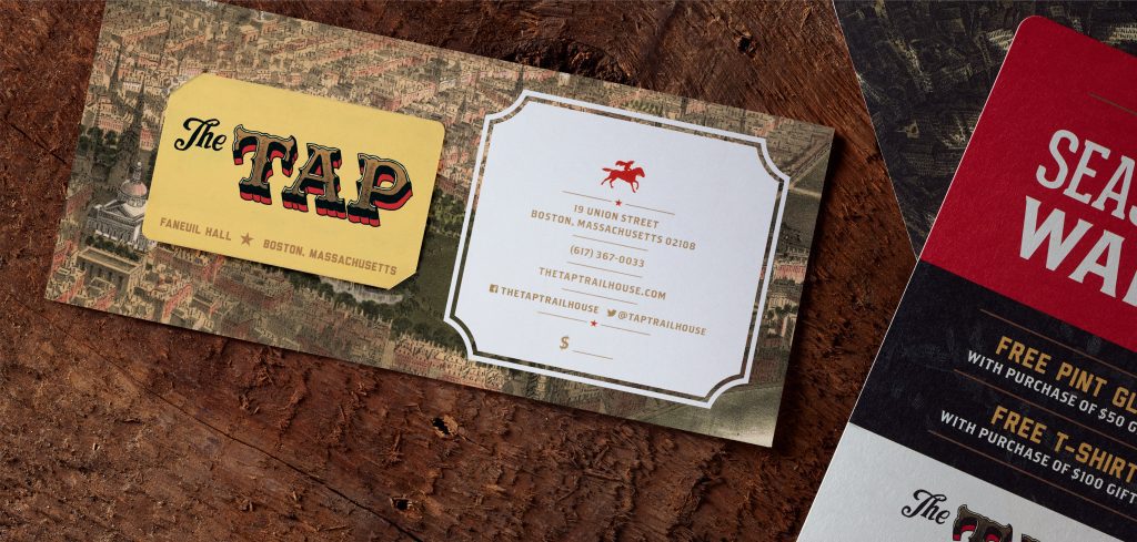
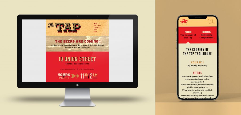
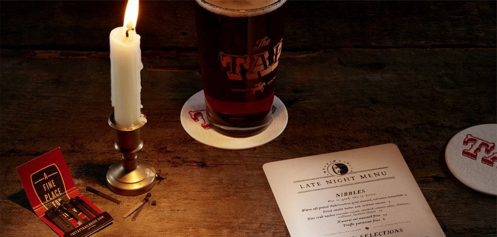
Nestled on Boston’s Freedom Trail near historic Faneuil Hall, the Tap Trailhouse offers modern interpretations of traditional colonial fare. Dimly lit, with low ceilings, red-gloss woodwork and worn brick, it’s a stage for modern celebration that echos of the past.
Photography: John Hesselbarth
The Tap came to us for a rebrand that would speak to a younger crowd while paying tribute to their neighborhood’s rich heritage. We responded with a brand identity infused with colonial spirit and subtle humor. A variety of styles are used throughout the program, suggesting that designs were conceived by the very craftspeople who produced materials, as they were years ago. Menu copy was inspired by the writings of Benjamin Franklin, turning it into something that guests pore over and talk about. Overall, the rebrand provided the Tap Trailhouse with it’s own distinct place in the Boston story—a place where modern travelers still raise a pint to independence.
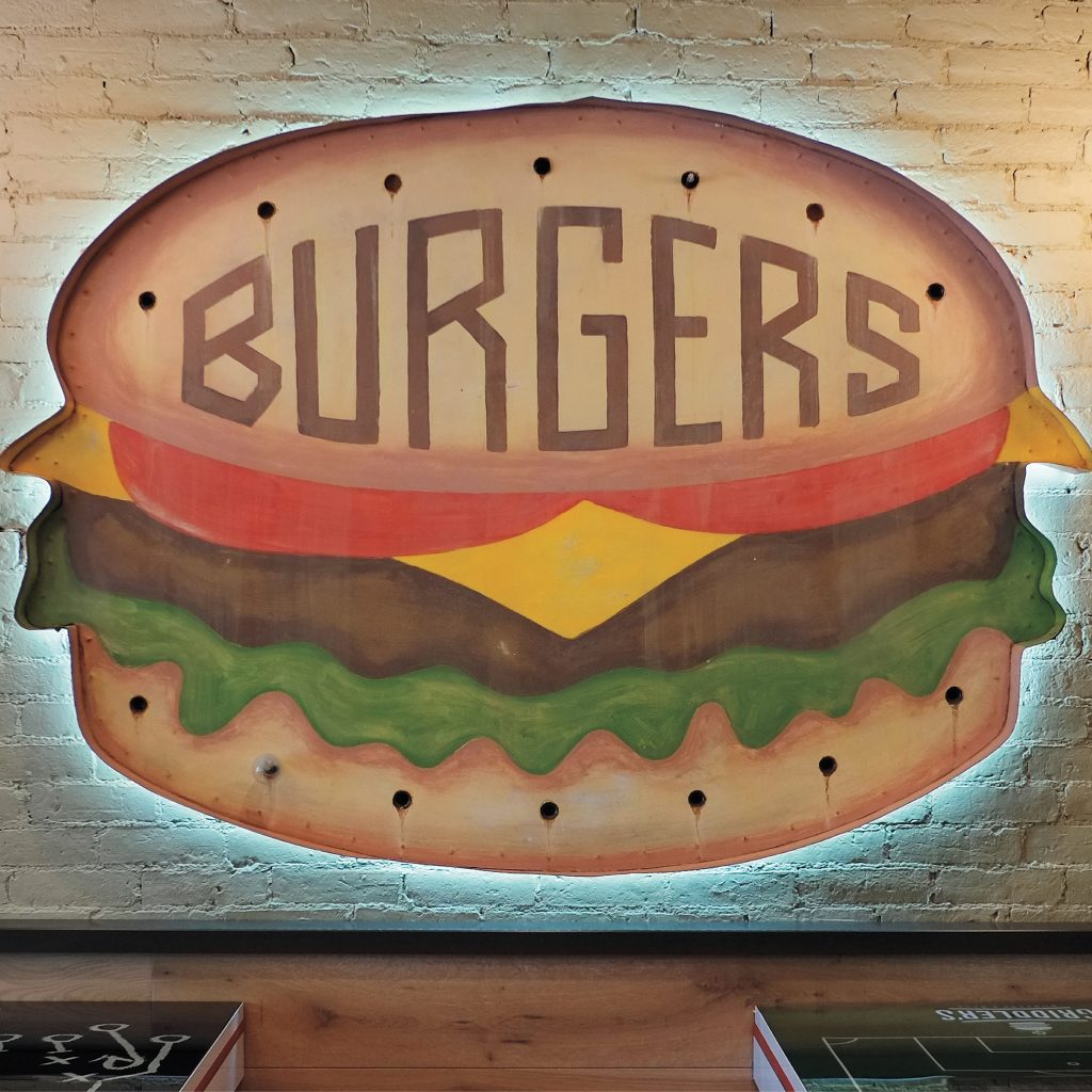
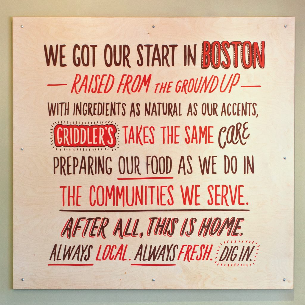
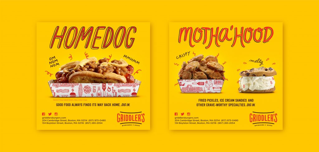
A Boston-raised burger with ingredients as natural as the accent.
Scope Campaign, Collateral & Menus, Digital Marketing, Illustration, Merch, Photogaphy, Signage & Environmental Graphics, Web Site
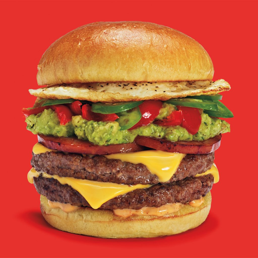
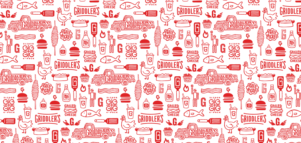
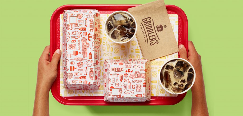
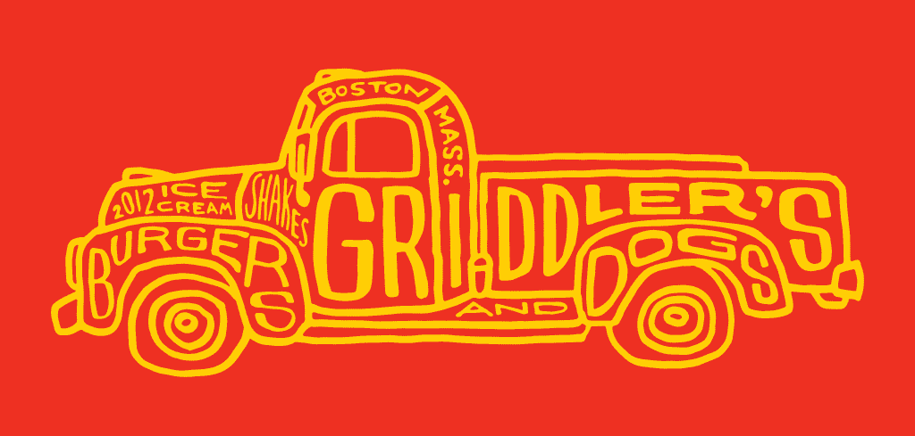
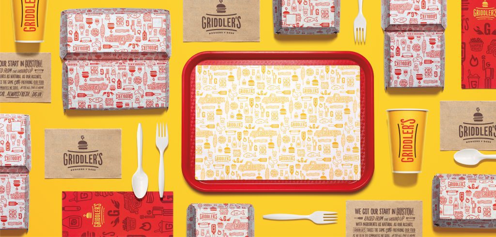
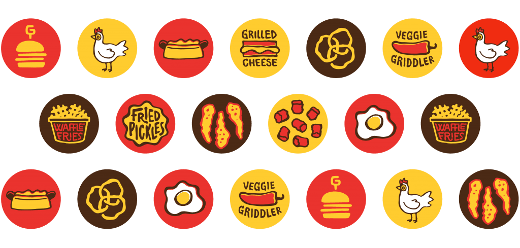
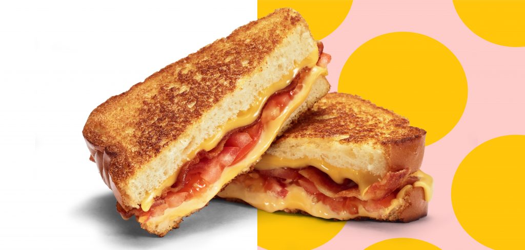
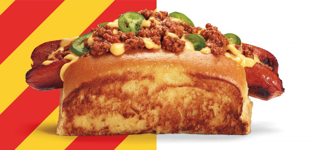
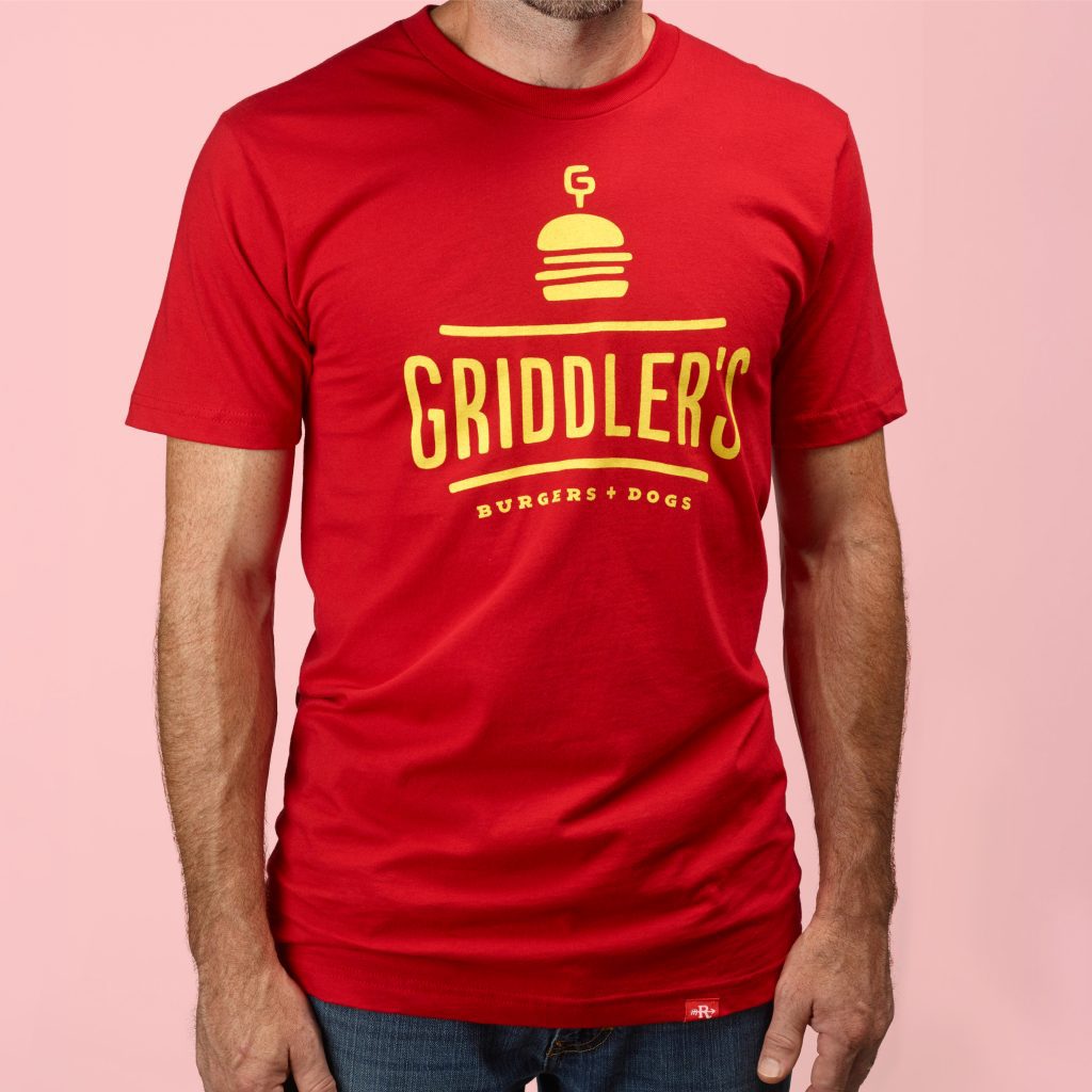
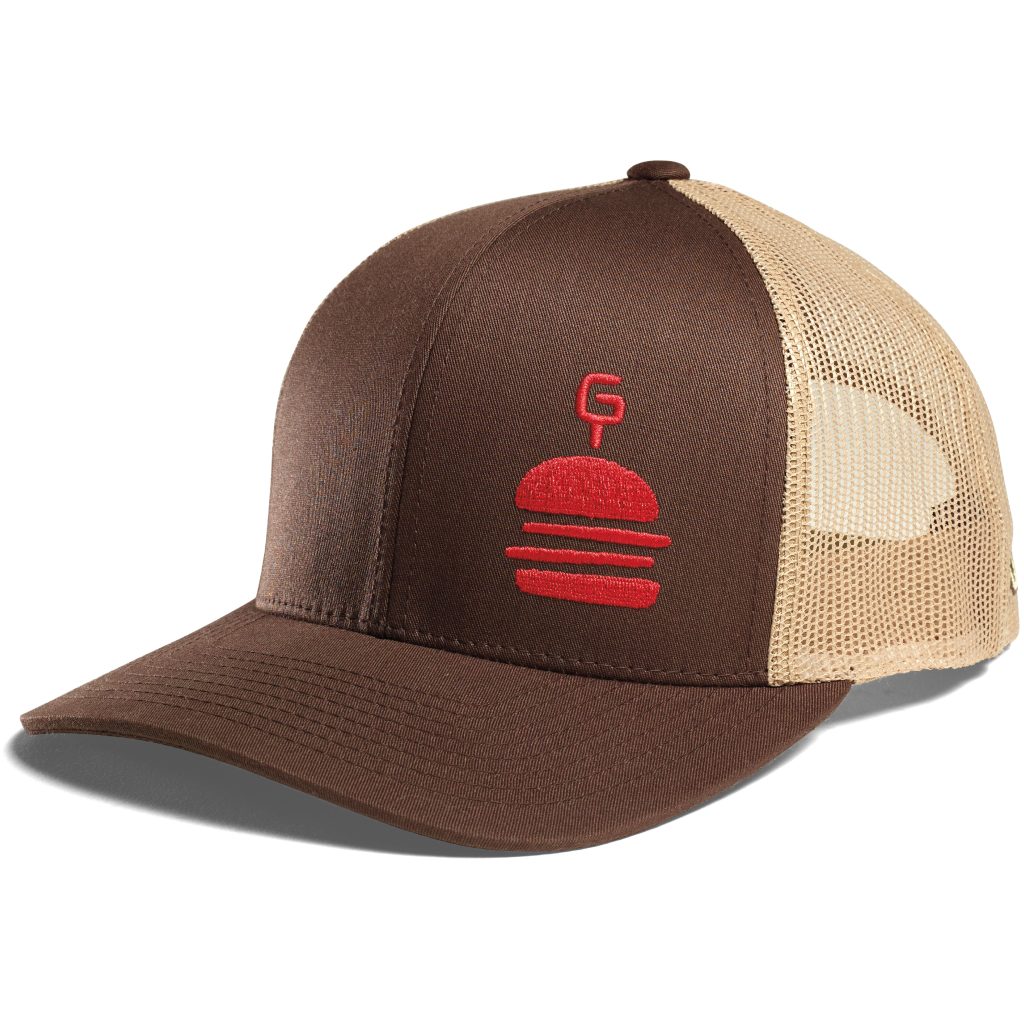
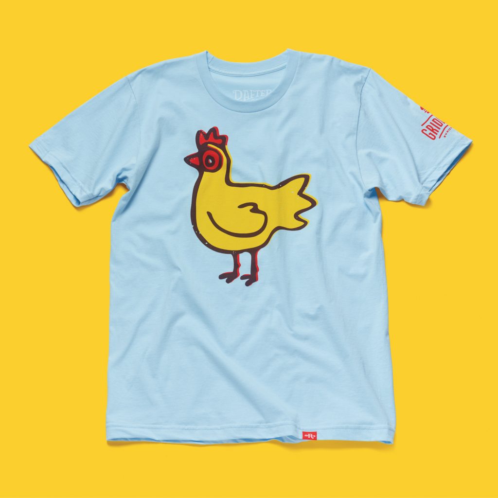
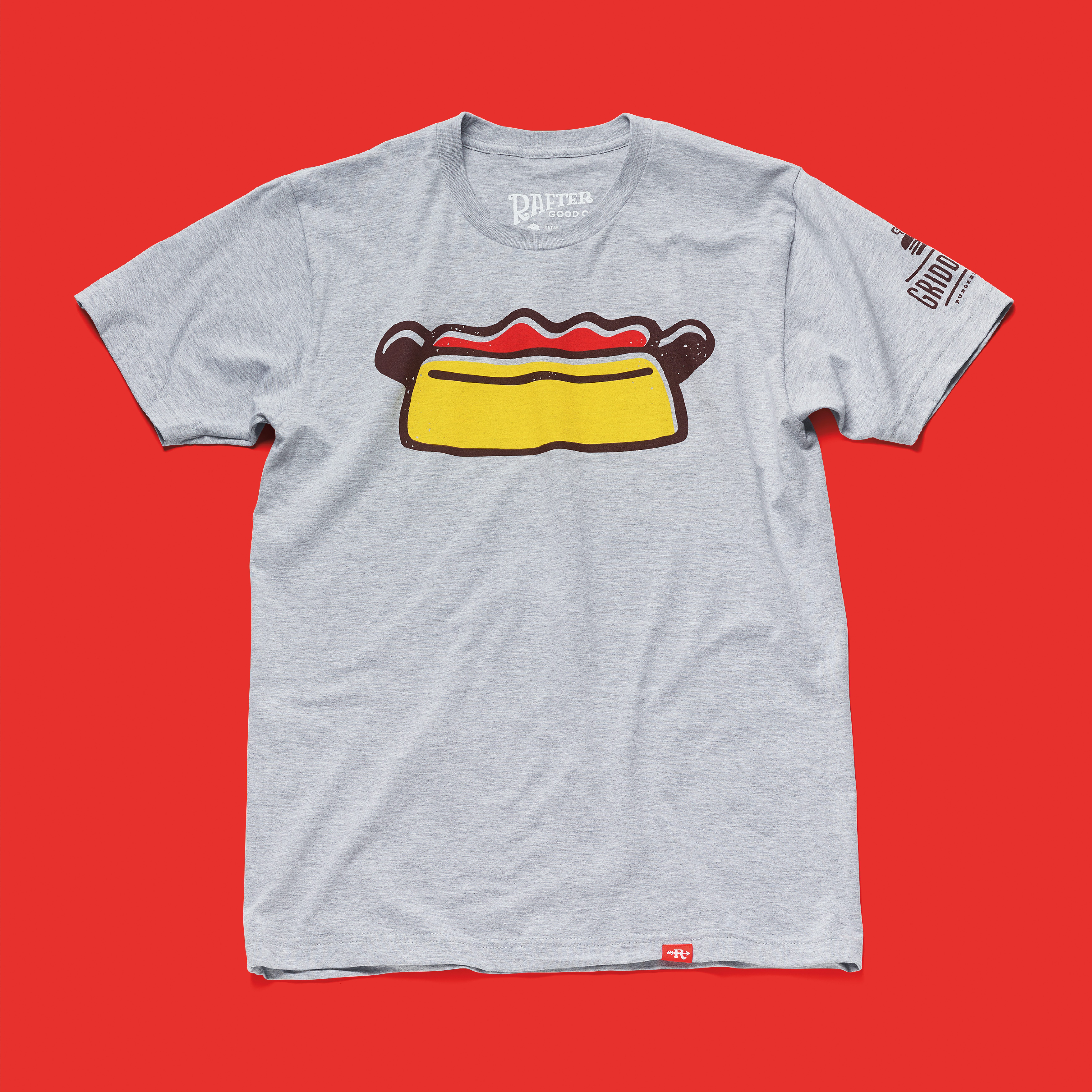
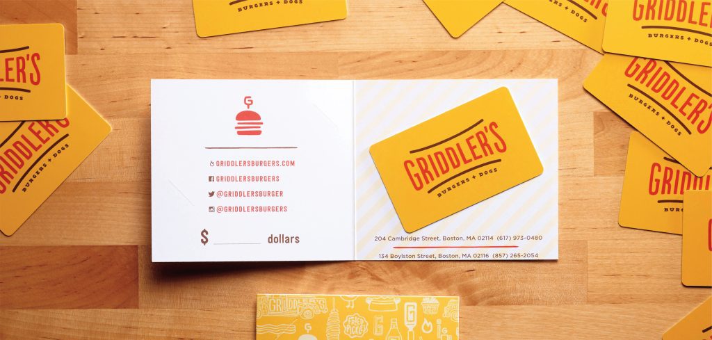
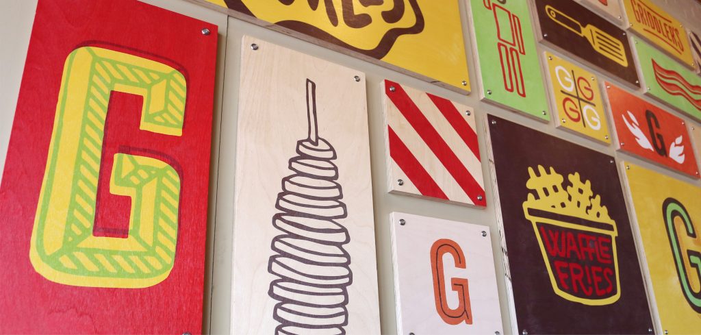
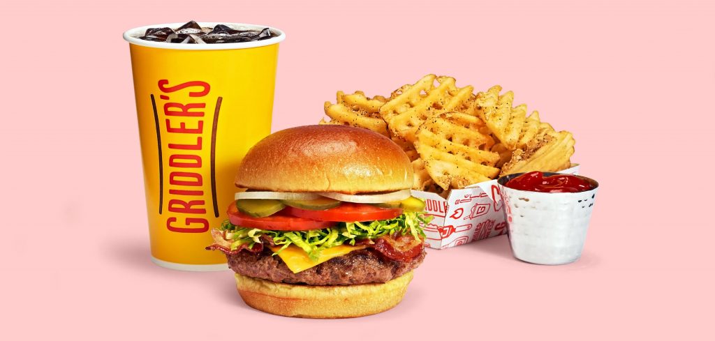
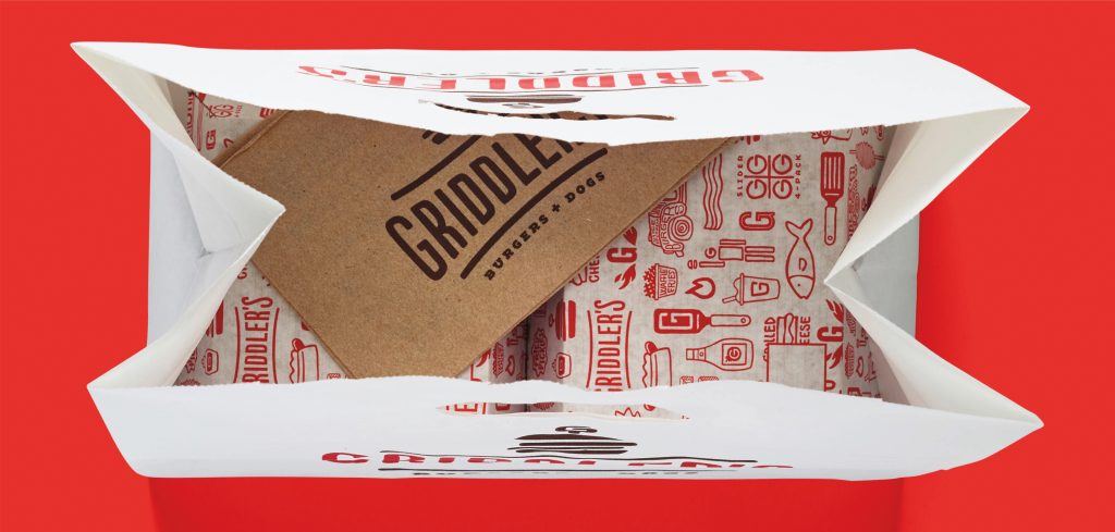
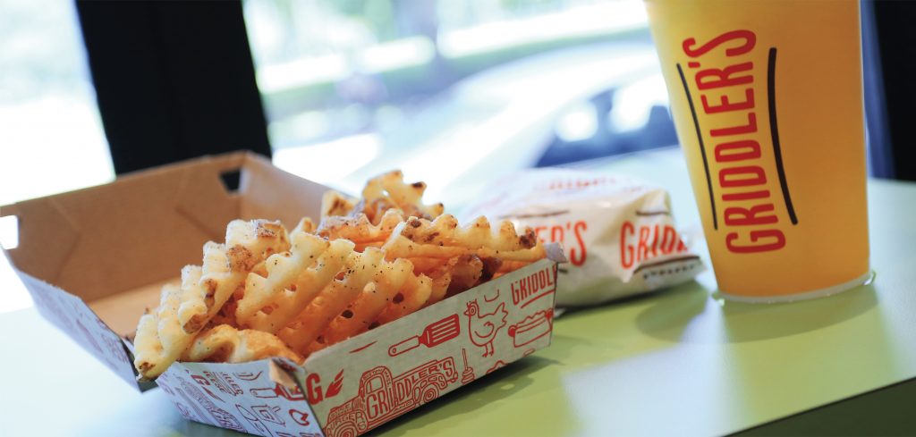
Griddler’s brings tasty specialty burgers, hot dogs, and milkshakes to fun-loving Bostonians. With a menu of all fresh, locally-sourced ingredients including a wide array of BYO toppings, Griddler’s offers playful and indulgent food options with grown-up values.
Photography: Bryan Borgal
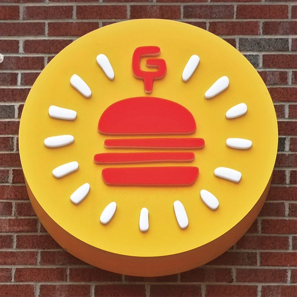
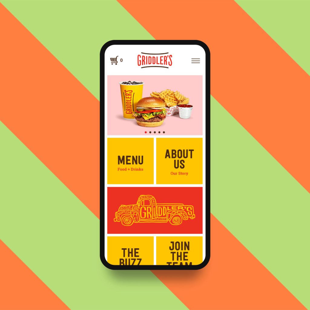
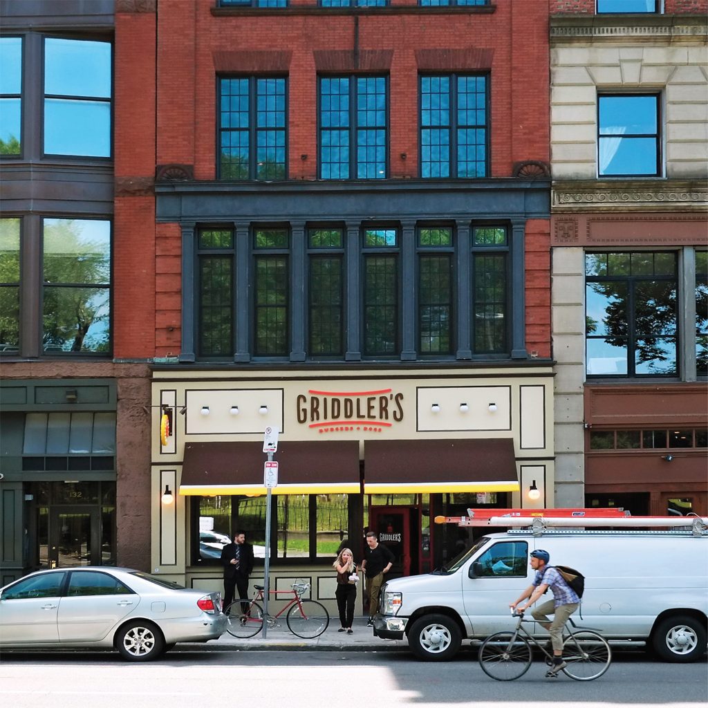
Starting with two Boston locations—Boston Common and Beacon Hill, we were asked to fully reposition the brand, setting up Griddler’s for expansion into new company-owned and franchise locations. The scalable new brand extended to all customer touch points.
A hometown voice expressed through hand-drawn lettering and illustrations infuses energy and personality into the midway-inspired interior, a comprehensive paper goods program, gift cards and merchandise. Coordinated outbound advertising as well as on-site point of sale and digital communications featuring mouth-watering photography of select menu items takes the Griddler’s brand to the streets.
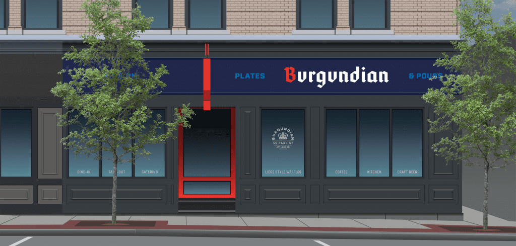
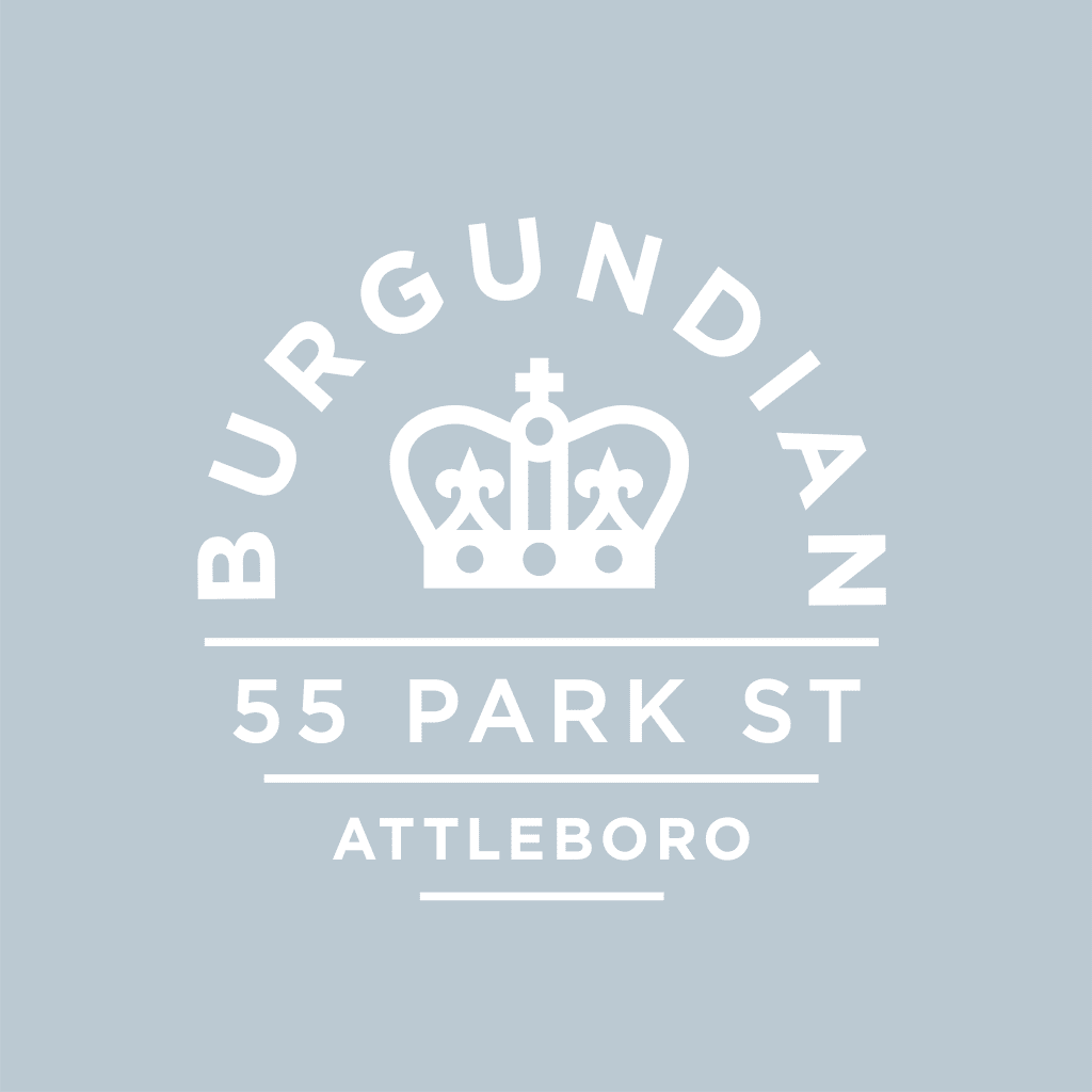
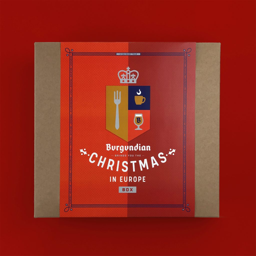
À votre santé! Burgundian drops an old-world Europe experience into a modern American context.
Scope Brand Identity, Brand Strategy, Illustration, Merch, Signage & Environmental Graphics, Web Site
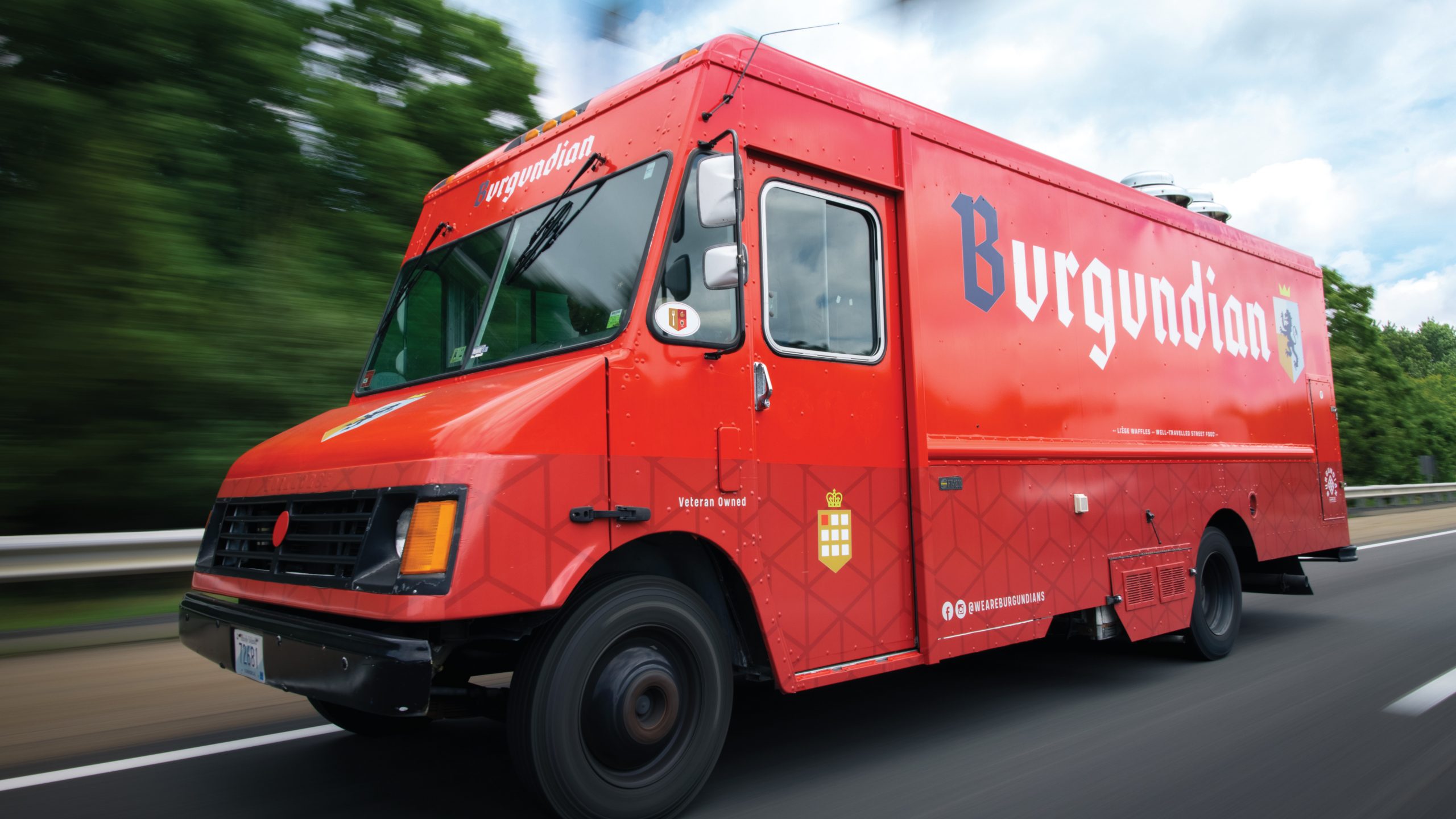
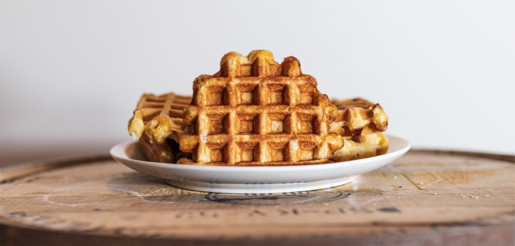
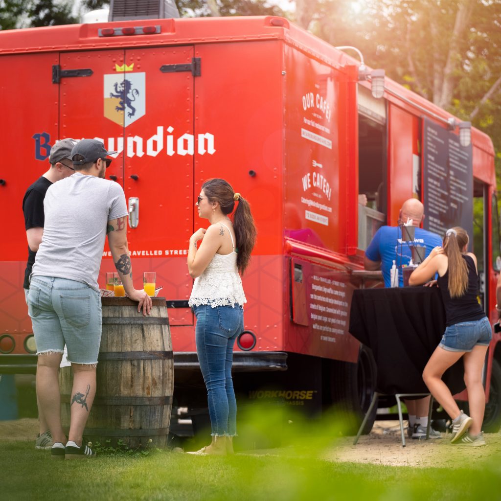
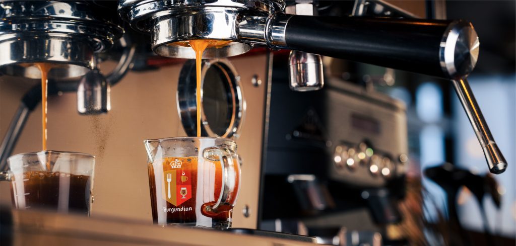
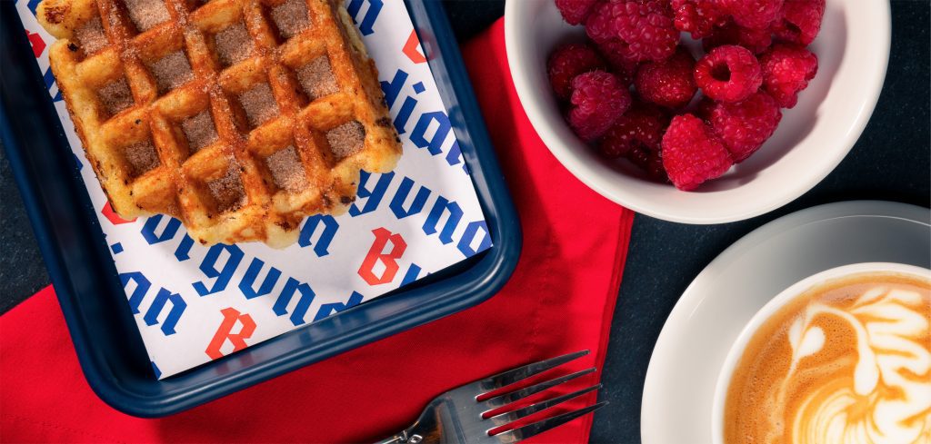
Burgundian offers the kind of fare that makes you want to hang out for a while. The idea began to brew when our client, Shane Matlock, was stationed on the border of France and Belgium while serving as an officer in the U.S. Army. There, he cultivated a love for the tastes and unhurried lifestyle of Europe’s street side cafés.
Returning from overseas, armed with an authentic Liége waffle recipe—a gift from a Belgium street vendor—Shane took his concept to the streets of America, serving up his dough-based waffles out of the enthusiastically-followed Burgundian truck.
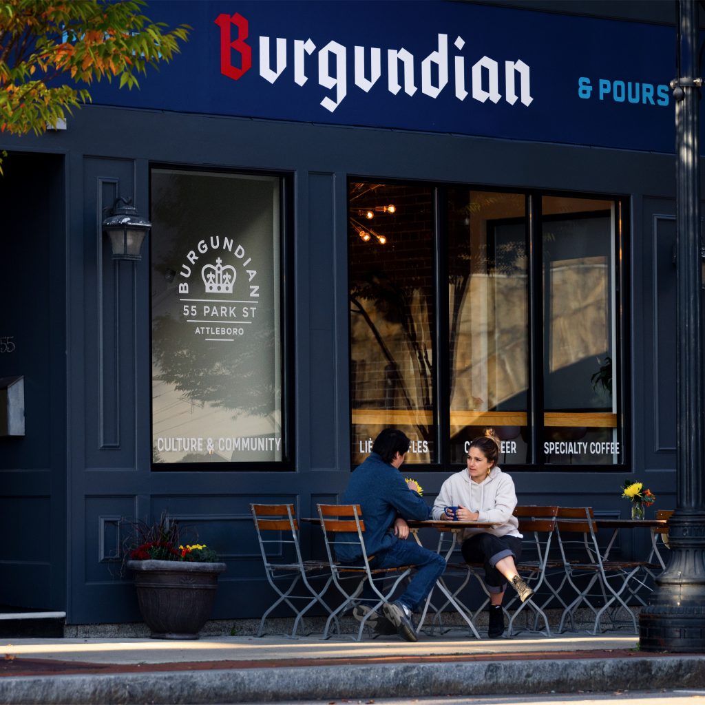
In short time, dreams of a storefront café became reality and we were asked to help with the expansion. We worked with Burgundian to develop strategy, establish the brand platform and build a strong identity that would grow with them as they made the shift from a “waffle truck” to a multi-service experience. One that brings people together to enjoy “well-traveled street food” and celebrate genuine friendship.
Chum blended old-world European charm with a fresh, modern aesthetic resulting in a brand that is perfectly tailored to our goals. The new brand signals that we are ready to graduate from scrappy startup to a lifestyle brand primed for growth.
Shane Matlock, Owner, Burgundian
Burgundian’s revenue tripled in the year following the rebrand.
The rebrand provided the foundation for launching 4 new revenue platforms: restaurant, retail, wholesale, food tourism.
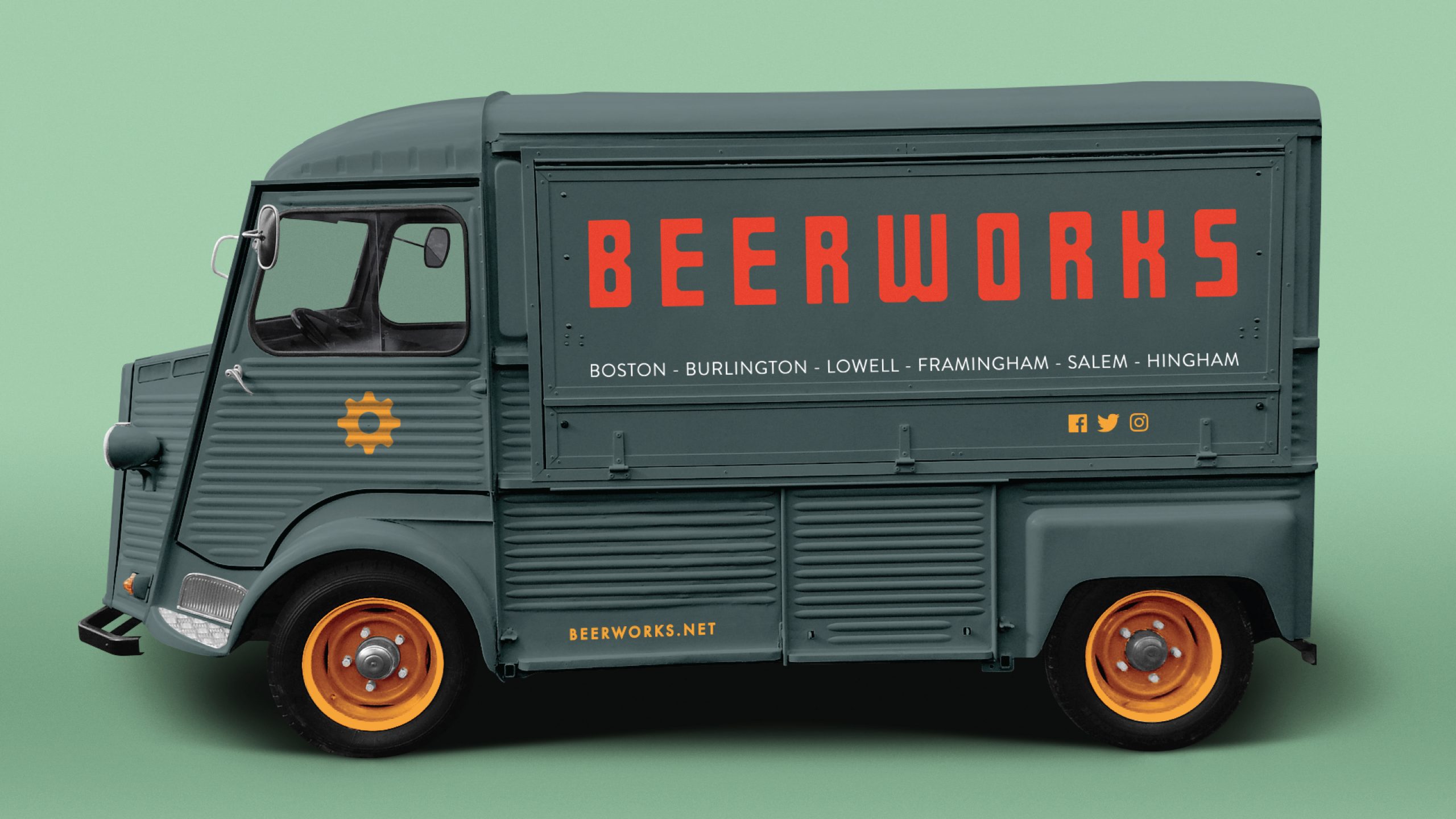
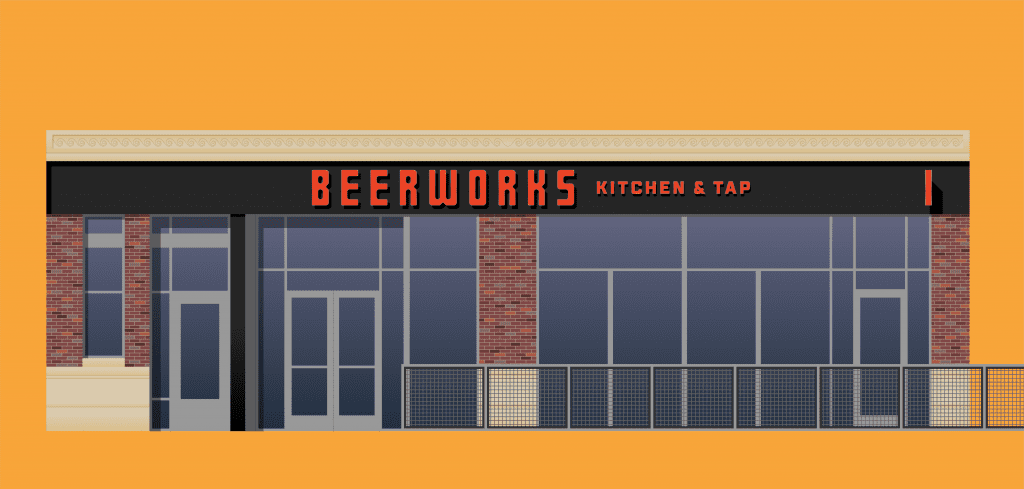
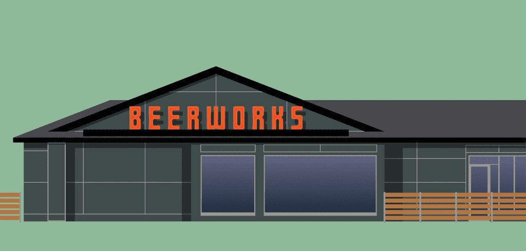
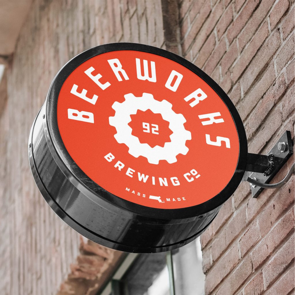
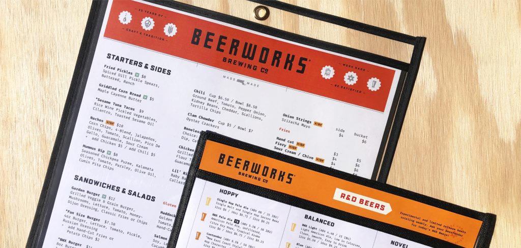
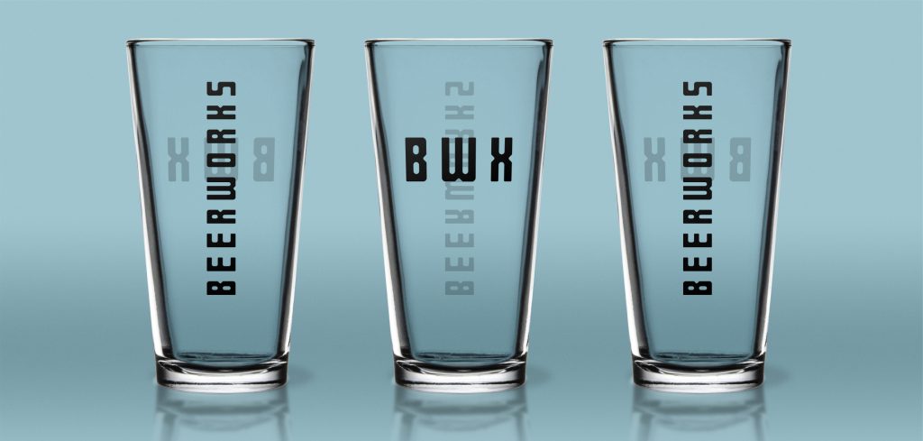
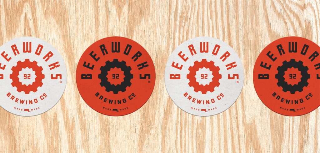
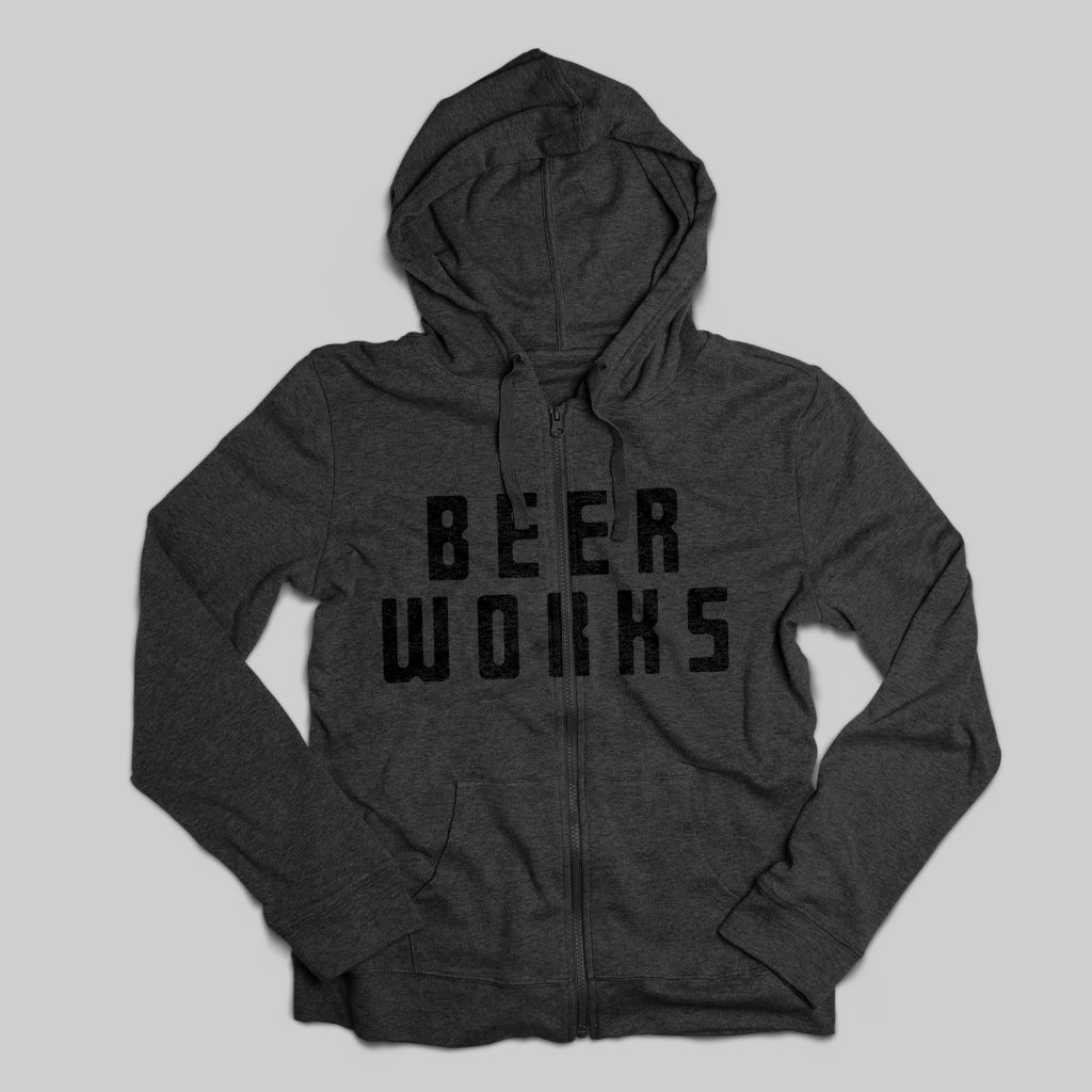
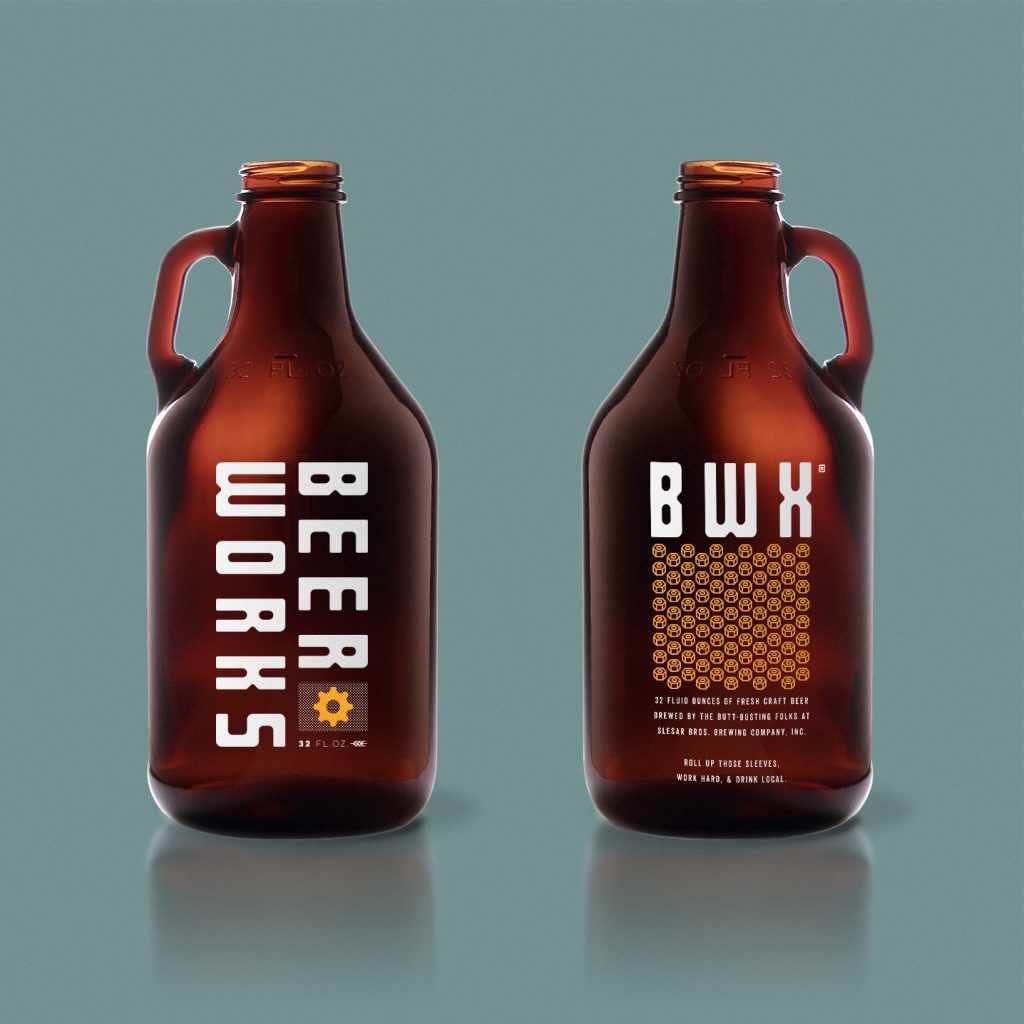
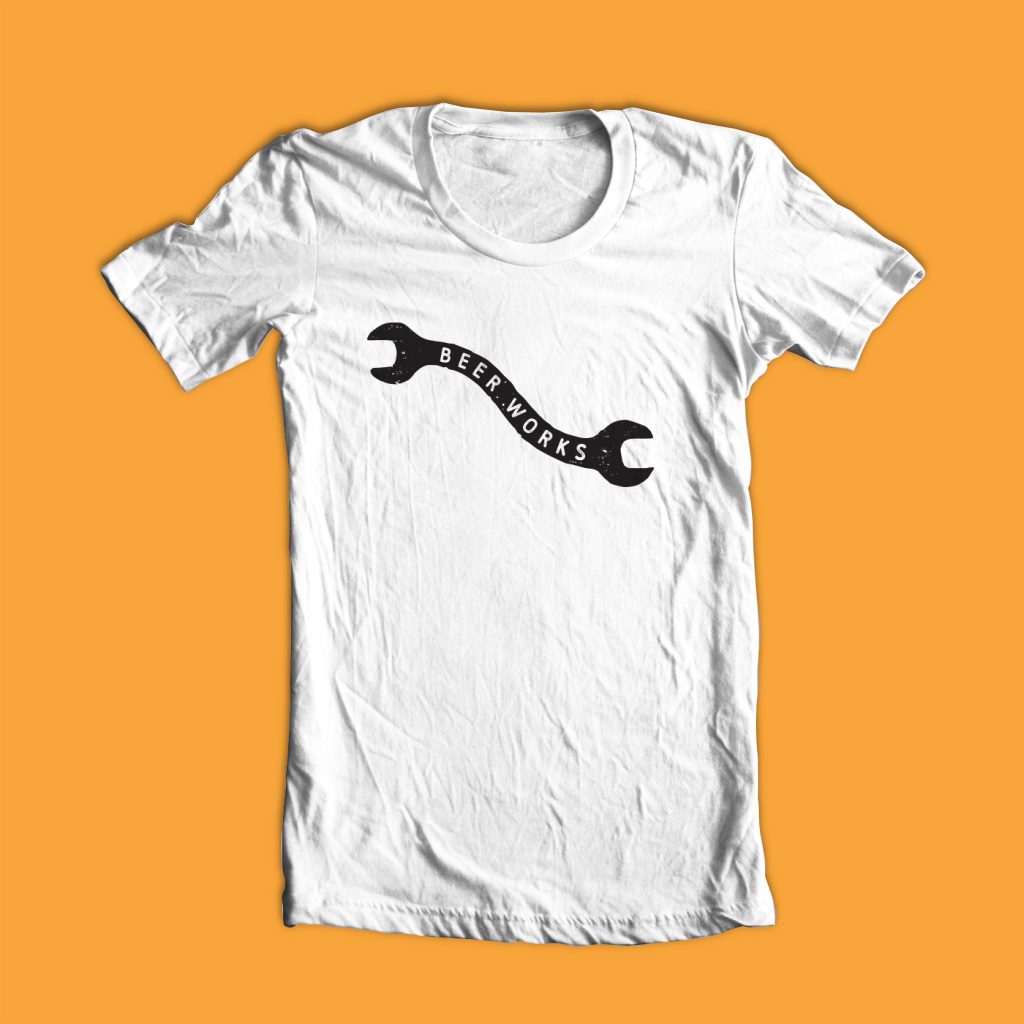
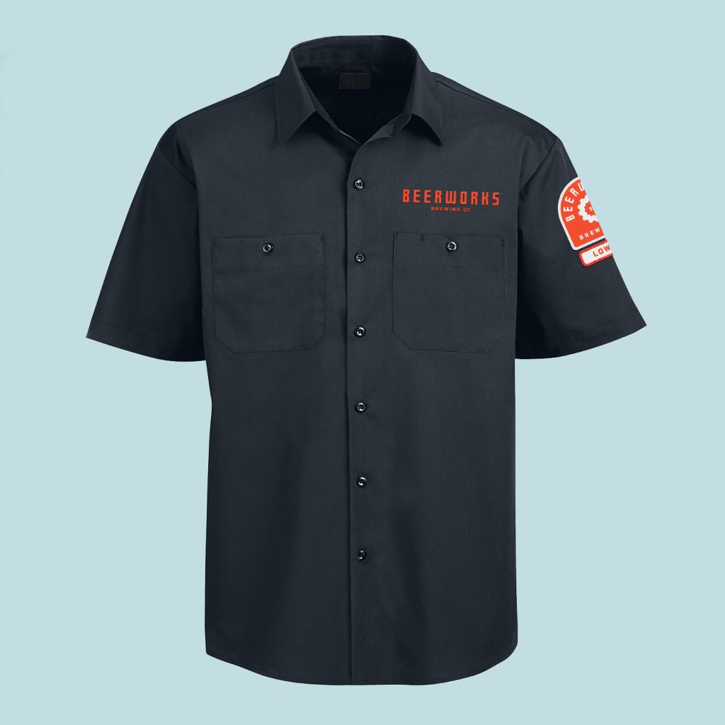
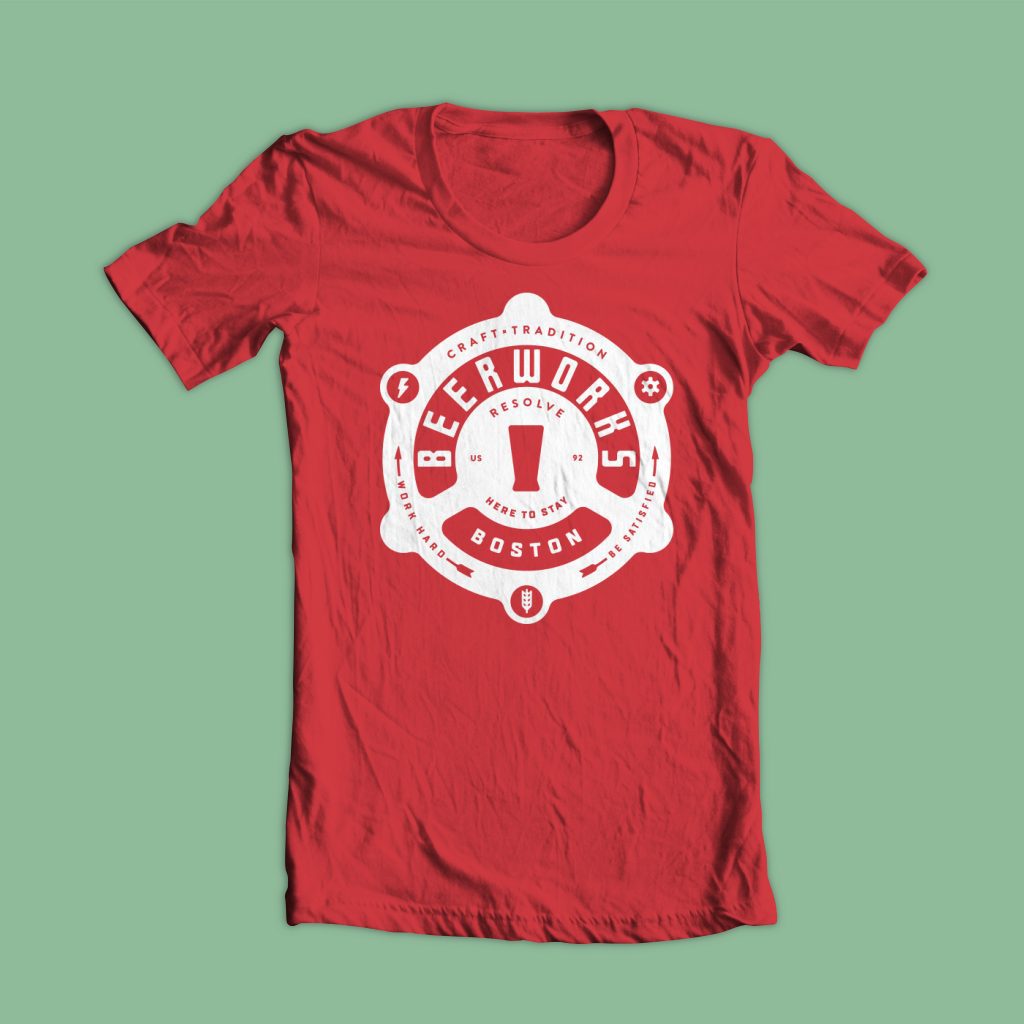
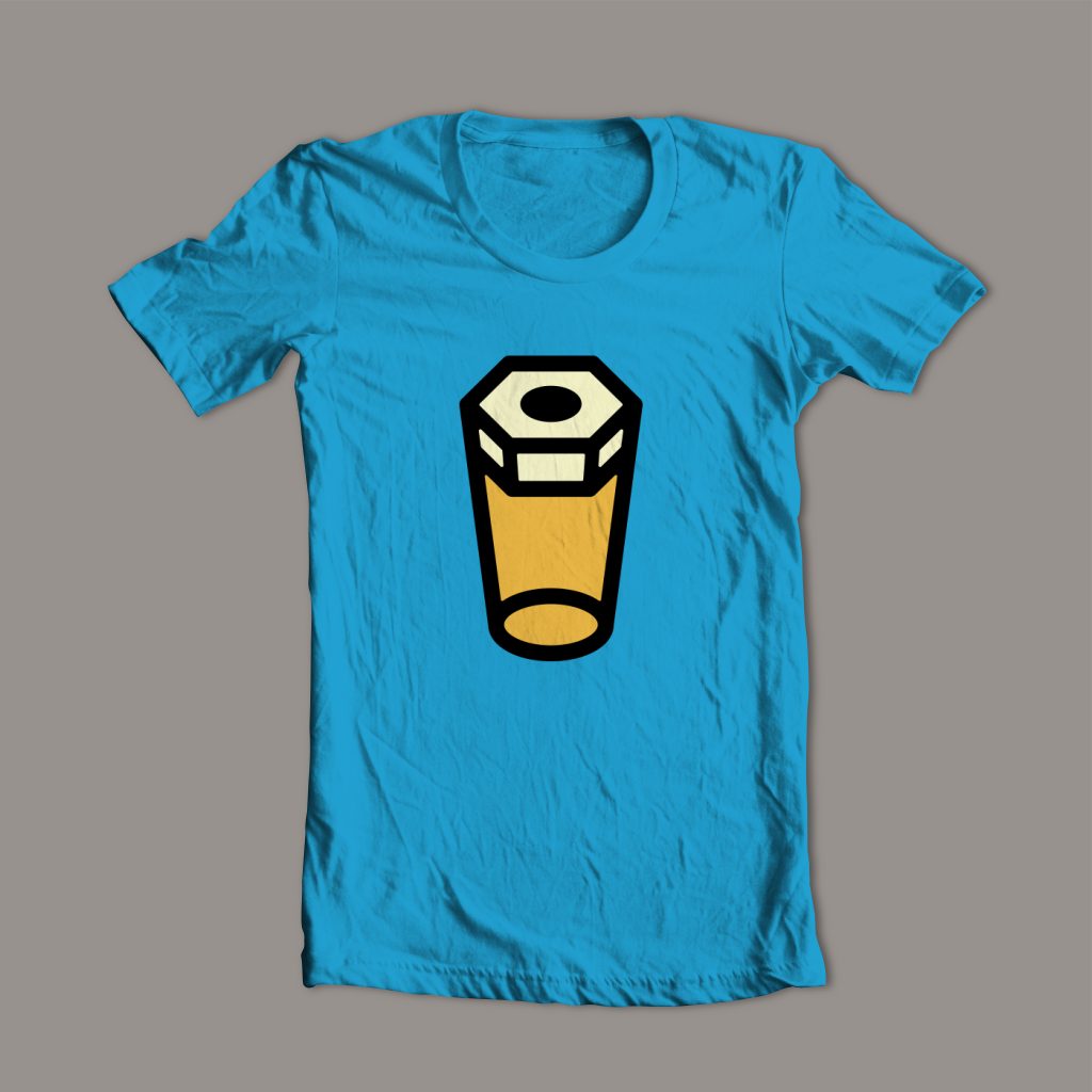
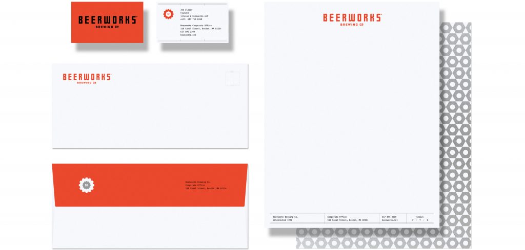
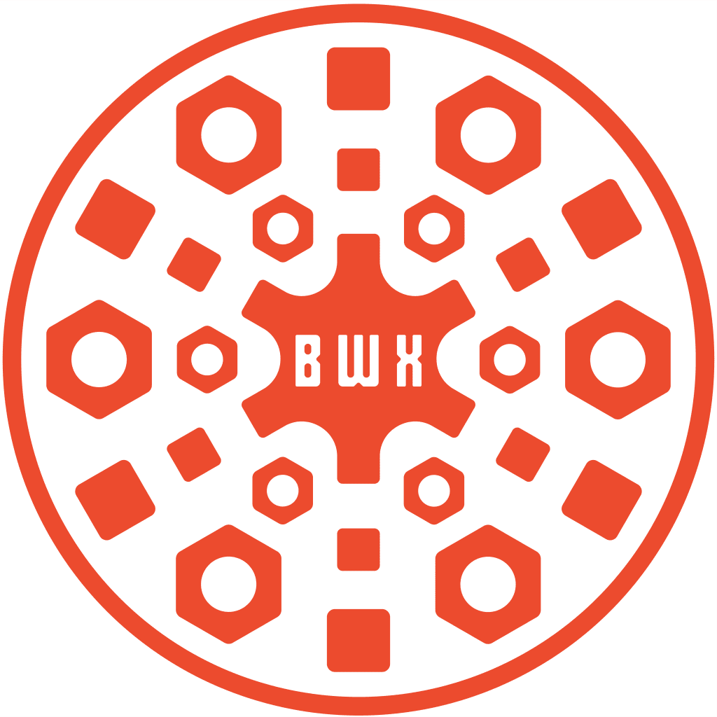
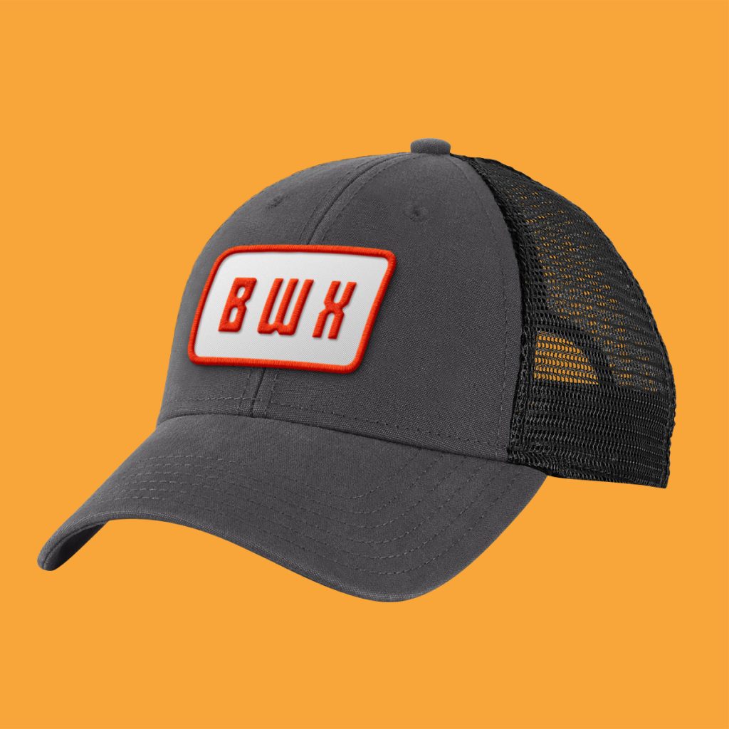
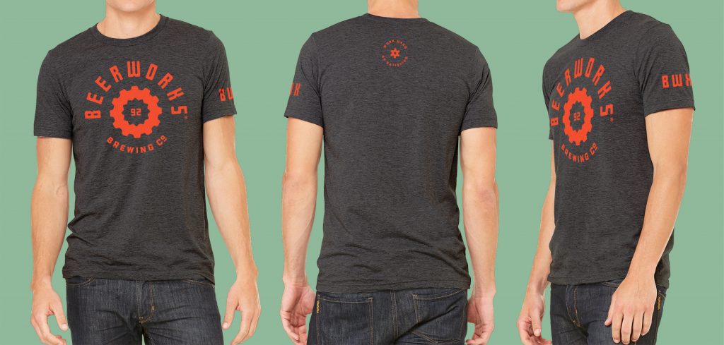
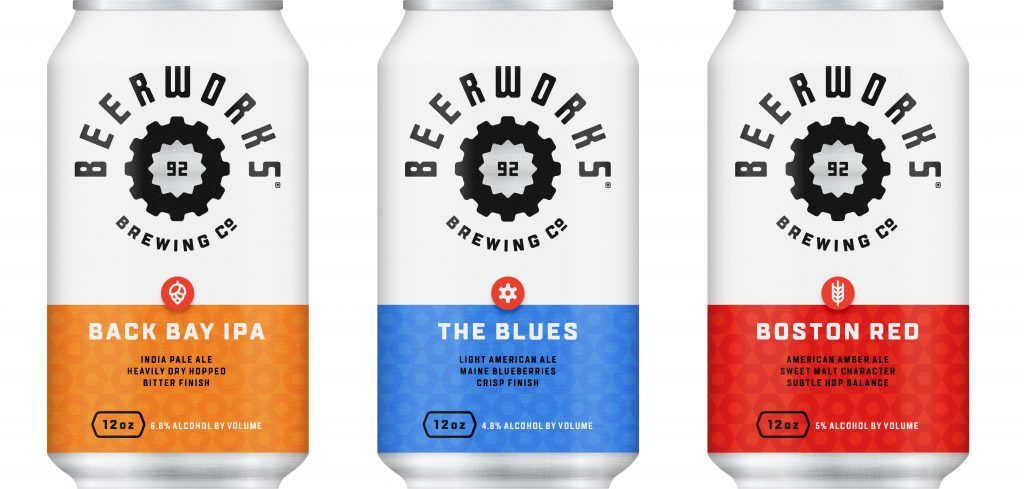
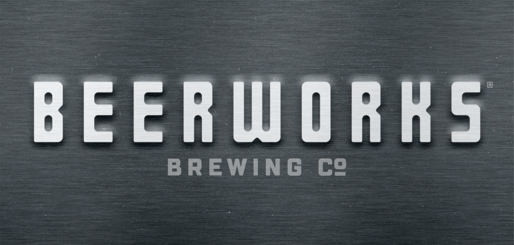
Beerworks Is a 15-location brewery-restaurant chain that pioneered on-site brewing in a dine-in environment. When Beerworks opened its doors over 25 years ago, local craft beer options were limited—and places that offered on-premise brewing and great food were even more rare.
Today, that’s all changed. Local craft brewers have become a crowd, with taprooms that raise the bar on brewery-based dining experiences. Seeing the competition, Beerworks approached us to help update their well-worn brand and restructure the outgrown naming system for its 15 locations.
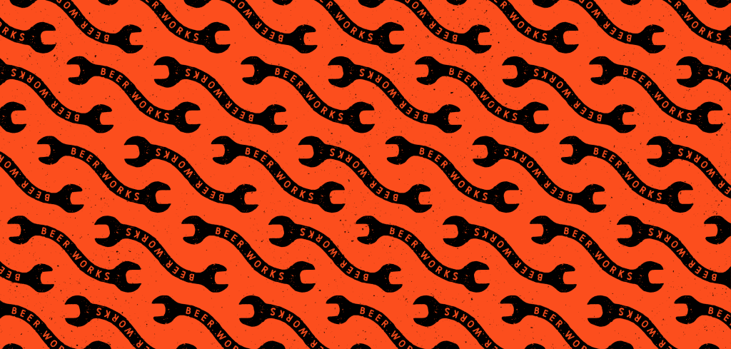
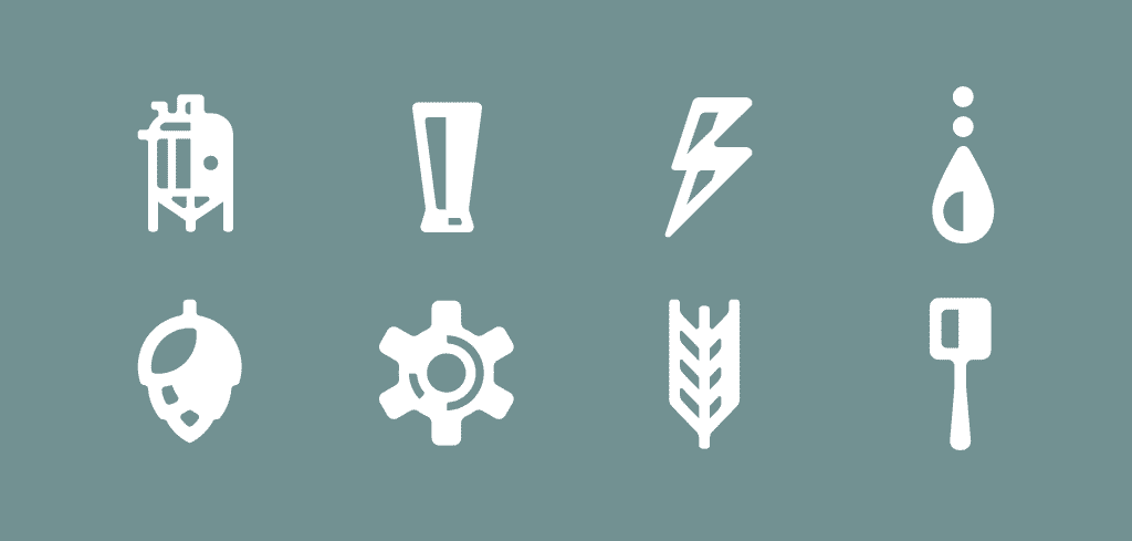
To highlight a uniqueness that no competitors could claim, we took a “back-to-the-factory” approach to styling. We dialed up the brand’s witty, industrial personality, taking visual inspiration from clunky and colorful old machines to communicate that Beerworks is an original that’s also relevant.
The retooled brand tells a story that connects with today’s hard working people. It claims that the values of craft and tradition, forged over 25 years, are here to stay.
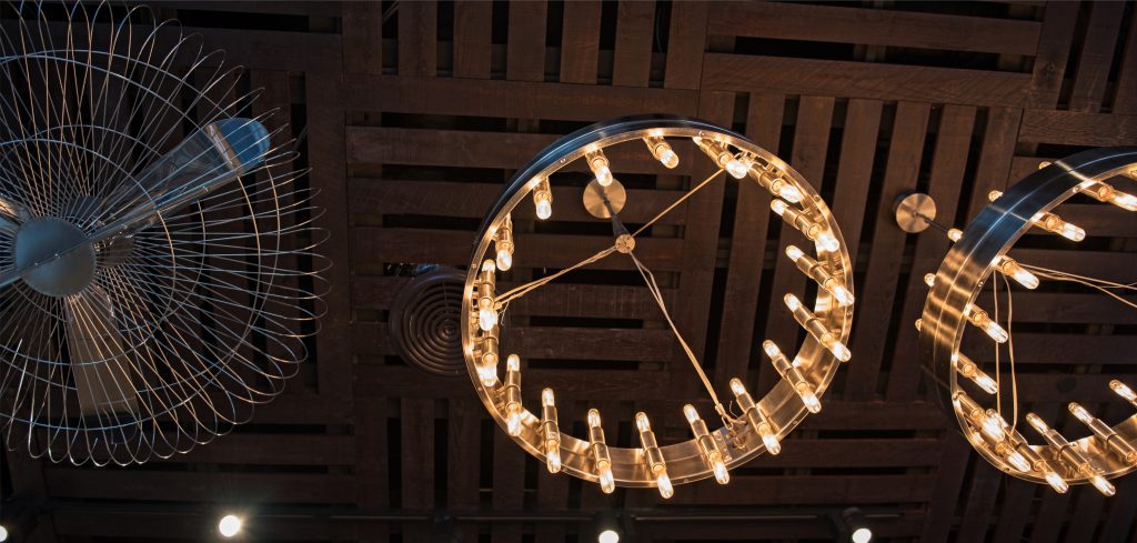
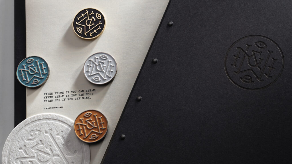
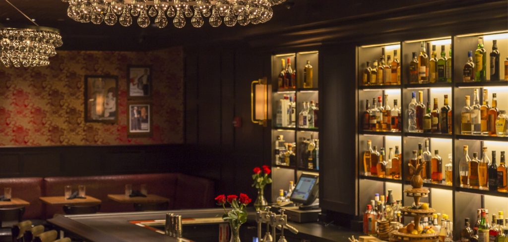
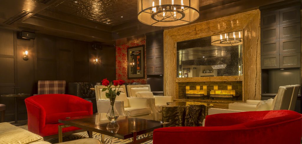
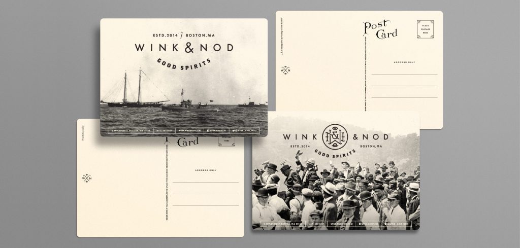
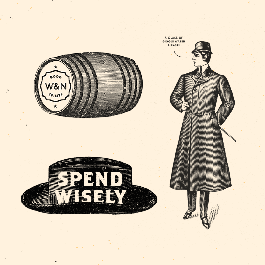
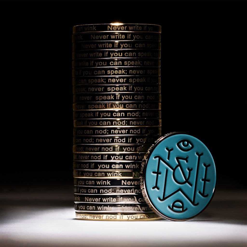
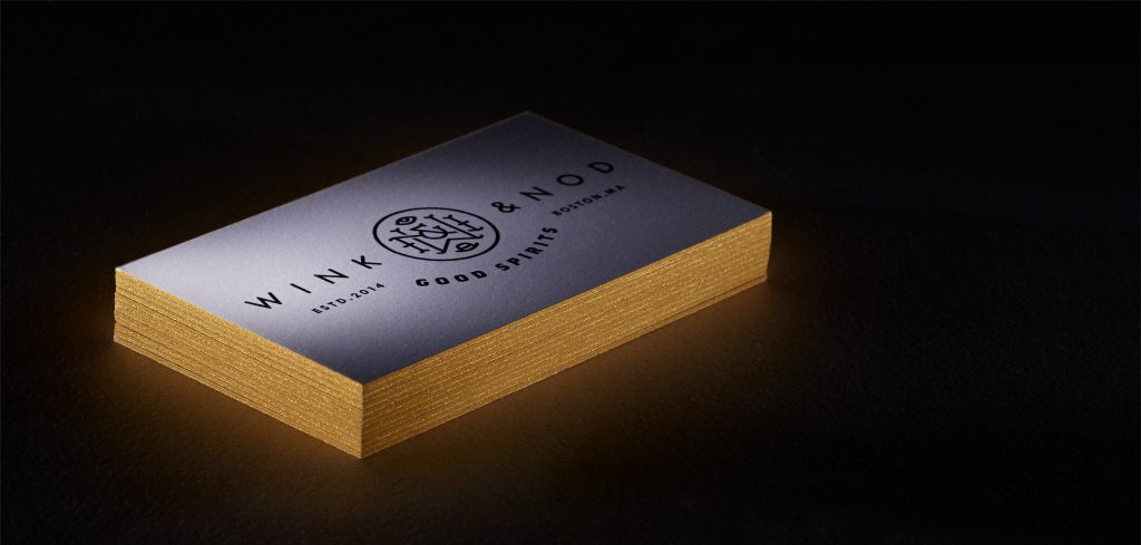
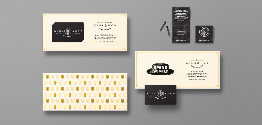
Hush-hush. A neighborhood bar’s hidden entrance opens to the chic feeling of a prohibition-era speakeasy.
Scope Brand Identity, Brand Strategy, Collateral & Menus, Copywriting, Illustration, Merch, Naming, Signage & Environmental Graphics, Web Site
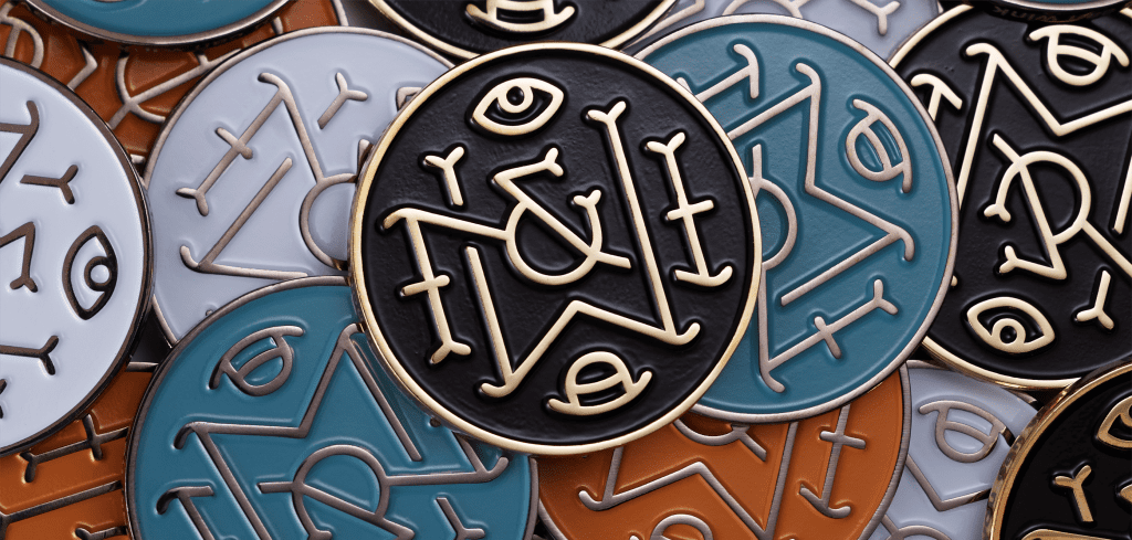
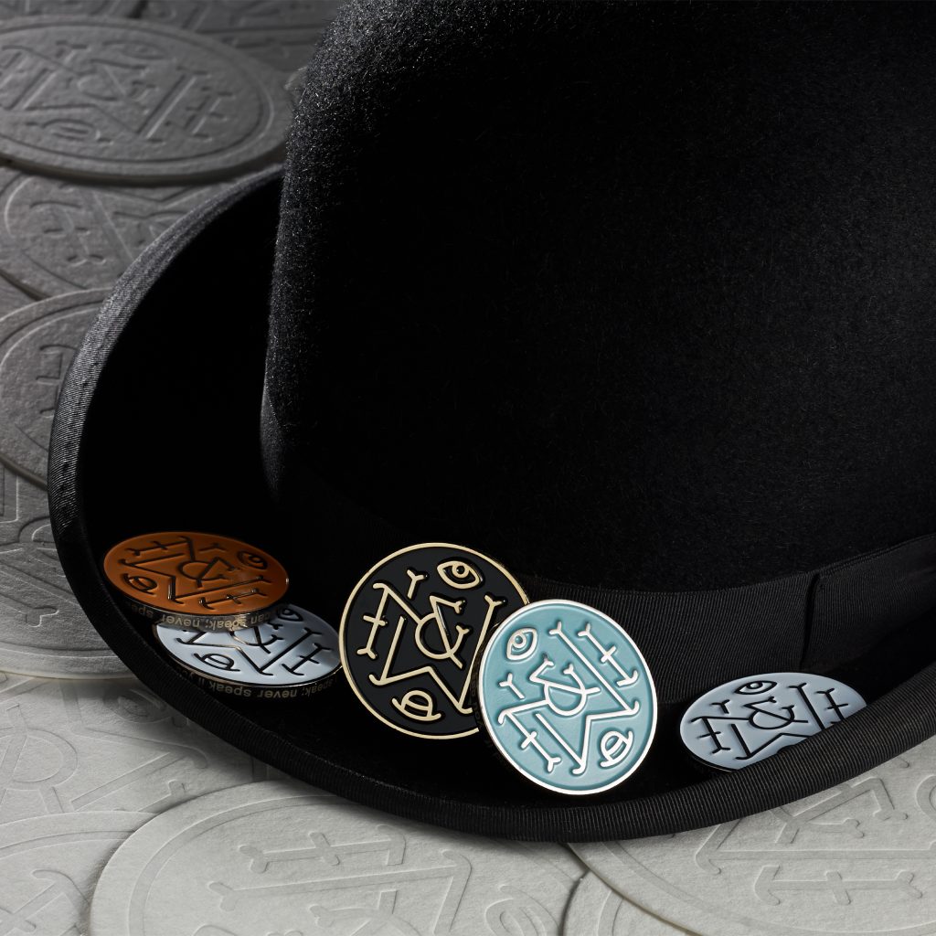
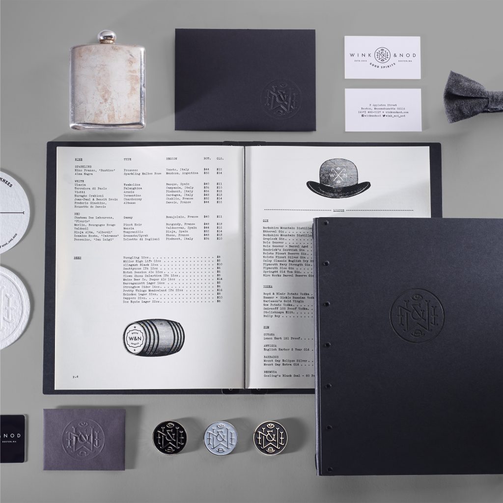
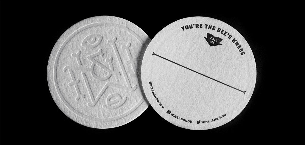
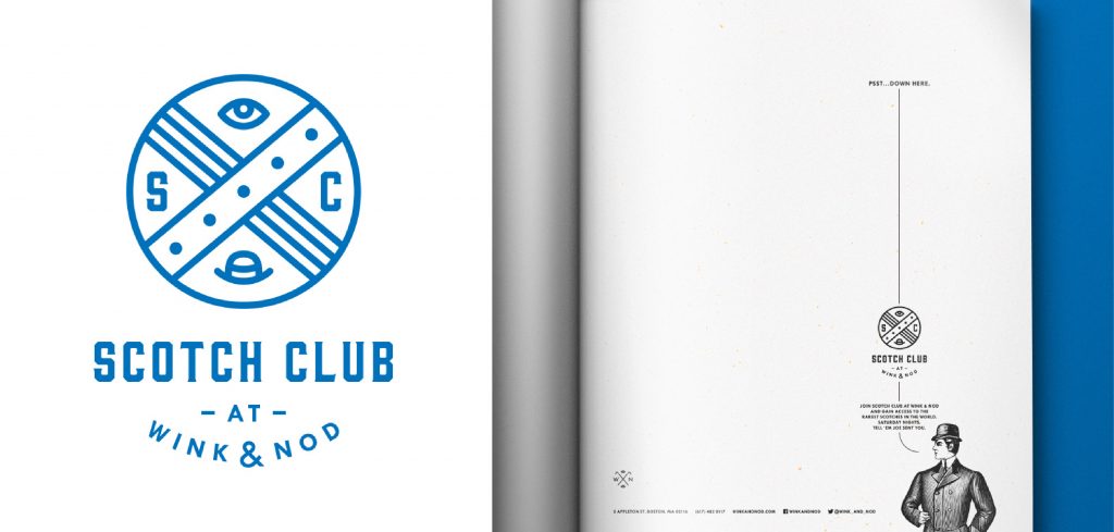
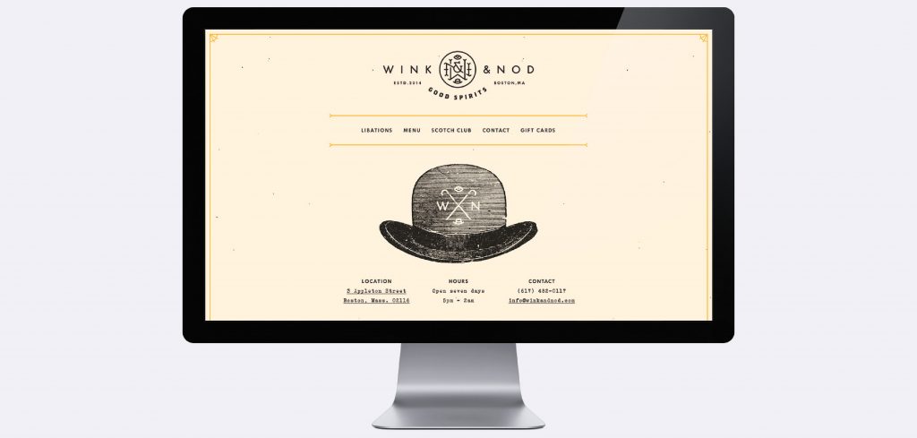
Finding inspiration in Martin Lomasney’s famous quote on the importance of, well… “discretion”, Wink & Nod’s award-winning concept captures the good spirit of yesteryear’s speakeasy while giving patrons access to the prime pop-up program that rotates through Wink & Nod’s kitchen.
Photography: Bryan Borgal, John Hesselbarth, Jackie Young
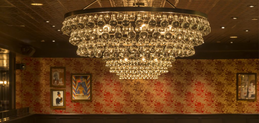
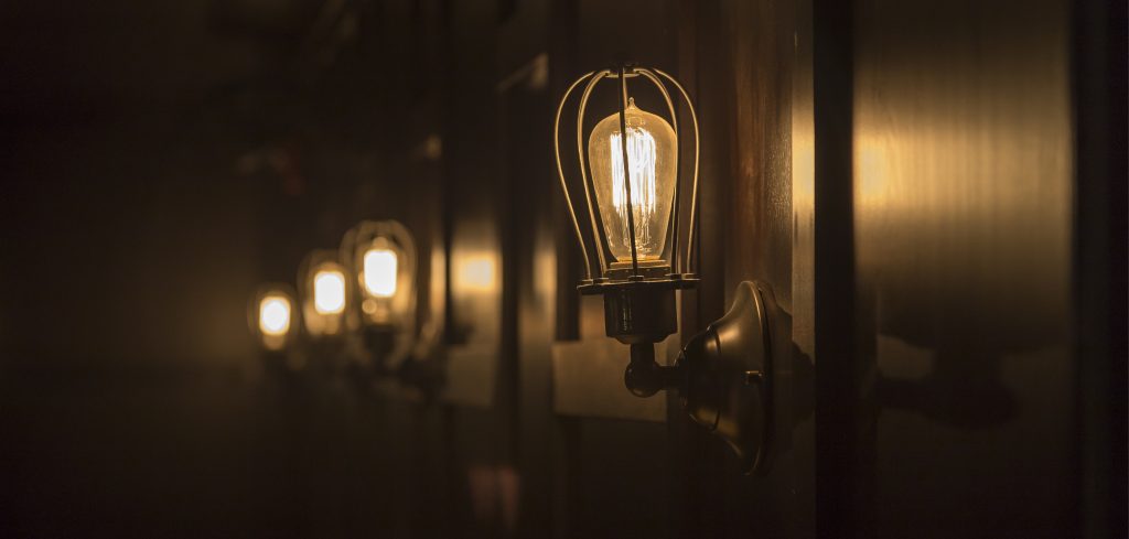
The secluded downstairs space is thoughtfully eclectic, taking cues from opulent Chinese-design blended with the pragmatic sensibilities of 1920’s America. Plush seating is surrounded by dark finishes, low lighting and dark velvet curtains, adding a sense of sophistication and covertness. The backlit bar creates a focal point while the adjacent lounge is anchored by a large vintage fireplace.
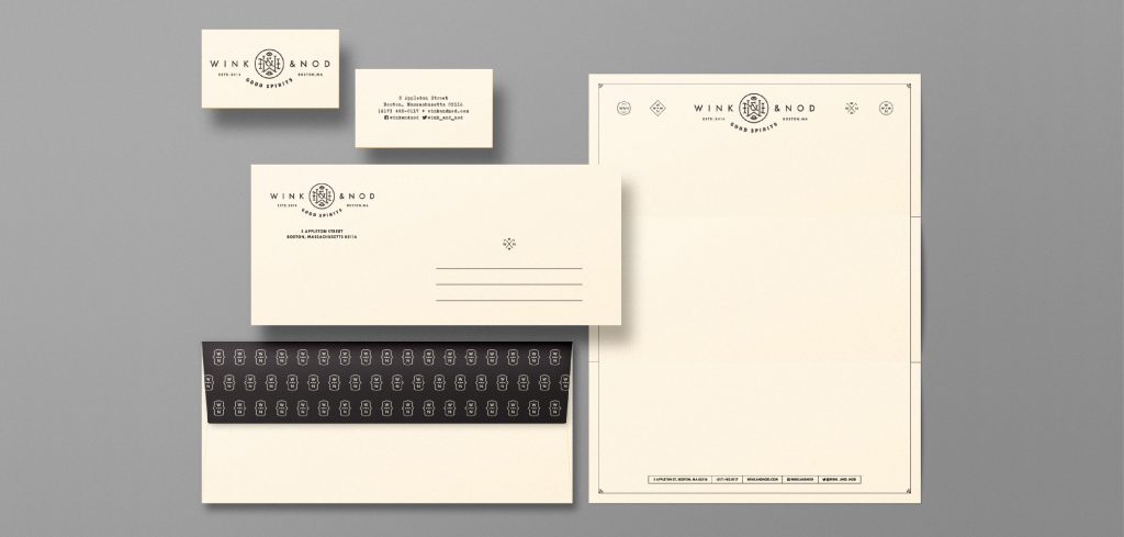
We were asked to create a premium brand design to stylishly represent this sophisticated social lounge. With vintage underpinnings and a modern, enigmatic vibe, the brand language offers the flexibility to support a series of brand marks including stand alone logos for W&N’s Scotch Club and their Black Card Cocktails.
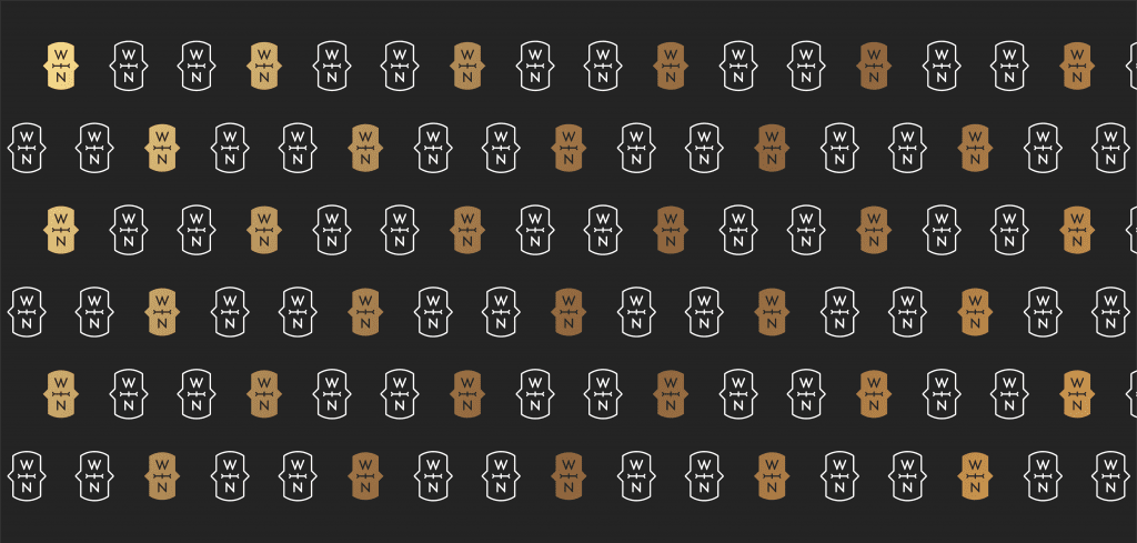
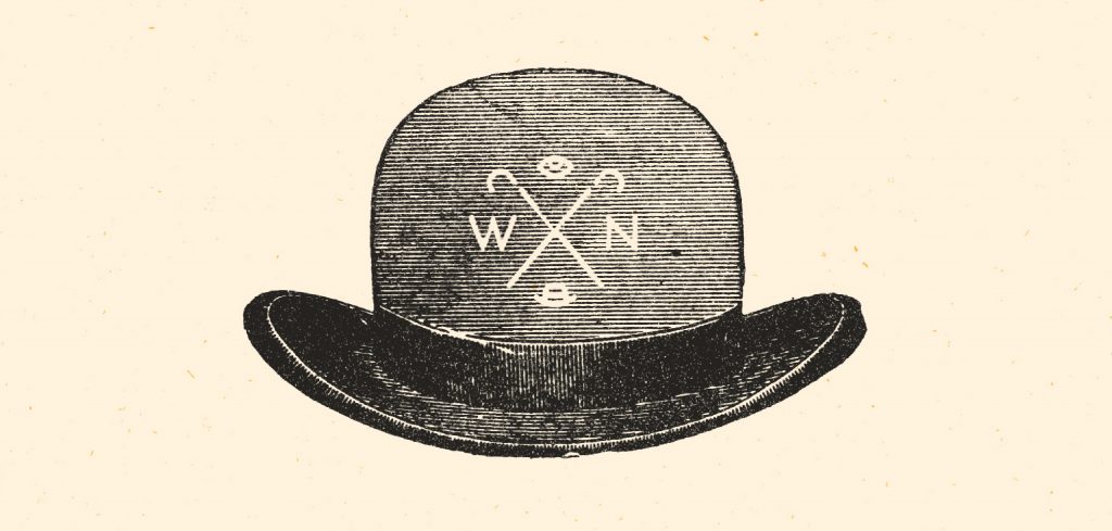
Subtle black-on-black and white-on-white printing, natural fibers with black and gold accents are utilized through out the menus and paper-goods program. Vintage engraved art and black and white photographs tell bygone stories of rum-runners, protestors and partying law-breakers.
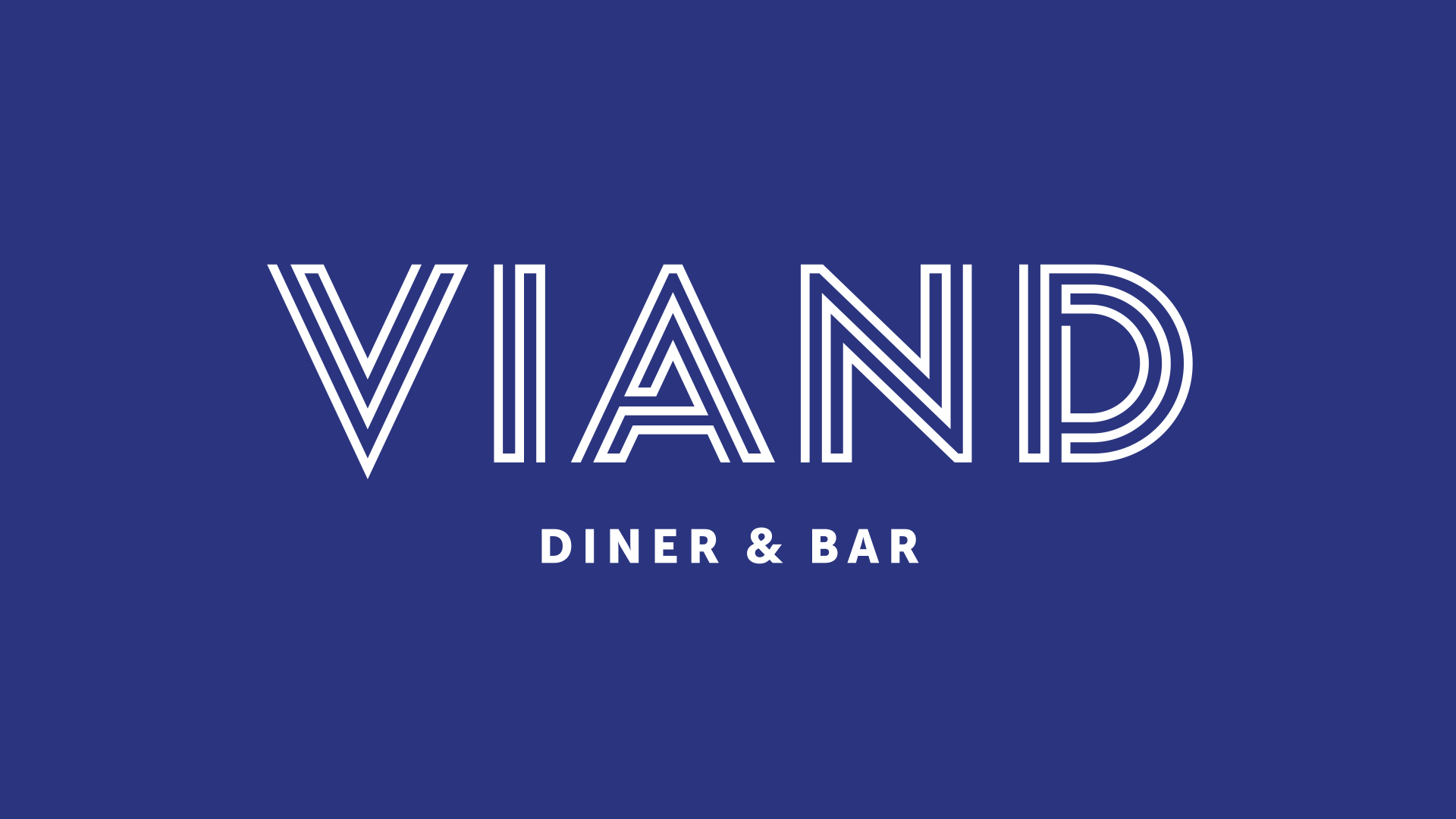
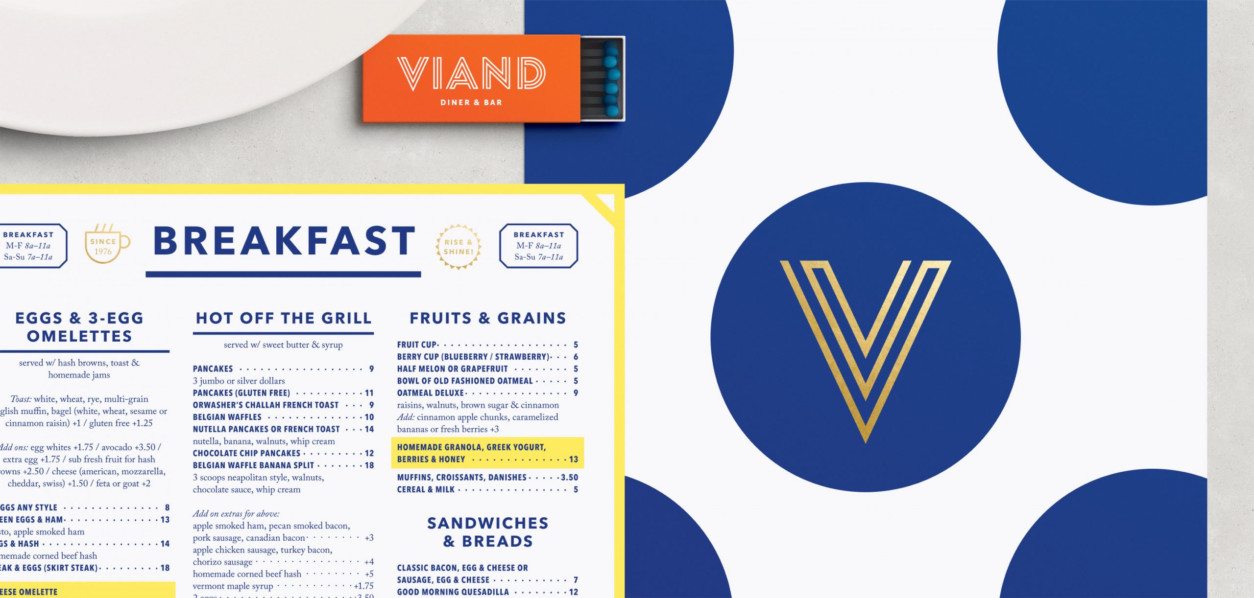
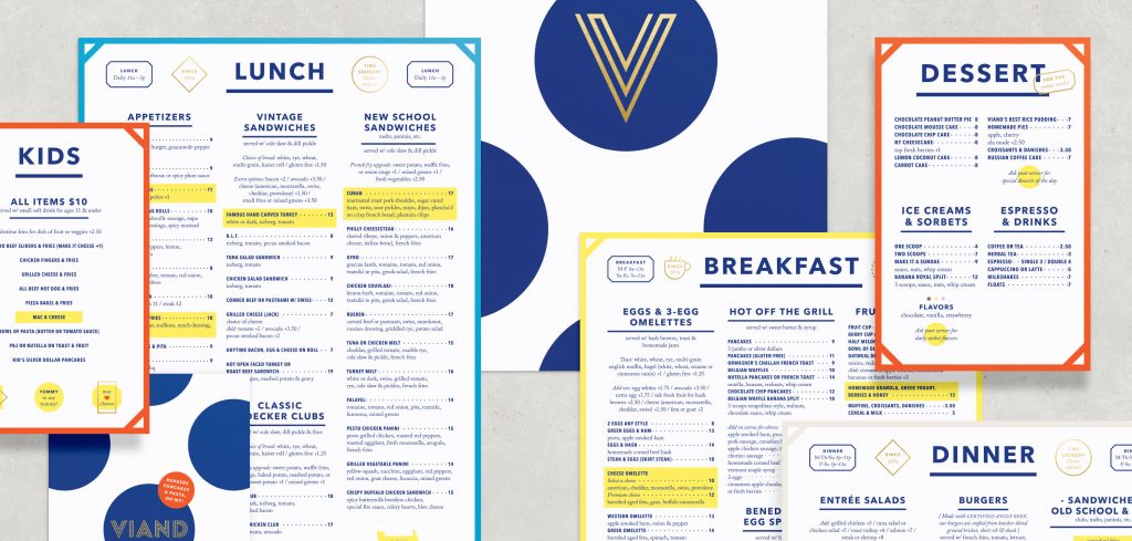
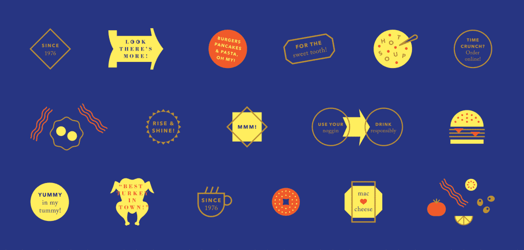
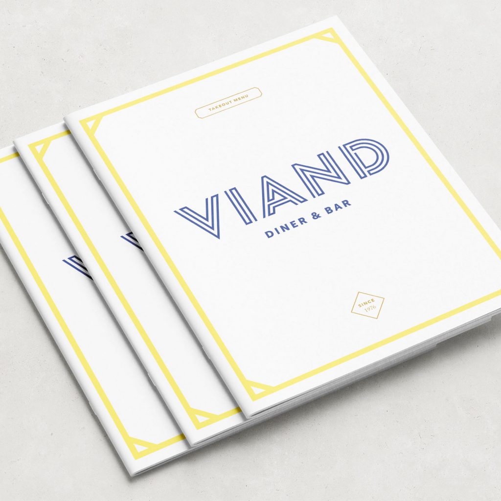
Viand, purveyor of “The best turkey plate in New York City”, is the quintessential diner, serving patrons from Manhattan’s East and West sides for over thirty years.
The growing family business was preparing to open a third location and wanted to introduce a new, cohesive visual identity that would eventually be shared by all three. The designs needed to speak for a quality experience—one that customers had come to expect. They also needed to be true to the restaurant’s history and, forward-looking to what the Viand was becoming.
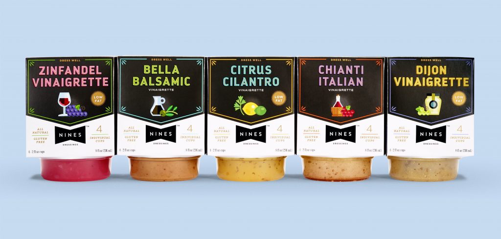
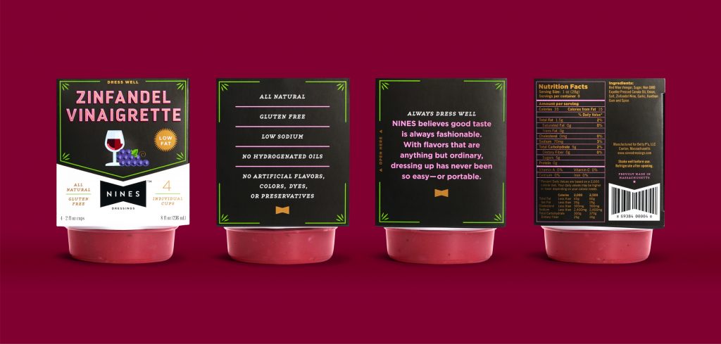
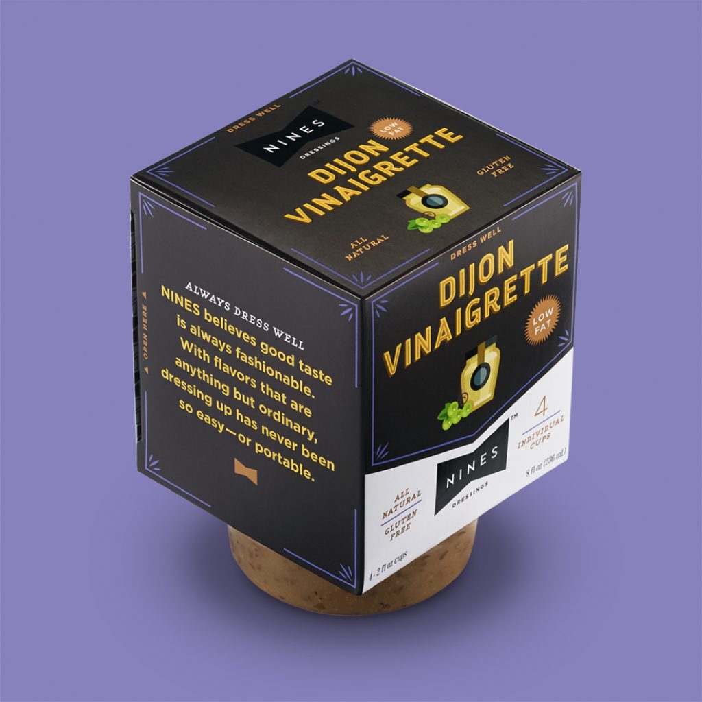
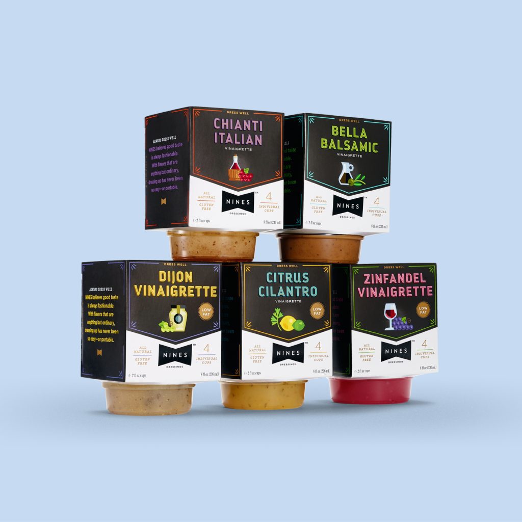
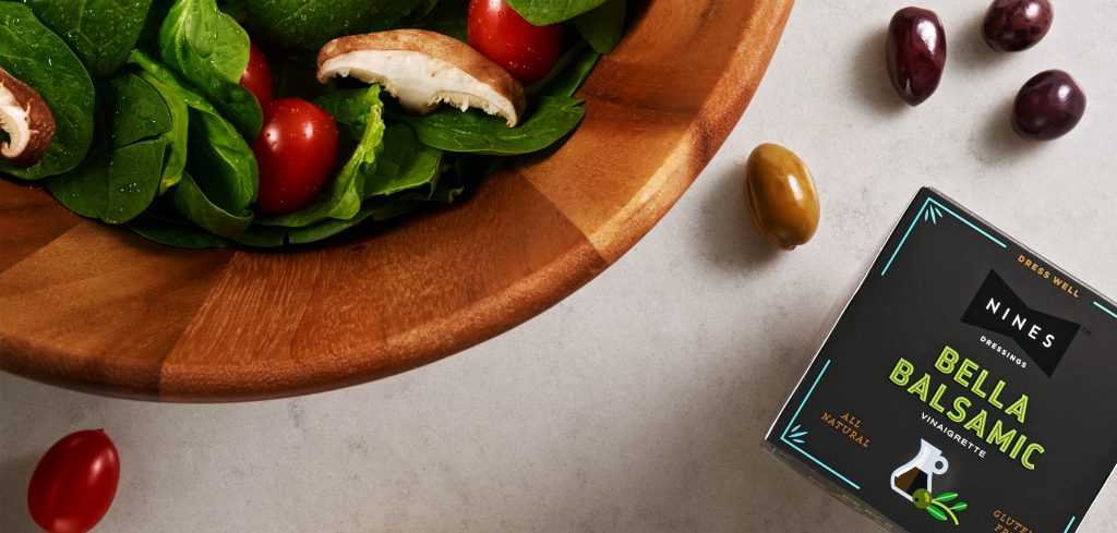
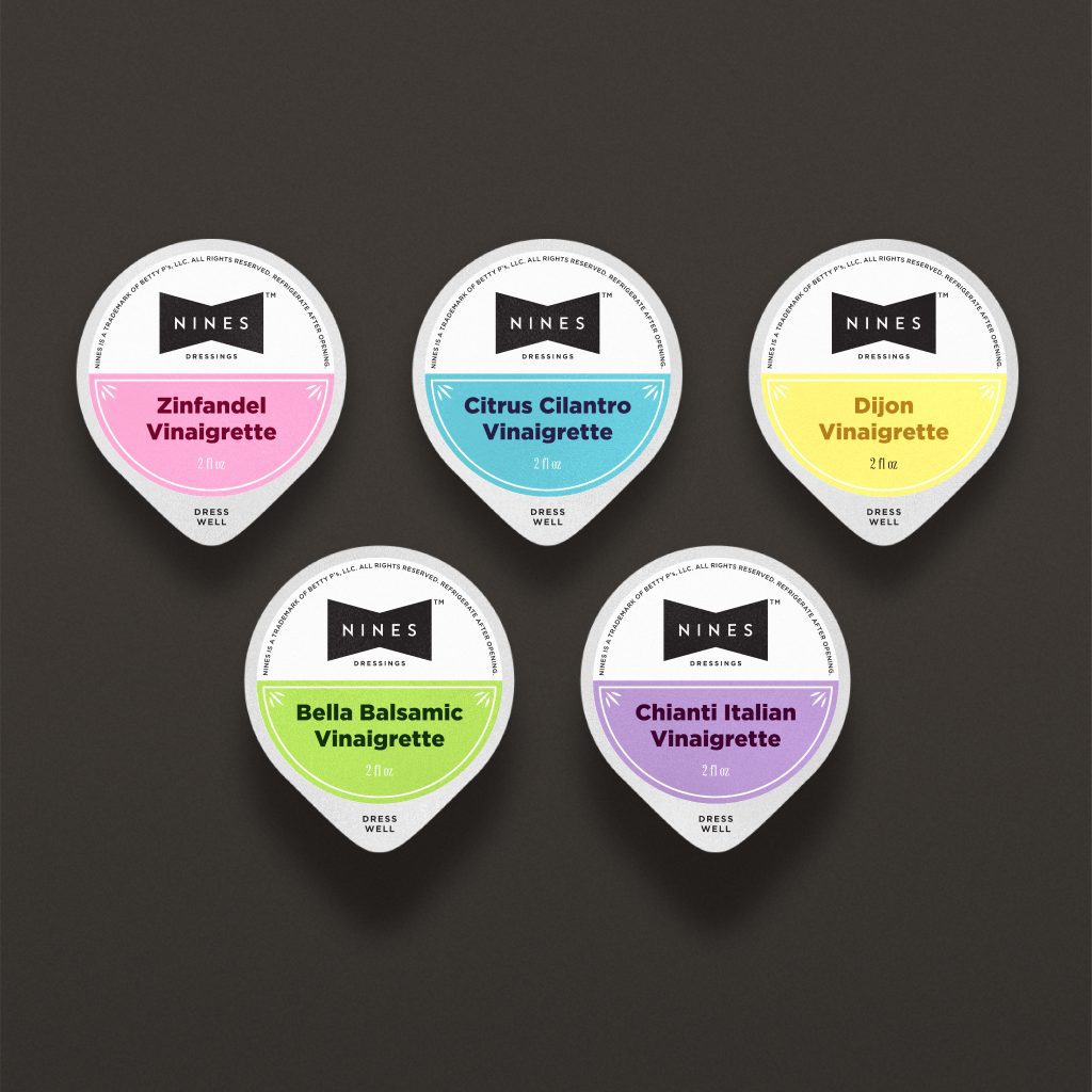
Nines is for busy people who want to dress their salads well. Offering on-trend flavors with all-natural ingredients, it hits all the right notes with grab-and-go convenience.
Photography: Bryan Borgal, John Hesselbarth, Jackie Young
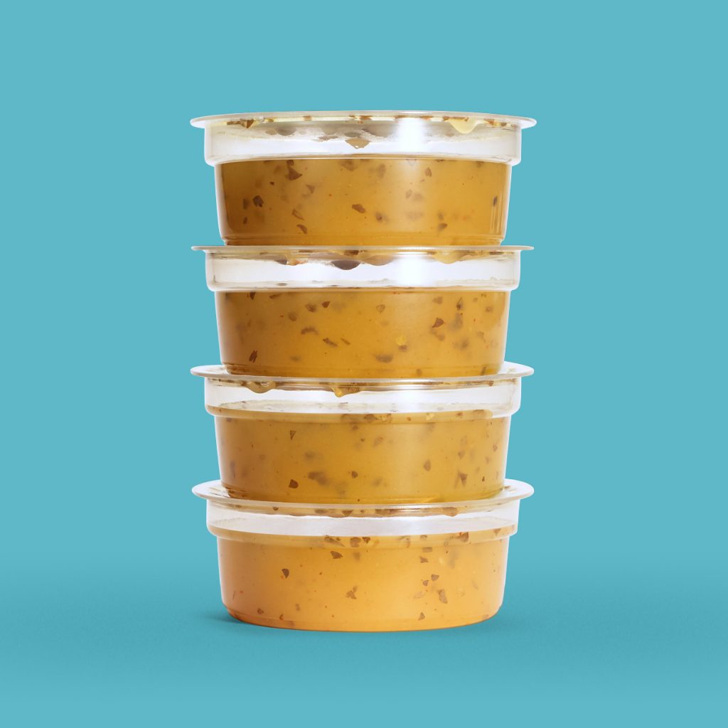
Our client, a leading salad dressing wholesaler, acclaimed by restaurants for their range of great-tasting flavors, wanted to make the leap to retail. In order to earn space on grocer’s shelves, the new brand needed packaging that would make a statement. When our research pointed to the growing demand for portable, single-serve products, our strategy began to take shape.
With smaller than average dimensions, the package speaks to the dressing’s high quality, on-trend flavor profiles and a shelf-stable recipe not readily found in other ‘to-go’ dressings.
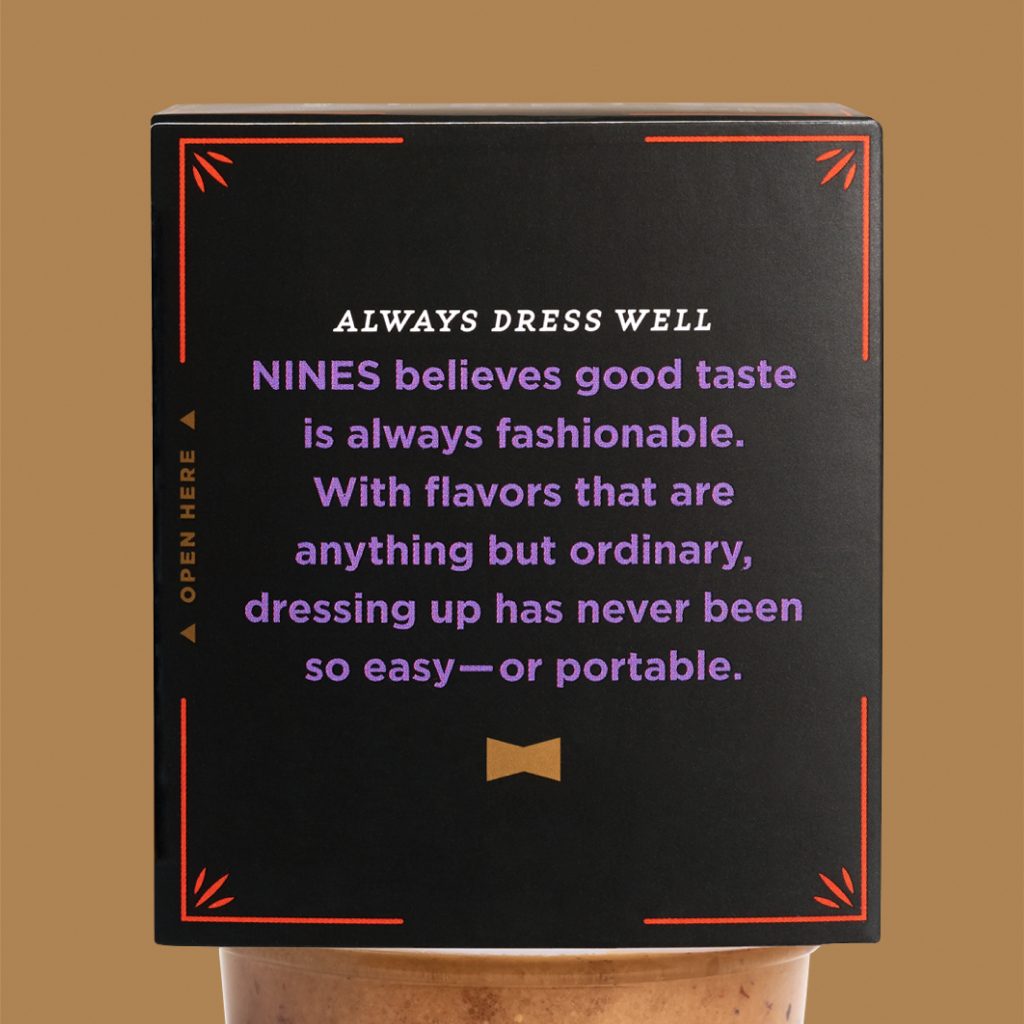
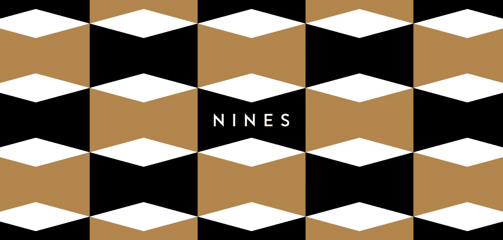
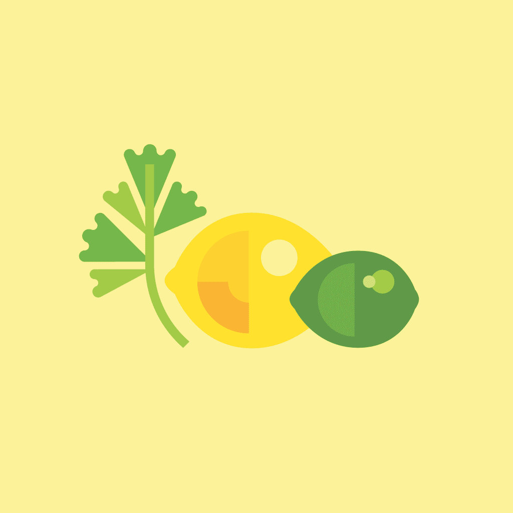
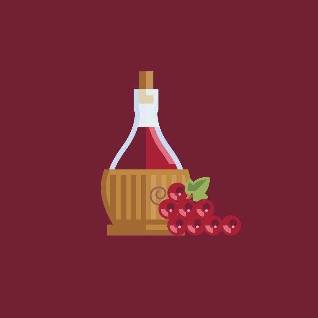
The black bowtie, a classic icon of sophistication, anchors the visual brand and offers context for the company’s name and their family of premium products. Simple, colorful illustrations differentiate the variety of flavors and depict the all-natural ingredients. Adding a touch of humor, the copy on and inside the package encourages consumers to “Always Dress Well”.
Within 6 months of the rebrand, Nines was picked up by a 500+ location, multinational grocery chain.
Nines was sold at 16 independent organic grocers within 6 months of launch.
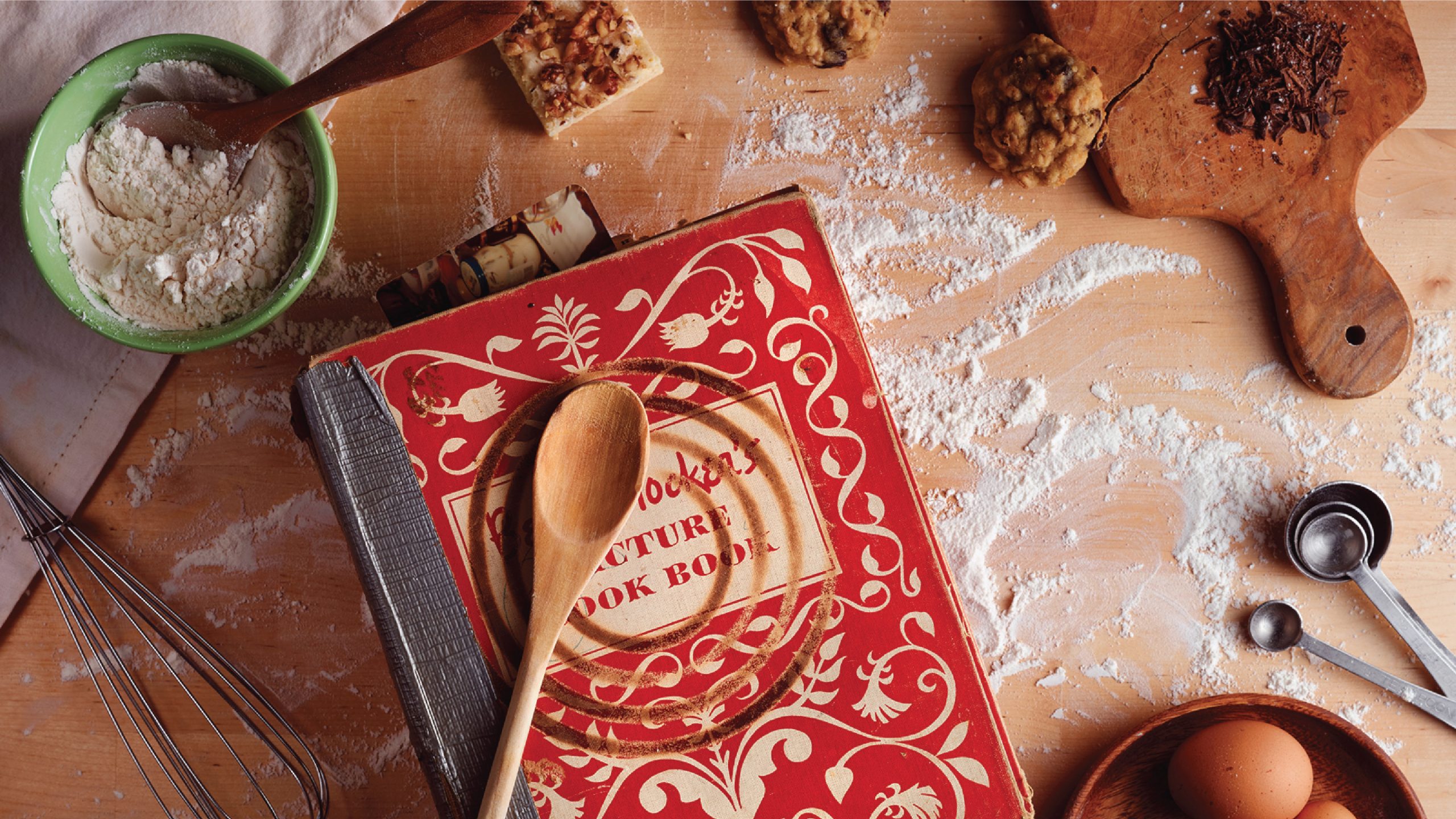
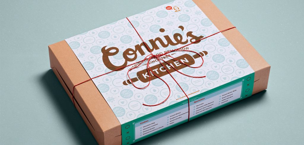
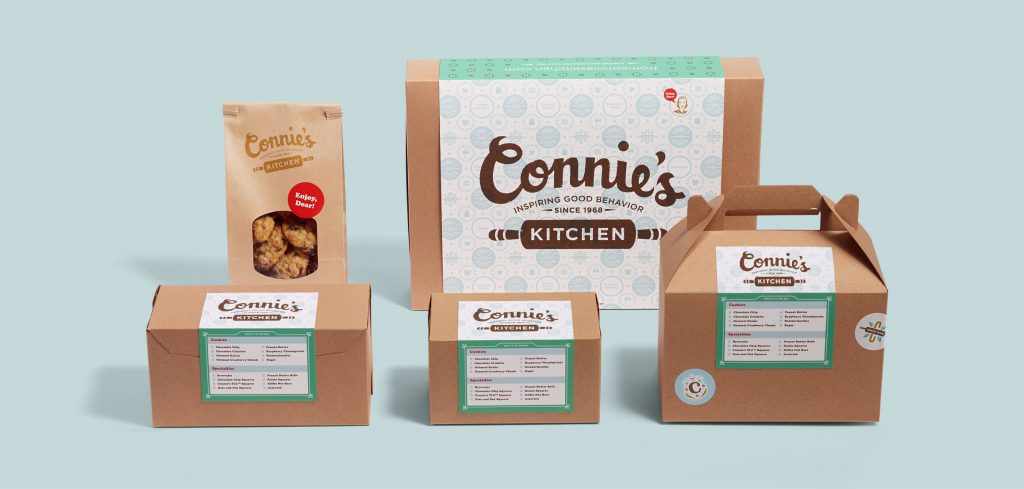
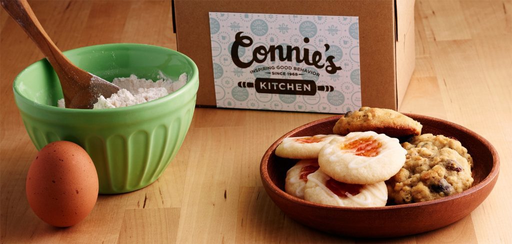
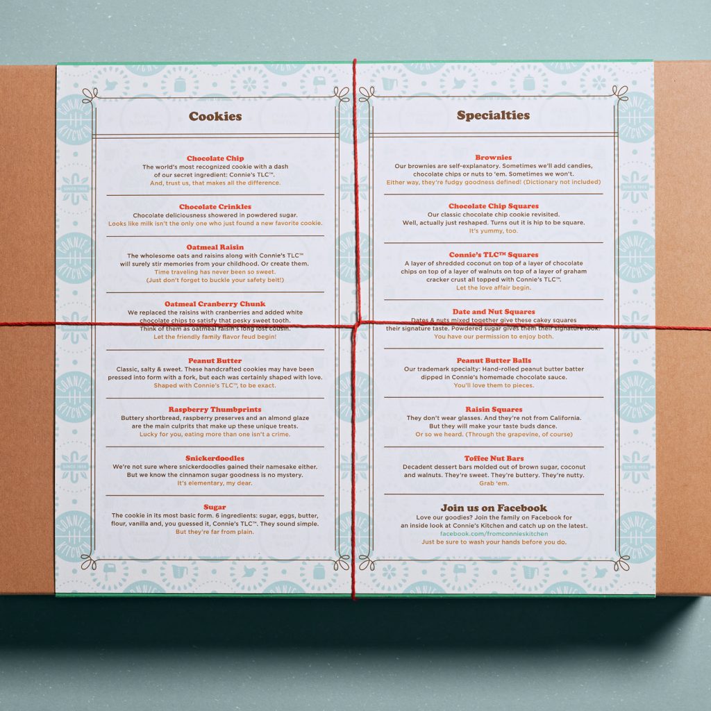
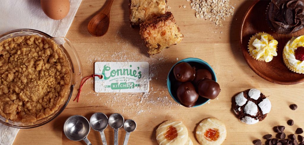
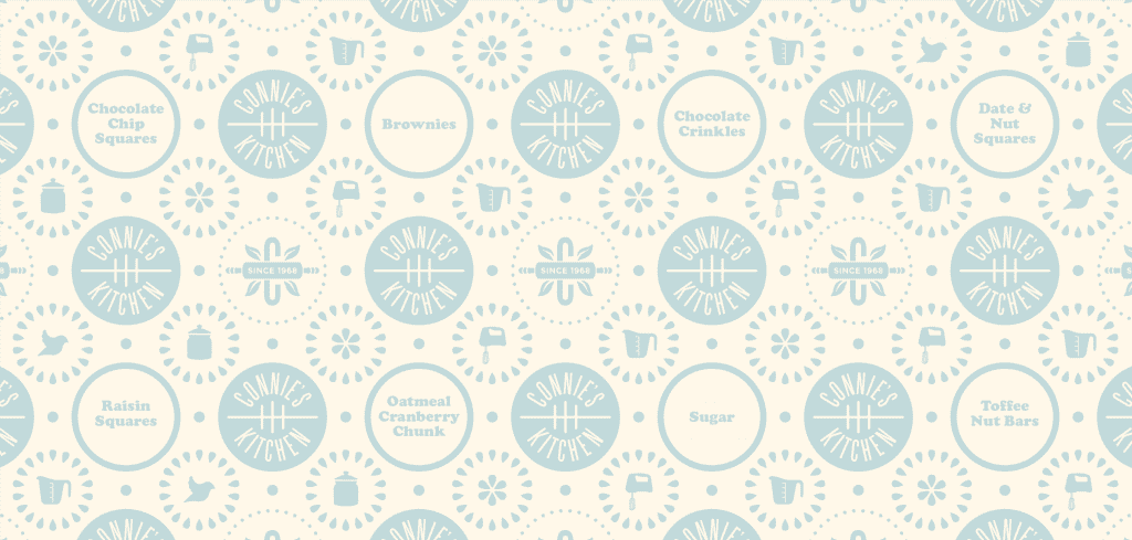
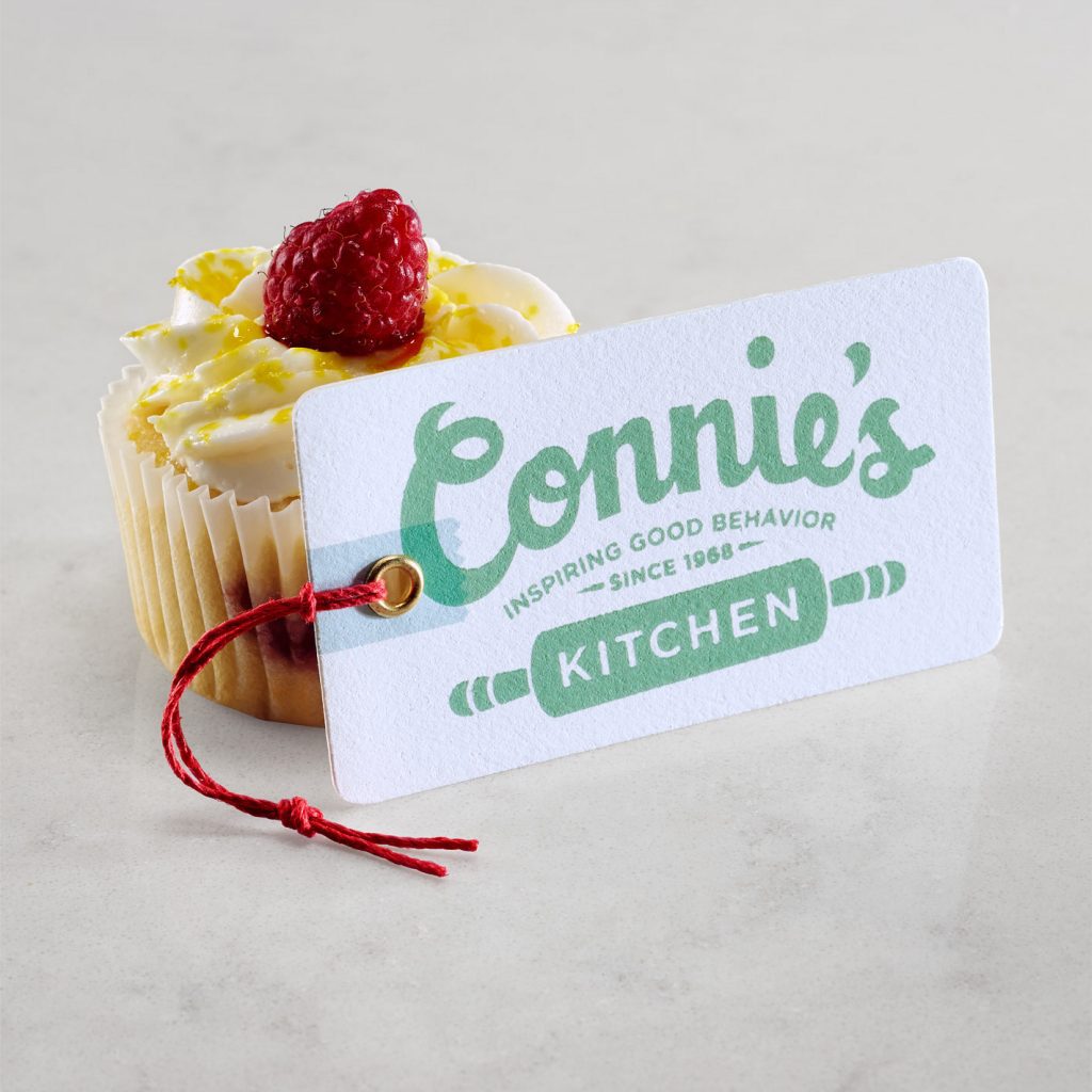
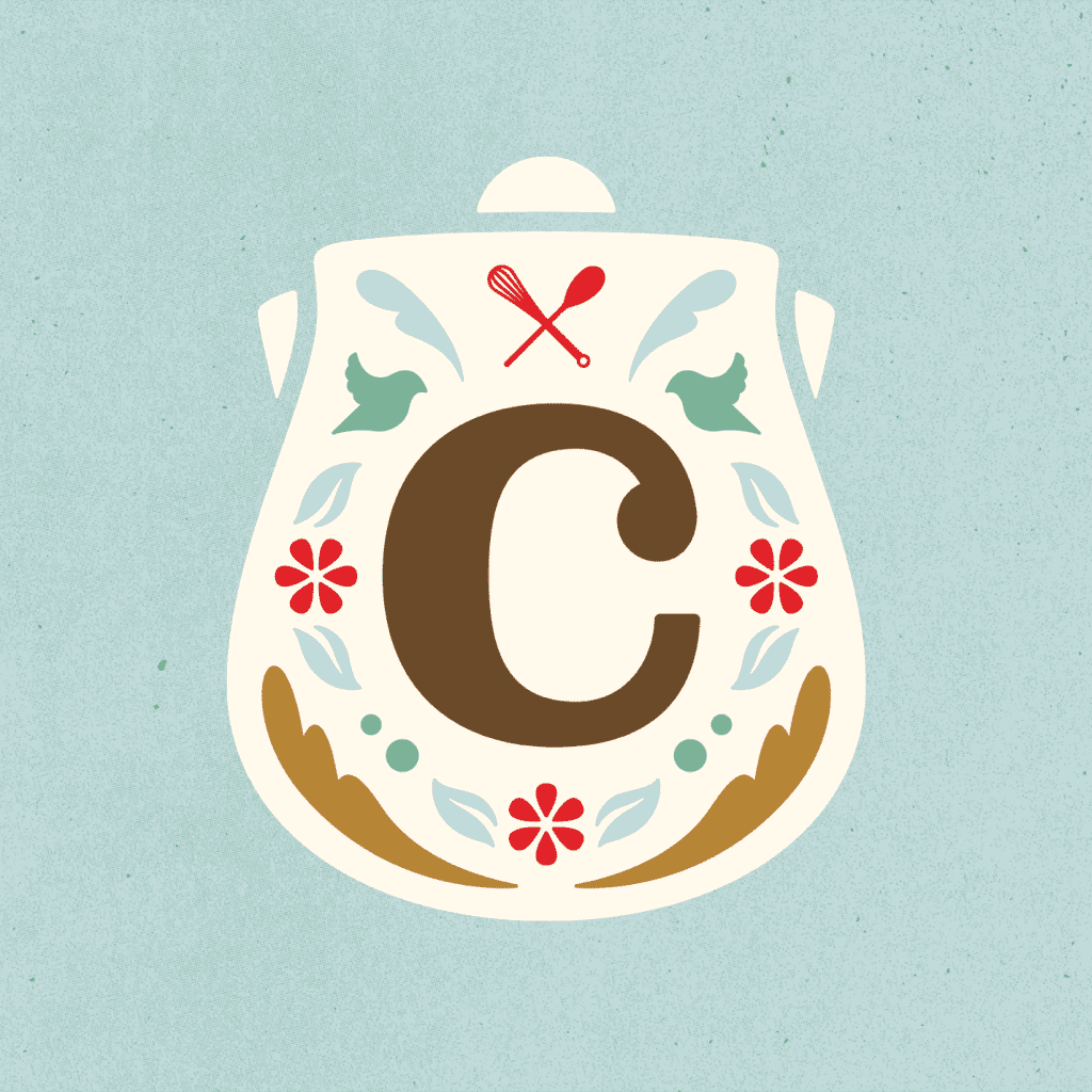
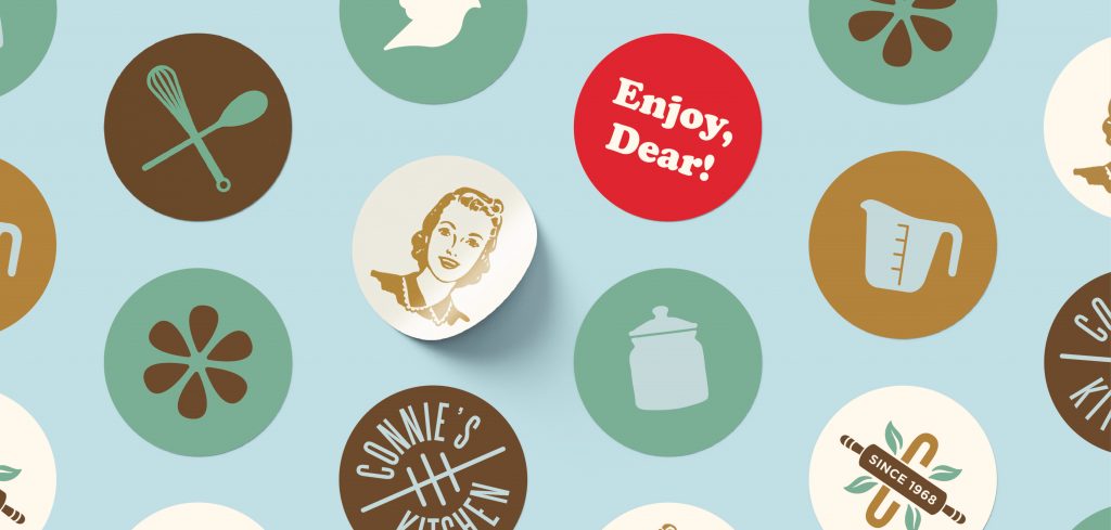
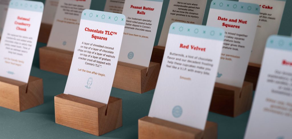
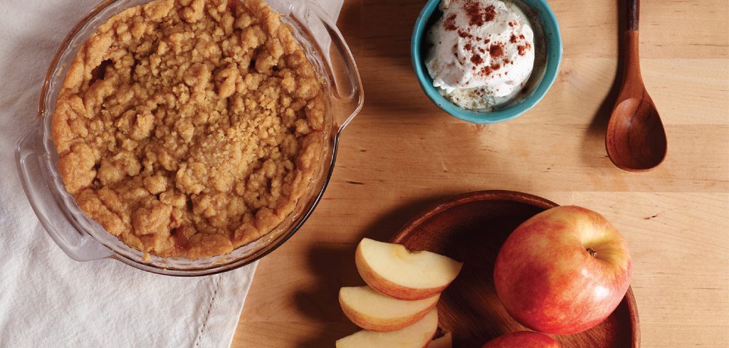
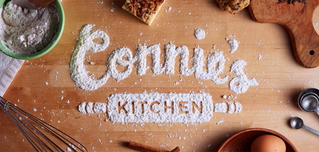
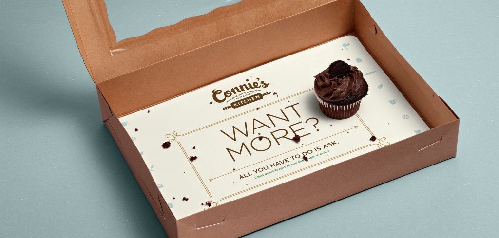
Connie’s Kitchen is a small-batch bakery producing fresh, hand-made goodies for gifting and special occasions. A business 40 years in the making, Connie’s goodies were originally made, primarily, for her three energetic boys and, on occasion, a few lucky friends. Over the years, Connie added new recipes and flavors to her ensemble, all the while, leveraging her treats for better manners.
Photography: Bryan Borgal, John Hesselbarth
With Connie’s well-worn recipe cards and cookbooks as inspiration, we created a logo mark and packaging designs that are rich with home-grown nostalgia—expressions of a mom’s “TLC” mixed with an unusual attention to craft. Subtle details and words from Connie add warmth to the program, reminding customers to “use the magic word” and creating an overall brand voice that feels as if Connie were speaking to her own boys.